
Research
PyPI Package Impersonates SymPy to Deliver Cryptomining Malware
Malicious PyPI package sympy-dev targets SymPy users, a Python symbolic math library with 85 million monthly downloads.
By Kirill Boychenko - Jan 21, 2026
@draftbit/web
Advanced tools
Draftbit's component library used inside our Builder. It's based on React Native Paper but allows us to extend and empower our users with more features ⚡️
Embedded themes. Jigsaw has a very robust theming system that is directly integrated into our builder. React Native Paper is based on Material Design where ours is more generalized for both iOS and Android. That doesn't make it any better or worse, it just means ours is directly integrated into our product and by controlling the library we can make changes as often as we need
Different components & use cases. React Native Paper is really great for building Material-style apps where we use Jigsaw to build any type of app. You'll find a different series of components for different use cases
We love React Native Paper and even plan on supporting it one day as a different component library, Jigsaw just allows us to deeply embed components, props, themes directly into the Draftbit platform
@draftbit/web is only used for our internal builder. Because we're using @expo/vector-icons and React Native's way of compiling files, this isn't compatible inside create-react-app. The fix is to publish a separate @draftbit/web file with Icon.web.tsx being the Icon.tsx file and Icon.native.tsx being the Icon.tsx file.
Both icon files live inside files/ top level, next to src.
npm install @draftbit/ui
After your last commit, run npm version. Probably minor or patch. We only run major for major Expo releases.
Then run:
yarn publish:both
If that doesn't work, you can manually run the script that lives inside publish.sh. Either directly: ./publish.sh or by copying the steps within that file
See the contributing guide to learn how to contribute to the repository and the development workflow.
Most of the primitives should already be here. If a component with no actual logic needs to be added, you can add that into src/mappings (see that folder for an example)
All components live inside src/components/MyComponent.ts. Add your component, add the required SEED_DATA and you should be good to go!
Seed data is how we know what to render and support inside the product. It takes on this format. src/core/component-types.js will show you the different GROUPS, PROP_TYPES, FORM_TYPES, and other fields you might need.
group: GROUPS.advanced,
name: "textBreakStrategy",
label: "textBreakStrategy",
description:
"Set text break strategy on Android API Level 23+, possible values are simple, highQuality, balanced The default value is highQuality.",
options: ["simple", "highQuality", "balanced"],
editable: true,
required: false,
formType: FORM_TYPES.flatArray,
propType: PROP_TYPES.STRING,
defaultValue: "highQuality",
MIT
FAQs
Draftbit UI Library
The npm package @draftbit/web receives a total of 9 weekly downloads. As such, @draftbit/web popularity was classified as not popular.
We found that @draftbit/web demonstrated a not healthy version release cadence and project activity because the last version was released a year ago. It has 3 open source maintainers collaborating on the project.
Did you know?

Socket for GitHub automatically highlights issues in each pull request and monitors the health of all your open source dependencies. Discover the contents of your packages and block harmful activity before you install or update your dependencies.
Research
Malicious PyPI package sympy-dev targets SymPy users, a Python symbolic math library with 85 million monthly downloads.
Product
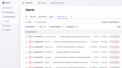
Create and share saved alert views with custom tabs on the org alerts page, making it easier for teams to return to consistent, named filter sets.

Product
Socket’s Rust and Cargo support is now generally available, providing dependency analysis and supply chain visibility for Rust projects.