Security News
/Research
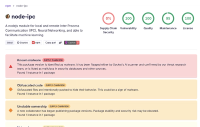
node-ipc npm Package Compromised in Supply Chain Attack
Socket detected malicious node-ipc versions with obfuscated stealer/backdoor behavior in a developing npm supply chain attack.
By Socket Research Team - May 14, 2026
@freakycoder/react-native-header-view
Advanced tools
Fully customizable Collection of Header View for React Native.


Gorgeous Header View

Add the dependency:
npm i @freakycoder/react-native-header-view
"react": ">= 16.x",
"react-native": ">= 0.55.x",
"react-native-vector-icons": ">= 6.6.0",
"react-native-dynamic-vector-icons": ">= x.x.x"
"@freakycoder/react-native-helpers": ">= 0.0.2",
import { GorgeousHeader } from "@freakycoder/react-native-header-view";

<GorgeousHeader onChangeText={(text) => console.log(text)} />;
import { AppleHeader } from "@freakycoder/react-native-header-view";

<AppleHeader />;
import { ModernHeader } from "@freakycoder/react-native-header-view";

<ModernHeader />;
import { ModernHeader } from "@freakycoder/react-native-header-view";

<ModernHeader
  text="Profile"
  rightIconType="Ionicons"
  backgroundColor="#fdfdfd"
  rightIconName="ios-settings"
  rightIconColor={colors.light.primary}
  leftIconComponent={your - icon - component}
  rightIconComponent={your - icon - component}
  leftIconOnPress={() => NavigationService.back()}
/>;
import { ClassicHeader } from "@freakycoder/react-native-header-view";

<ClassicHeader
  headerTitle="Header"
  rightComponentDisable
  leftComponentOnPress={() => {}}
  hitSlops={
    top: 30,
    bottom: 30,
    left: 30,
    right: 30
  }
/>
import { ClassicHeader } from "@freakycoder/react-native-header-view";

<ClassicHeader
  headerTitle="Header"
  leftComponent={
    <TouchableOpacity onPress={() => {}}>
      <Icon name="ios-arrow-back" type="Ionicons" size={30} color="blue" />
    </TouchableOpacity>
  }
  rightComponent={
    <TouchableOpacity onPress={() => {}}>
      <Icon name="github" type="AntDesign" size={30} color="purple" />
    </TouchableOpacity>
  }
/>;
| Property | Type | Default | Description |
|---|---|---|---|
| title | string | Order | change the title |
| subtitle | string | Healthy food can keep you fit. | change the subtitle |
| searchIcon | asset | default | set your own icon for the search one |
| titleTextStyle | style | default | set your own style for title text |
| subtitleTextStyle | style | default | set your own style for subtitle text |
| searchBarStyle | style | default | set your own style for search text input container |
| searchInputStyle | style | default | set your own style for search text input |
| menuImageStyle | style | default | set your own style for hamburger menu image |
| menuImageSource | asset | default | set your own image instead of default hamburger menu image |
| menuImageOnPress | function | undefined | use this to set your own function for pressing the hamburger menu image |
| profileImageStyle | style | default | set your own style for profile image |
| profileImageSource | asset | undefined | use this to set your own image for profile image |
| profileImageOnPress | function | undefined | use this to set your own function for pressing the profile image |
| Property | Type | Default | Description |
|---|---|---|---|
| dateTitle | string | MONDAY, 27 NOVEMBER | set your own string instead of date title |
| largeTitle | string | For You | set your own large title |
| imageSource | image | image | set your own image |
| onPress | function | null | use this to set onPress functionality |
| backgroundColor | color | transparent | use this to change the main container's background color |
| borderColor | color | #EFEFF4 | use this to change the bottom border color |
| dateTitleFontColor | color | #8E8E93 | use this to change the date title's font color |
| dateTitleFontSize | number | 13 | use this to set the date title's font size |
| dateTitleFontWeight | string | "600" | use this to set the date title's font weight |
| largeTitleFontColor | color | default color | use this to change the large title's font color |
| largeTitleFontSize | number | 34 | use this to set the large title's font size |
| largeTitleFontWeight | string | "bold" | use this to set the large title's font weight |
| dateTitleStyle | style | default style | use this to set your own style for date title (DO NOT RECOMMENDED!) |
| largeTitleStyle | style | default style | use this to set your own style for large title (DO NOT RECOMMENDED!) |
| containerStyle | style | default style | use this to set your own style for whole container (DO NOT RECOMMENDED!) |
| avatarStyle | style | default style | use this to set your own style for avatar style (DO NOT FORGET TO ADD BORDER-RADIUS!) |
| Property | Type | Default | Description |
|---|---|---|---|
| height | string OR number | 70 | change the height of the header |
| width | string OR number | "100%" | change the width of the header |
| backgroundColor | string | #fff | change the background color of the header |
| styles | styles | styles | use this to change main style of the header |
| text | string | Header Title | set the header's title |
| textStyle | style | style | set your own style for the header's text |
| left | number | 16 | use this to set left icon's align |
| right | number | 16 | use this to set right icon's align |
| leftIconName | string | ios-arrow-back | change the left icon depends on the React Native Vector Icons |
| leftIconType | string | Ionicons | change the left icon's type |
| leftIconSize | number | 25 | change the left icon's size |
| leftIconColor | color | #bbbabe | change the left icon's color |
| rightIconName | string | heart | change the right icon depends on the React Native Vector Icons |
| rightIconType | string | Entypo | change the right icon's type |
| rightIconSize | number | 25 | change the right icon's size |
| rightIconColor | color | #23c4c1 | change the right icon's color |
| leftIconComponent | component | Icon | use your own component instead of the integrated Icon component |
| rightIconComponent | component | Icon | use your own component instead of the integrated Icon component |
| leftIconOnPress | function | function | set the function for left icon's onPress |
| rightIconOnPress | function | function | set the function for right icon's onPress |
| leftDisable | boolean | false | disable the left icon component |
| rightDisable | boolean | false | disable the right icon component |
| Property | Type | Default | Description |
|---|---|---|---|
| styles | styles | styles | use this to change main style of the header |
| height | number | 50 | use this to change the header's height |
| width | number | 100% | use this to change the header's width |
| statusBarHidden | boolean | false | use this to let Header Component itself re-arrange depends on the status bar |
| hitSlops | object | object: 30 | use this to change the header's left and right components' hitSlots |
| bottomStick | boolean | false | stick the header to bottom side |
| headerTitle | string | "" | use this to set header's title |
| backgroundColor | color | #ffffff | use this to change the header's background color |
| leftComponent | component | Icon | set the left component |
| leftComponentStyle | style | style | set the left component's style |
| leftComponentDisable | boolean | false | disable the left component |
| leftComponentOnPress | function | null | set the left component's onPress function |
| rightComponent | component | Icon | set the right component |
| rightComponentStyle | style | style | set the right component's style |
| rightComponentDisable | boolean | false | disable the right component |
| rightComponentOnPress | function | null | set the right component's onPress function |
| centerComponent | component | Icon | set the center component |
| centerComponentStyle | style | style | set the center component's style |
Implemented enhancements:
Closed issues:
Merged pull requests:
Merged pull requests:
* This Change Log was automatically generated by github_changelog_generator
Photo by Joanna Nix on Unsplash
FreakyCoder, kurayogun@gmail.com
React Native Header View Library is available under the MIT license. See the LICENSE file for more info.
FAQs
Collection of Header Views for React Native.
The npm package @freakycoder/react-native-header-view receives a total of 116 weekly downloads. As such, @freakycoder/react-native-header-view popularity was classified as not popular.
We found that @freakycoder/react-native-header-view demonstrated a not healthy version release cadence and project activity because the last version was released a year ago. It has 1 open source maintainer collaborating on the project.
Did you know?

Socket for GitHub automatically highlights issues in each pull request and monitors the health of all your open source dependencies. Discover the contents of your packages and block harmful activity before you install or update your dependencies.
Security News
/Research
Socket detected malicious node-ipc versions with obfuscated stealer/backdoor behavior in a developing npm supply chain attack.

Security News
TeamPCP and BreachForums are promoting a Shai-Hulud supply chain attack contest with a $1,000 prize for the biggest package compromise.

Security News
Packagist urges PHP projects to update Composer after a GitHub token format change exposed some GitHub Actions tokens in CI logs.