ez-form
Index
Description
ez-form is a component that allows create reactive forms for angular 2+.
This library makes use of angular material, bocd otstrap and PrimeNG libraries and components
Install
$ npm i @gordon_freeman/ez-form
You must have bootstrap installed in your angular project
    @NgModule({
      declarations: [
        AppComponent
      ],
      imports: [
        EzFormModule,
      ],
      providers: [],
      bootstrap: [AppComponent]
    })
Usage
First we need a config object inside of parent component.
For example: we need to create a form with the following fields:
- UUID:
Disabled input (Optional)
     uuidField: InputTextFieldInterface = {
       controlName: 'uuid',
       type: {
         typeName: 'input-text'
       },
       disabled: true,
     };
- Password:
Password input (Required)
      passwordField: InputTextFieldInterface = {
        controlName: 'password',
        type: {
          typeName: 'input-text',
          class: 'password',
        },
        validators: [
          Validators.required,
        ]
      };
- Brithday:
Date input (Required)
  birthdayField: DateFieldInterface = {
    controlName: 'birthday',
    placeholder: 'Enter your birthday date',
    hint: 'Enter a valid date',
    type: {
      typeName: 'date'
    },
    validators: [
      Validators.required,
    ]
  };
- Address:
Long text input (Required)
  addressField: TextAreaFieldInterface = {
    controlName: 'address',
    label: 'Address',
    placeholder: 'Enter a complete address',
    type: {
      typeName: 'textArea',
      maxLength: 20,
    },
    validators: [
      Validators.required,
    ],
  };
- Email:
Text input (Required, Email Validation)
  emailField: InputTextFieldInterface = {
    controlName: 'email',
    validators: [
      Validators.required,
      Validators.email
    ],
    placeholder: 'Enter an email',
    type: {
      typeName: 'input-text',
      maxLength: 30,
    },
    errorMessages: {
      required: 'The email is mandatory',
      email: 'You must enter a valid email',
    },
    hint: 'Enter a valid email'
  };
- Civil State:
Select input (Required)
  civilStateField: SimpleSelectFieldInterface = {
    controlName: 'civilState',
    placeholder: 'Choose a civil state',
    label: 'Civil state',
    hint: 'Please pick a Civil State',
    validators: [
      Validators.required
    ],
    type: {
      typeName: 'select',
      options: [
        {
          value: 1,
          label: 'Married'
        },
        {
          value: 2,
          label: 'Single'
        }
      ]
    },
  };
- Cities:
Multiple Select input (Required, minimum 2)
  citiesField: CheckFieldInterface = {
    controlName: 'cities',
    type: {
      typeName: 'check',
      minRequired: 2,
      options: [
        {
          value: 1,
          label: 'Quito'
        },
        {
          value: 2,
          label: 'Cuenca'
        },
        {
          value: 3,
          label: 'Ambato'
        }
      ]
    },
    label: 'Cities',
    errorMessages: {
      required: 'select two cities at least',
    }
  };
- Favorite Fruit:
Radio Button input (Required)
          favoriteFruitField: RadioFieldInterface = {
            controlName: 'favoriteFruit',
            validators: [
              Validators.required
            ],
            label: 'Favorite Fruit',
            type: {
              typeName: 'radio',
              options: [
                {
                  value: 3,
                  label: 'Apple'
                },
                {
                  value: 1,
                  label: 'Pear'
                },
                {
                  value: 2,
                  label: 'Pineapple'
                }
              ],
            },
          };
- Profile Picture:
File input (Accept images only)
  profilePictureField: FileFieldInterface = {
    controlName: 'profilePicture',
    label: 'Profile Picture',
    hint: 'Please upload your profile picture',
    placeholder: 'Add your profile picture',
    validators: [
      Validators.required,
      FileValidator.extensions(['jpg']),
      FileValidator.minSize(100),
      FileValidator.maxSize(500),
    ],
    errorMessages: {
      required: 'Mandatory File',
      fileExtension: 'Please select a jpg file',
      fileMinSize: 'File size must be above of 100 kilobytes',
      fileMaxSize: 'File size is larger than 500 kilobytes'
    },
    type: {
      typeName: 'file',
      multiple: false,
      accept: 'image/*',
      showFile: true,
    },
  };
- someFields:
File input (Multiple)
- Validators: Required, minSize, maxSize, file extension.
  someFilesField: FileFieldInterface = {
      controlName: 'someFiles',
      label: 'Pictures',
      hint: 'Please upload your files',
      placeholder: 'Add Files',
      validators: [
        Validators.required,
        FileValidator.extensions(['png']),
        FileValidator.maxSize(500),
      ],
      errorMessages: {
        fileExtension: 'Please select png files only',
        required: 'Mandatory File',
        fileMaxSize: 'File size is larger than 500 kilobytes'
      },
      type: {
        typeName: 'file',
        multiple: true,
        accept: '*/*',
        showFile: true,
        tableHeaders: {
          actions: 'Operations',
          description: 'Entry Files'
        }
      },
    };
All fields must be at a config array like this in our parent component, for example:
parentComponent.ts
myConfiguration: PrincipalFormFieldInterface[] = [
    this.uuidField,
    this.passwordField,
    this.birthdayField,
    this.addressField,
    this.emailField,
    this.civilStateField,
    this.citiesField,
    this.favoriteFruitField,
    this.profilePictureField,
    this.someFilesField,
  ];
So in our parentComponent.html call the component.
    <ez-form
            [formConfig]="myConfiguration"
          >
          <button [disabled]="!usuario" class="btn btn-block btn-info">Submit</button>
    </ez-form>
If we want our form to be filled with default values. We need to declare a object with the controls name as keys example:
    userData = {
        uuid: 1234,
        email: 'juan.pecados@mail.com',
        civilState: 1,
        otherDate: '2015-02-16',
        birthday: '1999-02-16',
        favoriteFruit: 1,
        cities: [1, 3],
        password: '12133',
      };
Template parentComponent.html:
    <ez-form
            [formConfig]="myConfiguration"
            [inputData]="userData"
          >
          <button [disabled]="!usuario" class="btn btn-block btn-info">Submit</button>
    </ez-form>
The form has an Output where you will return the form data or an undefined depending
If the form has been filled out correctly.
So we need to make use of the Output : dataFromForm"
    <ez-form
            [formConfig]="myConfiguration"
            [inputData]="userData"
            (dataFromForm)="someFunction($event)"
            >
         <button (click)="someFunction()">Submit</button>
     </ez-form>
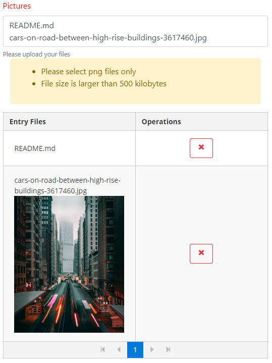
Results:
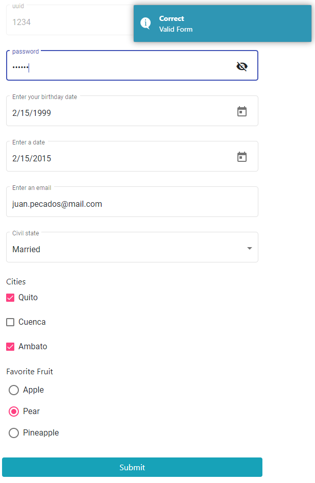
File
Multiple Files
Autocomplete
Parent component typescript code:
    articleField: AutoCompleteFieldInterface = {
        controlName: 'article',
        validators: [
          Validators.required
        ],
        label: 'Wikipedia article',
        placeholder: 'Example: DNA',
        type: {
          typeName: 'autoComplete',
          completeMethod: this.filterWikipediaArticleByTitle,
          showAttribute: 'title',
          componentReference: this,
        },
        errorMessages: {
          required: 'The article is mandatory',
        },
        hint: 'Search an article'
      };

    filterWikipediaArticleByTitle(event, contexto) {
        return contexto._wikipediaService.find(event.query ? event.query : event);
      }
About filter method
    The filter service methond must return an observable. If you need format the data from the API,
    you should use the `pipe` operator.
The find method code in wikipedia service:
    find(query: string): Observable<any> {
        const url = `${this.url}&srsearch=${query}`;
        return this._httpClient.get(url)
        .pipe(
          mergeMap(
            (response: any) => {
              if (response.query) {
                return of(response.query.search);
              }
              return of([]);
            }
          )
        );
      }
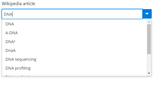
Results
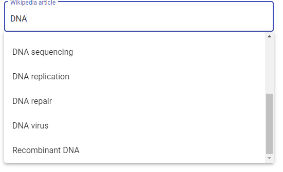
I put the PRIMENG autocomplete into bootstrap mode since the boostrap framework does not have an autocomplete component.
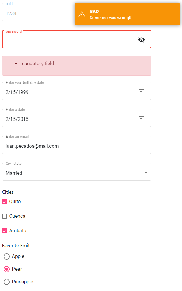
Toaster
This library makes use of angular2-toaster
- The toaster is the message which shows on screen when the form has been filled correctly or incorrectly.
- The display of this messages could be optional
We need to make use of the following Input : showToaster"
<ez-form
        [formConfig]="myConfiguration"
        [inputData]="userData"
        [showToaster]="false"
      > ...
Also we could config the messages that will show on the toaster:
    myToasterConfig = {
        success: {
          type: 'info',
          title: 'GOOD',
          body: 'All right!!'
        },
        fail: {
          type: 'warning',
          title: 'BAD',
          body: 'Someting was wrong!!'
        }
      };
Use the input : toasterConfig"
    <ez-form
            [formConfig]="myConfiguration"
            [inputData]="userData"
            [toasterConfig]="myToasterConfig"
          >...
Results:
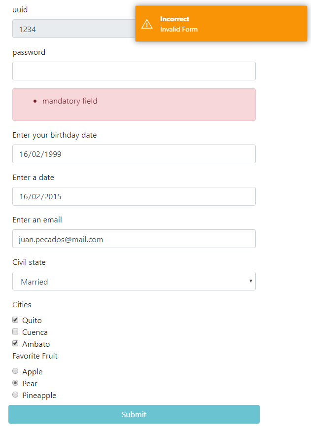
Bootstrap
By Deault the ez-form component loads its internal components from Angular Material.
- If you want make use of bootstrap components:
Use the Input : styleFramework"
    <ez-form
            [formConfig]="myConfiguration"
            [inputData]="userData"
            [styleFramework]="'material'"
          >..
Results
Animations
The error messages animations for every form field could be modify, so we need to make use of animate.css
.
Use the Input : msgErrorAnimation:
<ez-form
        [formConfig]="myConfiguration"
        [inputData]="userData"
        [msgErrorAnimation]="'fadeInLeft'"
      >
Complete example form component:
    <ez-form
            [formConfig]="myConfiguration"
            [inputData]="userData"
            (dataFromForm)="someFunction($event)"
            [styleFramework]="'material'"
            [msgErrorAnimation]="'fadeInLeft'"
            [toasterConfig]="myToasterConfig"
          >
            <button [disabled]="!userData" class="btn btn-block btn-info">Submit</button>
          </ez-form>
Summary
Component
| formConfig | Input | Form config object | YES |
| inputData | Input | Form default values object | OPTIONAL |
| dataFromForm | OutPut | Data returned from form | YES |
| styleFramework | Input | Form style | OPTIONAL |
| msgErrorAnimation | Input | Error message animation | OPTIONAL |
| toasterConfig | Input | Toaster message configuration object | OPTIONAL |
| showToaster | Input | Show Toaster message | OPTIONAL |
| fullWidth | Input | Full width of each form fields | OPTIONAL |
Control Object
| controlName | Form Control name | YES |
| placeholder | Describes the expected value of an input field | OPTIONAL |
| hint | Hint displayed in the input field before the user enters a value | OPTIONAL |
| label | Hint displayed in the input field before the user enters a value | OPTIONAL |
| type | Input type object: select, input, file, check.. | YES |
| validators | Array with angular form validators, it doesn't work with check type | OPTIONAL |
Type Attribute Object
| input | Input field for text and numbers |
| typename | type name: input, select, radio, check, textarea, date, file |
| class | Uniquely for input type. Defines the character type for example a password field |
| options | Uniquely for select, radio, check |
| minRequired | Uniquely for check. Defines how many checks fields are mandatory |
| maxLength | Uniquely for input, textarea and date. Defines how many characters are allowed |
| showFile | Uniquely for file. Default false. Show file or files preview. |
Example Full Code
If you are looking for a full example of this library please check the following github repository
Especial Thanks


