Cookie Consent

JavaScript utility library
- No dependencies
- Customizable cookie types (identifiers, optional/required, pre-checked)
- Conditional script tags, iframes and elements based on cookie consent and type
Developed with ❤️ by GRRR
Installation
$ npm install @grrr/cookie-consent
Custom element
This cookie-consent module is a custom element. This also means that the element is encapsulated in a shadow DOM. Here follows some information of how to implement this custom element in your own project.
Usage
Import the module and register it as a custom element:
import CookieConsent from "@grrr/cookie-consent";

if (window.customElements.get("cookie-consent") === undefined) {
    window.customElements.define("cookie-consent", cookieConsent);
}
Once registered, you can add the cookie-consent element to your HTML there's some optional data you can pass to the element but the only required attribute to pass along are the cookies:
const cookies = [
{
id: "functional",
label: functionalCookiesLabel,
description: functionalCookiesDescription,
required: true,
},
{
id: "marketing",
label: marketingCookiesLabel,
description: marketingCookiesDescription,
checked: marketingCookiesAccepted,
},
];
const stringifiedCookies = JSON.stringify(cookies);
<cookie-consent data-cookies="cookies" />;
Options
As mentioned before there is some optional data you can pass to the element:
- title
string
- description
string
- save button text
string
To use the options, add them as data attributes to the custom element:
<cookie-consent
data-title="Cookies & Privacy"
data-description="<p>This site makes use of third-party cookies.
Read more in our <a href='/privacy-policy'>privacy policy</a>.</p>"
data-saveButtonText="Save preferences"
data-cookies=cookies
/>
All options except cookies are optional. They will fall back to the defaults, which are listed here:
export const DEFAULTS = {
    prefix: "cookie-consent",
    append: true,
    appendDelay: 500,
    acceptAllButton: false,
    labels: {
        title: "Cookies & Privacy",
        description:
            '<p>This site makes use of third-party cookies. Read more in our <a href="/privacy-policy">privacy policy</a>.</p>',
        button: {
            default: "Save preferences",
            acceptAll: "Accept all",
        },
        aria: {
            button: "Confirm cookie settings",
            tabList: "List with cookie types",
            tabToggle: "Toggle cookie tab",
        },
    },
};
API
show()
Will show the dialog element, for example to show it when triggered to change settings.
button.addEventListener("click", (e) => {
    e.preventDefault();
    cookieConsent.show();
});
hide()
Will hide the dialog element.
button.addEventListener("click", (e) => {
    e.preventDefault();
    cookieConsent.hide();
});
getPreferences()
Will return an array with preferences per cookie type.
const preferences = cookieConsent.getPreferences();
updatePreference(cookies: array)
Update cookies programmatically.
By updating cookies programmatically, the event handler will receive an update method.
const cookies = [
    {
        id: "marketing",
        label: "Marketing",
        description: "...",
        required: false,
        checked: true,
    },
    {
        id: "simple",
        label: "Simple",
        description: "...",
        required: false,
        checked: false,
    },
];
on(event: string)
Add listeners for events. Will fire when the event is dispatched from the CookieConsent module.
See available events.
cookieConsent.on("event", eventHandler);
Events
Events are bound by the on method.
update
Will fire whenever the cookie settings are updated, or when the instance is constructed and stored preferences are found. It returns the array with cookie preferences, identical to the getPreferences() method.
This event can be used to fire tag triggers for each cookie type, for example via Google Tag Manager (GTM). In the following example trackers are loaded via a trigger added in GTM. Each cookie type has it's own trigger, based on the cookieType variable, and the trigger itself is invoked by the cookieConsent event.
Example:
cookieConsent.on("update", (cookies) => {
    const accepted = cookies.filter((cookie) => cookie.accepted);
    const dataLayer = window.dataLayer || [];
    accepted.forEach((cookie) =>
        dataLayer.push({
            event: "cookieConsent",
            cookieType: cookie.id,
        })
    );
});
Styling
No styling is being applied by the JavaScript module. However, there is a default stylesheet in the form of a Sass module which can easily be added and customized to your project and its needs.
You have to use the ::parts pseudo-element to style the dialog and its elements due to the Shadow DOM encapsulation. You can style the dialog and its elements by using the following parts:
cookie-consent::part(cookie-consent) {
}
cookie-consent::part(cookie-consent__header) {
}
cookie-consent::part(cookie-consent__title) {
}
cookie-consent::part(cookie-consent__tab-list) {
}
cookie-consent::part(cookie-consent__tab-list-item) {
}
cookie-consent::part(cookie-consent__tab) {
}
cookie-consent::part(cookie-consent__option) {
}
cookie-consent::part(cookie-consent__input) {
}
cookie-consent::part(cookie-consent__tab-toggle) {
}
cookie-consent::part(cookie-consent__tab-toggle-icon) {
}
cookie-consent::part(cookie-consent__tab-panel) {
}
cookie-consent::part(cookie-consent__tab-description) {
}
cookie-consent::part(cookie-consent__button) {
}
cookie-consent::part(cookie-consent__button-text) {
}
Stylesheet
View the base stylesheet.
Interface
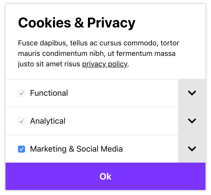
With the styling from the base module applied, the interface will look roughly like this (fonts, sizes and margins might differ):


