
Product
Announcing Precomputed Reachability Analysis in Socket
Socket’s precomputed reachability slashes false positives by flagging up to 80% of vulnerabilities as irrelevant, with no setup and instant results.
By Martin Torp - Jul 30, 2025
@hallysonh/ngx-popover
Advanced tools
Simple popover control for your angular7 applications using bootstrap4.
Based on ngx-popover.
Simple popover control for your angular7 applications using bootstrap4. Does not depend of jquery. If you don't want to use it without bootstrap - simply create proper css classes. Please star a project if you liked it, or create an issue if you have problems with it.
Access a demo here or download this project and execute: yarn && yarn start or npm install && npm run start to self server it.
Install npm module: npm install @hallysonh/ngx-popover --save
Import the module in your app module
import { NgxPopoverModule } from '@hallysonh/ngx-popover';

@NgModule({
  imports: [BrowserModule, NgxPopoverModule],
  declarations: [AppComponent],
  bootstrap: [AppComponent],
})
export class AppModule {}
After import NgxPopoverModule in your app, start using the component:
<div popover="content to be shown in the popover"
     popoverTitle="Popover header"
     popoverPlacement="top"
     [popoverOnHover]="false"
     [popoverCloseOnClickOutside]="true"
     [popoverCloseOnMouseOutside]="false"
     [popoverDisabled]="false"
     [popoverAnimation]="true"
     [popoverDismissTimeout]="1000">
    element on which this popover is applied.
</div>
Example of usage with dynamic html content:
<ng-template #myPopoverContent>
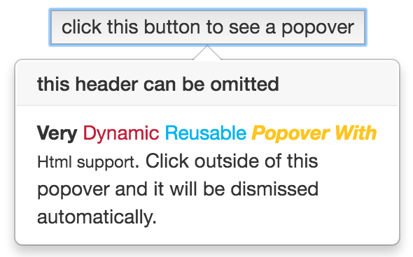
<b>Very </b><span style="color: #C21F39">Dynamic </span><span style="color: #00b3ee">Reusable </span>
<b><i><span style="color: #ffc520">Popover With </span></i></b><small>Html support </small>.
</ng-template>
<button [popover]="myPopoverContent"
popoverTitle="Popover title"
popoverPlacement="left"
[popoverAnimation]="true"
[popoverCloseOnClickOutside]="true">
element on which this popover is applied.
</button>
popover="string" The message or template to be shown in the popover.popoverTitle="string" Popover title text.popoverPlacement="top|bottom|left|right|auto|auto top|auto bottom|auto left|auto right" Indicates where the popover should be placed. When using "auto" modifier, will show in opposite direction if not enough room. Default is "bottom".[popoverDisabled]="true|false" Indicates if popover should be disabled. If popover is disabled then it will not be shown. Default is false[popoverAnimation]="true|false" Indicates if all popover should be shown with animation or not. Default is true.[popoverOnHover]="true|false" If set to true then popover will open on mouse over instead of mouse click. Default is false.[popoverCloseOnMouseOutside]="true|false" Indicates if popover should be closed when user mouse outside of it. Default is false.[popoverCloseOnClickOutside]="true|false" Indicates if popover should be closed when user click outside of it. Default is false.[popoverDismissTimeout]="number" Used to automatically dismiss popover after given amount of time. Default is 0, means disabled.import { NgModule, Component } from '@angular/core';
import { BrowserModule } from '@angular/platform-browser';
import { NgxPopoverModule } from '@hallysonh/ngx-popover';
@Component({
selector: 'app',
template: `
<div class="container">
<!-- regular popover -->
<p>
Message <span popover="Hello fact!" popoverTitle="Fact #1"><b>click this fact</b></span>
</p>
<!-- popover with dynamic html content -->
<br /><br />
<div>
<ng-template #myPopoverContent let-popover="popover">
<b>Very </b><span style="color: #C21F39">Dynamic </span><span style="color: #00b3ee">Reusable </span>
<b><i><span style="color: #ffc520">Popover With </span></i></b><small>Html support </small>.
Click outside of this popover and it will be dismissed automatically.
<button (click)="popover.hide()">click here to close it</button>.
</ng-template>
<button [popover]="myPopoverContent" popoverTitle="this header can be omitted" popoverPlacement="right" [popoverCloseOnClickOutside]="true">click
this button to see a popover</button>
</div>
<!-- popover show on hover -->
<br />
<div>
<button popover="Hello popover" [popoverOnHover]="true">hover this button to see a popover</button>
</div>
</div>
`,
})
export class App {}
@NgModule({
imports: [BrowserModule, NgxPopoverModule],
declarations: [AppComponent],
bootstrap: [AppComponent],
})
export class AppModule {}
Take a look on samples app in ./app for more examples of usages.
FAQs
Simple popover control for your angular7 applications using bootstrap4.
We found that @hallysonh/ngx-popover demonstrated a not healthy version release cadence and project activity because the last version was released a year ago. It has 1 open source maintainer collaborating on the project.
Did you know?

Socket for GitHub automatically highlights issues in each pull request and monitors the health of all your open source dependencies. Discover the contents of your packages and block harmful activity before you install or update your dependencies.
Product
Socket’s precomputed reachability slashes false positives by flagging up to 80% of vulnerabilities as irrelevant, with no setup and instant results.

Product
Socket is launching experimental protection for Chrome extensions, scanning for malware and risky permissions to prevent silent supply chain attacks.

Product
Add secure dependency scanning to Claude Desktop with Socket MCP, a one-click extension that keeps your coding conversations safe from malicious packages.