notistack
Notistack is an extention to Material-ui Snackbar that manages snackbars so they can be displayed and stacked on top of one another.
It's highly customizable and you can customize it the same way you do for Mui-Snackbars.
Getting Started
Use your prefered package manager:
npm install notistack
yarn add notistack
Usage
1: Wrap your app inside a SnackbarProvider component: (see docs for a full list of available props)
import { SnackbarProvider } from 'notistack';

<SnackbarProvider maxSnack={3}>
    <App />
</SnackbarProvider>
2: Export any component that needs to send notification using withSnackbar. By doing this, you'll have access to the method onPresentSnackbar in your props which can be used to send snackbars.
import { withSnackbar } from 'notistack';
class MyComponent extends Component {
handleNetworkRequest = () => {
const { onPresentSnackbar } = this.props;
fetchSomeData()
.then(() => onPresentSnackbar('success', 'Successfully fetched the data.'))
.catch(() => onPresentSnackbar('error', 'Failed fetching data.'));
};
render(){
};
};
export default withSnackbar(MyCompnent);
Demo
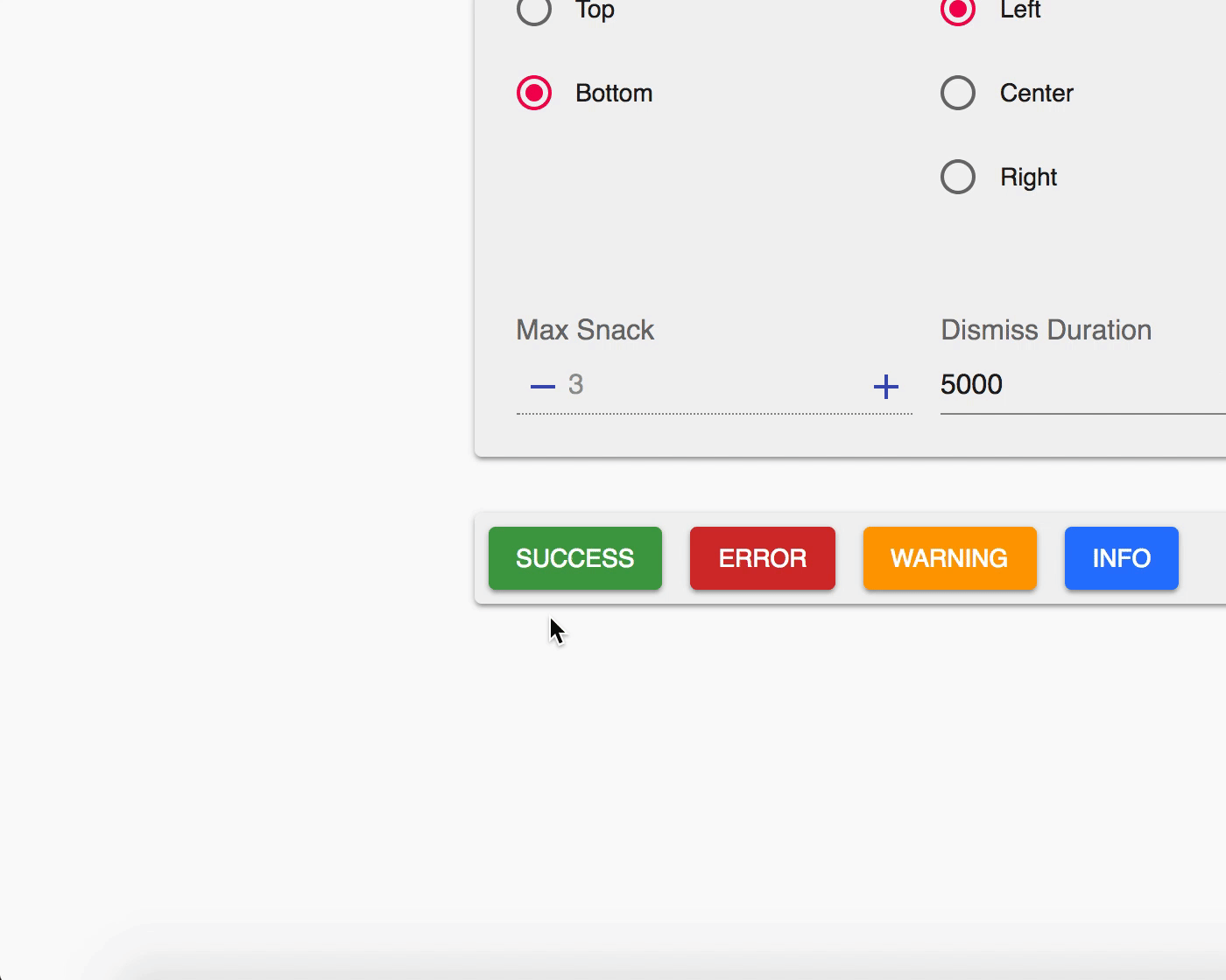
You can see the online demo and experiment all the possible configurations here.
Or see the code for a minimal working example: codesandbox

Docs
SnackbarProvider:
Besides maxSnack and iconVariant, any other prop gets passed down to a Snackbar component. See Material-ui Snackbar docs for more info.
maxSnack type: number required: true default=3
iconVariant type: any required: false default=Material design icons
transitionDuration={{ exit: 380, enter: 400 }}
withSnackbar:
When you export your component using withSnackbar you'll have access to onPresentSnackbar in your props that basically adds a snackbar to the queue to be displayed to the user. It takes two arguments variant and message.
variant type:string oneOf(['error', 'success', 'warning', 'info'])
message type:string
Future
Contribution
Open an issue and your problem will be solved.
Notes
Material Design guidelines suggests that only one snackbar should be displayed at a time. But I liked to stack them. 😂 So I made notistack.
Author - Contact
Hossein Dehnokhalaji


