Research
/Security News
DuckDB npm Account Compromised in Continuing Supply Chain Attack
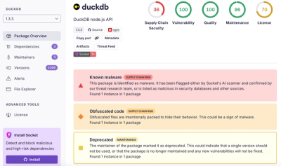
Ongoing npm supply chain attack spreads to DuckDB: multiple packages compromised with the same wallet-drainer malware.
@hint/hint-meta-viewport
Advanced tools
meta-viewport)meta-viewport warns against not having a single viewport meta
tag in the <head> with the proper value.
The viewport meta tag is an essential part of responsive web design, that may also offer some performance improvements.
Mobile browsers render pages in a virtual "window" (the viewport), usually wider than the screen, so they don’t need to squeeze every page layout into a tiny window (which would break many non-mobile-optimized sites). Users can pan and zoom to see different areas of the page.
Mobile Safari introduced the "viewport meta tag" to let web developers control the viewport’s size and scale. Many other mobile browsers now support this tag.
In recent years, screen resolutions have risen to the size that individual pixels are hard to distinguish with the human eye. For example, recent smartphones generally have a 5-inch screens with resolutions upwards of 1920—1080 pixels (~400 dpi). Because of this, many browsers can display their pages in a smaller physical size by translating multiple hardware pixels for each CSS "pixel". Initially this caused usability and readability problems on many touch-optimized web sites.
Using the viewport meta tag to control layout on mobile devices (MDN)
The viewport related topic is very complex so if you want to dig deeper, read Peter-Paul Koch’s "A tale of two viewports" part one and part two, or watch his talk 'The Mobile Viewports'.
NOTE: If your website is not responsive, then this meta tag might not be needed.
Ideally the following meta viewport tag should be used:
<meta name="viewport" content="width=device-width, initial-scale=1">
Or, if most of your users don’t use Safari for iOS < 9:
<meta name="viewport" content="width=device-width">
Notes:
It is recommended to use:
width=device-width
device-width will make the page match the screen’s width in
device-independent pixels, allowing its content to reflow to
match different screen sizes.
Setting the width property to a specific size (e.g.: width=320)
is not recommended.
Having width=device-width also constitutes a performance
improvement, as under most circumstances, it enables fast tapping,
removing the 300-350 ms tap delay on Safari for iOS 10+ and other mobile browsers.
initial-scale=1
This is mostly needed to work around the orientation change bug from Safari for iOS < 9.
Using values different then 1 (or 1.0) are
problematic.
user-scalable, maximum-scale, and minimum-scale properties
should not be used.
These properties can block the user from zooming on a page. With such a wide range of devices available with different display dimensions, screen resolutions, pixel densities, etc., it is difficult to choose an appropriate text size in a design. Most of the time using these properties enable users to pick a text size that is unreadable while preventing them from zooming, frustrating them, or making the web site/app inaccessible in some cases.
Considering the issues described, these properties are now ignored by some mobile browsers such as Safari for iOS 10+.
The hint checks if the viewport meta tag was specified a single
time in the <head>, and if:
width property is provided and its value is device-widthinitial-scale property is provided (note: depends on the
configurations) and its value is
1 or 1.0user-scalable, maximum-scale, or minimum-scale are usedx=y) or invalid values
(width=x)The viewport meta tag is not specified in <head>:
<!doctype html>
<html lang="en">
    <head>
        <meta charset="utf-8">
        <title>example</title>
        ...
    </head>
    <body>
        <meta name="viewport" content="width=device-width, initial-scale=1">
    </body>
</html>
The viewport meta tag contains an unknown property:
<meta name="viewport" content="unknown-property=1, width=device-width, initial-scale=1">
The viewport meta tag contains an invalid value:
<meta name="viewport" content="width=invalid-value, initial-scale=1">
The viewport meta tag contains a disallowed property (user-scalable):
<meta name="viewport" content="width=device-width, initial-scale=1, user-scalable=no">
The viewport meta tag contains a fixed width value:
<meta name="viewport" content="width=320, initial-scale=1">
The viewport meta tag contains initial-scale with a value
different than 1 or 1.0:
<meta name="viewport" content="width=device-width, initial-scale=5">
There are multiple viewport meta tags:
<!doctype html>
<html lang="en">
    <head>
        <meta charset="utf-8">
        <title>example</title>
        <meta name="viewport" content="width=device-width, initial-scale=1">
        ...
        <meta name="viewport" content="width=device-width">
        ...
    </head>
    <body>...</body>
</html>
If versions of Safari for iOS < 9 are targeted:
<!doctype html>
<html lang="en">
    <head>
        <meta charset="utf-8">
        <title>example</title>
        <meta name="viewport" content="width=device-width, initial-scale=1">
        ...
    </head>
    <body>...</body>
</html>
<!doctype html>
<html lang="en">
    <head>
        <meta charset="utf-8">
        <title>example</title>
        <meta name="viewport" content="width=device-width, initial-scale=1.0, shrink-to-fit=no, viewport-fit=cover">
        ...
    </head>
    <body>...</body>
</html>
If versions of Safari for iOS 9+ are targeted:
<!doctype html>
<html lang="en">
    <head>
        <meta charset="utf-8">
        <title>example</title>
        <meta name="viewport" content="width=device-width">
        ...
    </head>
    <body>...</body>
</html>
This hint takes into consideration the targeted
browsers, and if no
versions of Safari for iOS < 9 are included, it will not
require initial-scale=1.
This package is installed automatically by webhint:
npm install hint --save-dev
To use it, activate it via the .hintrc configuration file:
{
    "connector": {...},
    "formatters": [...],
    "hints": {
        "meta-viewport": "error",
        ...
    },
    "parsers": [...],
    ...
}
Note: The recommended way of running webhint is as a devDependency of
your project.
FAQs
hint for best practices related to the meta viewport
We found that @hint/hint-meta-viewport demonstrated a not healthy version release cadence and project activity because the last version was released a year ago. It has 5 open source maintainers collaborating on the project.
Did you know?

Socket for GitHub automatically highlights issues in each pull request and monitors the health of all your open source dependencies. Discover the contents of your packages and block harmful activity before you install or update your dependencies.

Research
/Security News
Ongoing npm supply chain attack spreads to DuckDB: multiple packages compromised with the same wallet-drainer malware.

Security News
The MCP Steering Committee has launched the official MCP Registry in preview, a central hub for discovering and publishing MCP servers.

Product
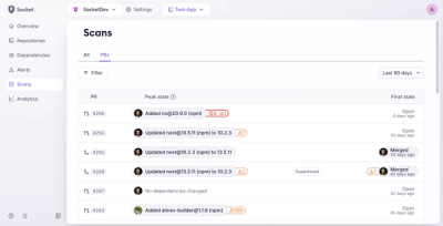
Socket’s new Pull Request Stories give security teams clear visibility into dependency risks and outcomes across scanned pull requests.