Iconify for Ember
Iconify for Ember is not yet another icon component! There are many of them already.
What you get with other components:
- Limited set of icons.
- Large bundle size because all icons are bundled.
Iconify icon component is nothing like that. Component does not include any icon data, it is not tied to any specific icon set. Instead, all data is retrieved from public API on demand.
That means:
- One syntax for over 100,000 icons from 100+ icon sets.
- Renders SVG. Many components simply render icon fonts, which look ugly. Iconify renders pixel perfect SVG.
- Loads icons on demand. No need to bundle icons, component will automatically load icon data for icons that you use from Iconify API.
For more information about Iconify project visit https://iconify.design/.
For extended documentation visit Iconify for Ember documentation.
Installation
If you are using NPM:
npm install --save-dev @iconify/ember
If you are using Yarn:
yarn add --dev @iconify/ember
Usage with API
Install @iconify/ember then use IconifyIcon component in template with icon name or data as "icon" parameter:
<IconifyIcon @icon='mdi-light:home' />
Component will automatically retrieve data for "mdi-light:home" from Iconify API and render it. There are over 100,000 icons available on Iconify API from various free and open source icon sets, including all the most popular icon sets.
Offline Usage
Retrieving icon data from Iconify API requires visitor to be online. What if you want to use component offline or on local network?
If you want to use icon component without relying on public Iconify API, there are several options:
- You can import icon data from Iconify Icons packages.
- You can create custom icon bundles (more efficient, but requires more coding).
- You can host your own Iconify API instead of relying on third party service.
See Iconify for Ember offline use documentation or Iconify API documentation.
Icon Names
Icon name is a string. Few examples:
@api-provider:icon-set-prefix:icon-namemdi-light:home (in this example API provider is empty, so it is skipped)
It has 3 parts, separated by ":":
- provider points to API source. Starts with "@", can be empty (empty value is used for public Iconify API).
- prefix is name of icon set.
- name is name of icon.
See Iconify for Ember icon names documentation for more detailed explanation.
Using icon data
Instead of icon name, you can pass icon data to component:
<IconifyIcon @icon={{chartIcon}} @height='24' />
import areaChartOutlined from '@iconify-icons/ant-design/area-chart-outlined';
export default class IconDemoComponent extends Component {
chartIcon = areaChartOutlined;
}
See icon packages documentation for more details.
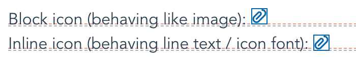
Inline
Icons have 2 modes: inline and block. Difference between modes is vertical-align that is added to inline icons.
Inline icons are aligned slightly below baseline, so they look centred compared to text, like glyph fonts.
Block icons do not have alignment, like images, which aligns them to baseline by default.
Alignment option was added to make icons look like continuation of text, behaving like glyph fonts. This should make migration from glyph fonts easier.
To toggle between block and inline modes, you can use boolean inline property:
<div>
	<p>
		Block:
		<IconifyIcon @icon='line-md:image-twotone' />
		<IconifyIcon @icon='mdi:account-box-outline' />
	</p>
	<p>
		Inline:
		<IconifyIcon @icon='line-md:image-twotone' @inline={{true}} />
		<IconifyIcon @icon='mdi:account-box-outline' @inline={{true}} />
	</p>
</div>
Visual example to show the difference between inline and block modes:
Icon component properties
icon property is mandatory. It tells component what icon to render. If the property value is invalid, the component will render an empty icon. The value can be a string containing the icon name (icon must be registered before use by calling addIcon or addCollection, see instructions above) or an object containing the icon data.
Make sure you add @ before all property names because those are component properties, not element properties.
The icon component has the following optional properties:
inline. Changes icon behaviour to match icon fonts. See "Inline icon" section below.width and height. Icon dimensions. The default values are "1em" for both. See "Dimensions" section below.color. Icon colour. This is the same as setting colour in style. See "Icon colour" section below.flip, hFlip, vFlip. Flip icon horizontally and/or vertically. See "Transformations" section below.rotate. Rotate icon by 90, 180 or 270 degrees. See "Transformations" section below.align, vAlign, hAlign, slice. Icon alignment. See "Alignment" section below.onLoad. Callback function that is called when icon data has been loaded. See "onLoad" section below.
Other properties and events
You can pass any other properties as element properties (without @ before name), they will be passed to SVG element.
Dimensions
By default, icon height is "1em". With is dynamic, calculated using the icon's width to height ratio.
There are several ways to change icon dimensions:
- Setting
font-size in style.
- Setting
width and/or height property.
Values for width and height can be numbers or strings.
If you set only one dimension, another dimension will be calculated using the icon's width to height ratio. For example, if the icon size is 16 x 24, you set the height to 48, the width will be set to 32. Calculations work not only with numbers, but also with string values.
Dimensions as numbers
You can use numbers for width and height.
<IconifyIcon @icon='mdi-light:home' @height={{24}} />
<IconifyIcon @icon='mdi-light:home' @width={{16}} @height={{16}} />
Number values are treated as pixels. That means in examples above, values are identical to "24px" and "16px".
Dimensions as strings without units
If you use strings without units, they are treated the same as numbers in an example above.
<IconifyIcon @icon='mdi-light:home' @height='24' />
<IconifyIcon @icon='mdi-light:home' @width='16' @height='16' />
Dimensions as strings with units
You can use units in width and height values:
<IconifyIcon @icon='mdi-light:home' @height='2em' />
Be careful when using calc, view port based units or percentages. In SVG element they might not behave the way you expect them to behave and when using such units, you should consider settings both width and height.
Dimensions as 'auto'
Keyword "auto" sets dimensions to the icon's viewBox dimensions. For example, for 24 x 24 icon using @height="auto" sets height to 24 pixels.
<IconifyIcon @icon='mdi-light:home' @height='auto' />
Icon colour
There are two types of icons: icons that do not have a palette and icons that do have a palette.
Icons that do have a palette, such as emojis, cannot be customised. Setting colour to such icons will not change anything.
Icons that do not have a palette can be customised. By default, colour is set to "currentColor", which means the icon's colour matches text colour. To change the colour you can:
- Set
color style or use stylesheet to target icon. If you are using the stylesheet, target svg element.
- Add
color property.
Examples:
Using color property:
<IconifyIcon @icon='eva:alert-triangle-fill' @color='red' />
<IconifyIcon @icon='eva:alert-triangle-fill' @color='#f00' />
Using inline style:
<IconifyIcon @icon='eva:alert-triangle-fill' style='color: red;' />
Using stylesheet:
<IconifyIcon @icon='eva:alert-triangle-fill' class='red-icon' />
.red-icon {
	color: red;
}
Transformations
You can rotate and flip the icon.
This might seem redundant because icon can also be rotated and flipped using CSS transformations. So why do transformation properties exist? Because it is a different type of transformation.
- CSS transformations transform the entire icon.
- Icon transformations transform the contents of the icon.
If you have a square icon, this makes no difference. However, if you have an icon that has different width and height values, it makes a huge difference.
Rotating 16x24 icon by 90 degrees results in:
- CSS transformation keeps 16x24 bounding box, which might cause the icon to overlap text around it.
- Icon transformation changes bounding box to 24x16, rotating content inside an icon.
See icon transformations documentation for more details.
Flipping an icon
There are several properties available to flip an icon:
hFlip: boolean property, flips icon horizontally.vFlip: boolean property, flips icon vertically.flip: shorthand string property, can flip icon horizontally and/or vertically.
Examples:
Flip an icon horizontally:
<IconifyIcon @icon='eva:alert-triangle-fill' @hFlip={{true}} />
<IconifyIcon @icon='eva:alert-triangle-fill' @flip='horizontal' />
Flip an icon vertically:
<IconifyIcon @icon='eva:alert-triangle-fill' @vFlip={{true}} />
<IconifyIcon @icon='eva:alert-triangle-fill' @flip='vertical' />
Flip an icon horizontally and vertically (the same as 180 degrees rotation):
<IconifyIcon @icon='eva:alert-triangle-fill' @hFlip={{true}} @vFlip={{true}} />
<IconifyIcon @icon='eva:alert-triangle-fill' @flip='horizontal,vertical' />
Rotating an icon
An icon can be rotated by 90, 180 and 270 degrees. Only contents of the icon are rotated.
To rotate an icon, use rotate property. Value can be a string (degrees or percentages) or a number.
Number values are 1 for 90 degrees, 2 for 180 degrees, 3 for 270 degrees.
Examples of 90 degrees rotation:
<IconifyIcon @icon='eva:alert-triangle-fill' @rotate={{1}} />
<IconifyIcon @icon='eva:alert-triangle-fill' @rotate='90deg' />
<IconifyIcon @icon='eva:alert-triangle-fill' @rotate='25%' />
onLoad
onLoad property is an optional callback function. It is called when icon data has been loaded.
It is not an event, such as onClick event for links, it is a simple callback function.
When onLoad is called:
- If value of icon property is an object,
onLoad is not called.
- If value of icon property is a string and icon data is available,
onLoad is called on first render.
- If value of icon property is a string and icon data is not available,
onLoad is called on first re-render after icon data is retrieved from API.
What is the purpose of onLoad? To let you know when Icon component renders an icon and when it does not render anything. This allows you to do things like adding class name for parent element, such as "container--with-icon" that modify layout if icon is being displayed.
Full documentation
For extended documentation visit Iconify for Ember documentation.
License
Ember component is released with MIT license.
© 2021 - 2022 Vjacheslav Trushkin / Iconify OÜ
See Iconify icon sets page for list of collections and their licenses.


