

Research
Two Malicious Rust Crates Impersonate Popular Logger to Steal Wallet Keys
Socket uncovers malicious Rust crates impersonating fast_log to steal Solana and Ethereum wallet keys from source code.
By Kirill Boychenko - Sep 24, 2025
@inb/oeb-widgets-graphs
Advanced tools
![]()


The package is build with Lint Elements components and javascript modules.
It has some dependencies associated for the functionalities:
Download the package and install dependencies:
npm install
Serve with hot reload at localhost:
npm run dev
Build package for production:
npm run build
npm i @inb/oeb-widgets-graphs
or
import '/dist/oeb-widgets-graphs.es.js';
or
<script type="module" src="https://cdn.jsdelivr.net/gh/inab/oeb-widgets-graphs@main/dist/oeb-widgets-graphs.umd.js" />
Then just declare the element with the variables that contain the data to be able to build the corresponding graph.
<widget-element
  :data=graphData
  :type=graphType>
</widget-element>
Bar plot shows the results of a benchmarking challenge that uses one single evaluation metric in the form of a Barplot. Challenge participants are shown in the X axis, while the value of their metric is shown in the Y axis. Bar plot live demo
) #### Bar plot classification
The results of this plot format can be transformed into a tabular format by sorting the participants in descending/ascending order according to their metrics and applying a quartile classification over that linear set of values. This classification splits the participants into four different groups/clusters depending on their performance. Clusters are separated in the plot with vertical lines and shown in the right table together with a green color-scale, which is easier to interpret for both experts and non-expert users.

#### Bar plot classification
The results of this plot format can be transformed into a tabular format by sorting the participants in descending/ascending order according to their metrics and applying a quartile classification over that linear set of values. This classification splits the participants into four different groups/clusters depending on their performance. Clusters are separated in the plot with vertical lines and shown in the right table together with a green color-scale, which is easier to interpret for both experts and non-expert users.

You can see an example of a structure to display bar graphs within the "demo" section of the application. Bar plot structure example
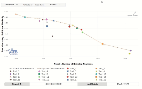
Scatter plot displays the results of scientific benchmarking experiments in graph format, and apply various classification methods to transform them to tabular format. Scatter plot live demo


You can see an example of a structure to display bar graphs within the "demo" section of the application. Scatter plot structure example
Box plot shiw the results of a benchmarking challenge that uses a graphical representation of the distribution of a dataset on a seven-number summary of datapoints. The challenge metrics is represented in Y axis by default. Box plot live demo

The result of the plot can be ordened by maximum or minimum median value.

You can see an example of a structure to display bar graphs within the "demo" section of the application. Box plot structure example
A radar chart is an informative visual tool in which multiple variables (three or more) are compared on a two-dimensional plane. To do this, we will create different axes that come from a common central point. In most cases, all axes are evenly distributed and drawn evenly relative to each other. Radar plot live demo

You can see an example of a structure to display bar graphs within the "demo" section of the application. Radar plot structure example.
A line plot is an effective visual tool used to display trends and relationships between numerical variables over a continuous range. It consists of data points connected by a line, typically plotted on a two-dimensional plane with one variable on the x-axis and another on the y-axis. Line plots are particularly useful for illustrating patterns over time, comparing multiple datasets, or highlighting fluctuations and trends within the data. Line plot live demo
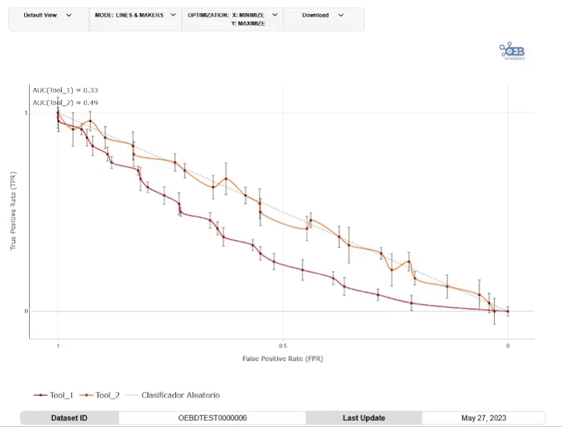
You can see an example of a structure to display bar graphs within the "demo" section of the application. Line plot structure example.
FAQs
Unknown package
We found that @inb/oeb-widgets-graphs demonstrated a healthy version release cadence and project activity because the last version was released less than a year ago. It has 7 open source maintainers collaborating on the project.
Did you know?

Socket for GitHub automatically highlights issues in each pull request and monitors the health of all your open source dependencies. Discover the contents of your packages and block harmful activity before you install or update your dependencies.
Research
Socket uncovers malicious Rust crates impersonating fast_log to steal Solana and Ethereum wallet keys from source code.

Research
A malicious package uses a QR code as steganography in an innovative technique.

Research
/Security News
Socket identified 80 fake candidates targeting engineering roles, including suspected North Korean operators, exposing the new reality of hiring as a security function.