Product
Announcing Bun and vlt Support in Socket
Bringing supply chain security to the next generation of JavaScript package managers
@instructure/ui-icons
Advanced tools
npm install @instructure/ui-icons
To use the React components:
---
type: code
---
import { IconAddLine } from '@instructure/ui-icons'

const MyComponent = () => {
  return <IconAdd />
}
Use dashes in the name of the .svg files (e.g calendar-month).
Use the same name for the "line" and "solid" variants, and save them in the respective folder, e.g. Solid/calendar-month and Line/calendar-month.
Copy the new icon files in the /svg/Solid and /svg/Line directories.
Double-check that the SVG size is 1920x1920.
---
type: code
---

<svg
  width="1920"
  height="1920"
  viewBox="0 0 1920 1920"
  fill="none"
  xmlns="http://www.w3.org/2000/svg"
>
  {...}
</svg>
---
type: code
---

// Before:
<svg
  width="1920"
  height="1920"
  viewBox="0 0 1920 1920"
  fill="none"
  xmlns="http://www.w3.org/2000/svg"
>
  <g clip-path="url(#clip0_1007_24)">
    <path d="..." fill="#2D3B45" />
  </g>
  <defs>
    <clipPath id="clip0_1007_24">
      <rect width="1920" height="1920" fill="white" />
    </clipPath>
  </defs>
</svg>

// After:
<svg
  width="1920"
  height="1920"
  viewBox="0 0 1920 1920"
  fill="none"
  xmlns="http://www.w3.org/2000/svg"
>
  <path d="..." fill="#2D3B45" />
</svg>
If the icon has to bidirectional (being mirrored in RTL mode, typically arrow icons), add the icon name to the bidirectional list in packages/ui-icons/icons.config.js. Deprecated icons are handled here as well.
Run npm run export:icons from the repository root directory to generate the icons. This script will also take care of further optimizations on the SVG files (e.g. removing the fills). The configs for this are located in packages/ui-icons-build/lib/tasks/optimize-svgs/index.js and packages/ui-icons/svgo.config.js.
Run npm install && npm run bootstrap.
Finally, run npm run dev from the repository root directory to start the local server and check the generated output.
Verify icons display correctly by checking under iconography in the main nav. Check all 3 versions (React, SVG and icon font).
(Note: The fonts are sometimes not rendered correctly, but we decided not to fix them, because they are not really used anywhere, and we might stop supporting icon fonts in the future in general.)
Draw your icons on the 1920 x 1920 art-boards.
Before you flatten shapes or vectorize strokes as described below, make a hidden copy of the original paths off to the side so that you can more easily come back and make changes later.
Flatten your shapes.
Export strokes to vector.
Don’t use borders on vectors, especially not inside/outside borders which aren’t supported in SVG. Do not use clipping paths.
Make sure none of the paths go outside of the art-board. If so, the glyph in the icon font will be misaligned. Draw inside the lines.
Fill the space edge-to-edge as much as possible. The build process will add margins as needed.
FAQs
Icon set for Instructure, Inc. products
The npm package @instructure/ui-icons receives a total of 27,492 weekly downloads. As such, @instructure/ui-icons popularity was classified as popular.
We found that @instructure/ui-icons demonstrated a healthy version release cadence and project activity because the last version was released less than a year ago. It has 41 open source maintainers collaborating on the project.
Did you know?

Socket for GitHub automatically highlights issues in each pull request and monitors the health of all your open source dependencies. Discover the contents of your packages and block harmful activity before you install or update your dependencies.

Product
Bringing supply chain security to the next generation of JavaScript package managers

Product
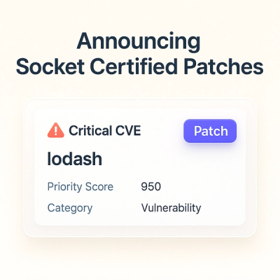
A safer, faster way to eliminate vulnerabilities without updating dependencies

Product
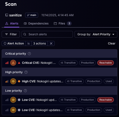
Reachability analysis for Ruby is now in beta, helping teams identify which vulnerabilities are truly exploitable in their applications.