RFM
An open-source React package for easy integration of a file manager into applications. It provides a user-friendly interface for managing files and folders, including viewing, uploading, and deleting, with full UI and backend integration.
And our source code project is here (forked from).
Since version 1.2 this package is no more just a file manager. It has been refactored to convert it into a very flexible object manager. This means that:
- RFM manages a hierarchy of objects, wherever they be files or any other thing with properties.
- Each object has its own properties and its own behaviour.
- In addition, each one of them can have spscific icons and actions.
- Full react file managar has been refactored adding new capabilities to extend:
- Top menu item actions
- Top menu file manager global actions
- Selection handlers (selet one, select all, inivert selection...)
- Status bar
- And lots of configurable items (show/hide brefreshm show/hide breadcrumb, backdrop on navigation actions...)
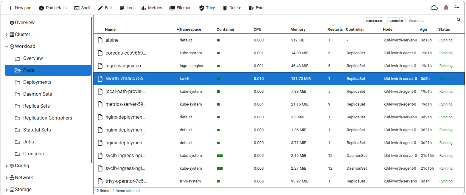
With RFM we have built a full Kubernetes manager (similar to Lens, HeadLamp or K9s), by using RFM as the base application object manager, like we show here:
(You can take a look on our source project here, 'src' folder contains the React app)
✨ Features
- File & Folder Management: View, upload, download, delete, copy, move, create, and rename files
or folders seamlessly.
- Grid & List View: Switch between grid and list views to browse files in your preferred layout.
- Search: the navigation pane includes a search feature for filtering files on current
directory.
- Filters: you can add category filter to your file lists.
- Status bar: RFM has an optional status bar where info about current folder and current selection items is shown.
- View options: The file manager includes view options like classical desktop file managers.
- Navigation: Use the breadcrumb trail and sidebar navigation pane for quick directory
traversal.
- Spaces: Yo can add your own 'data spaces', so not only file data can be shown. You can convert your
RFM into a full object manager with items having its own properties and actions.
- Toolbar & Context Menu: Access all common actions (upload, download, delete, copy, move,
rename, etc.) via the toolbar or right-click for the same options in the context menu.
- Context cutomization: Add your specific icons and actions for your unique object types. They
will be shown when needed and added to context menus.
- Multi-Selection: Select multiple files and folders at once to perform bulk actions like
delete, copy, move, or download.
- Keyboard Shortcuts: Quickly perform file operations like copy, paste, delete, and more using
intuitive keyboard shortcuts.
- Drag-and-Drop: Move selected files and folders by dragging them to the desired directory,
making file organization effortless.
🚀 Installation
To install RFM, use the following command:
npm i @jfvilas/react-file-manager
💻 Usage
Here’s a basic example of how to use our RFM component in your React application (using default options means that objects are exactly a hierarchy of files and folders):
import { useState } from "react";
import { FileManager } from "@jfvilas/react-file-manager";
import "@jfvilas/react-file-manager/dist/style.css";
function App() {
const [files, setFiles] = useState([
{
name: "Documents",
isDirectory: true,
path: "/Documents",
updatedAt: "2024-09-09T10:30:00Z",
},
{
name: "Pictures",
isDirectory: true,
path: "/Pictures",
updatedAt: "2024-09-09T11:00:00Z",
},
{
name: "Pic.png",
isDirectory: false,
path: "/Pictures/Pic.png",
updatedAt: "2024-09-08T16:45:00Z",
size: 2048,
class: 'image'
},
])
return (
<>
<FileManager files={files} />
</>
)
}
export default App;
Typescript Usage
If you plan to user react-file-manager in a Typescript project, you can add type management by adding a .d.ts file. What follows is a sample file,
but you can download a full module declaration file here. Inside that file you will find a module declaration and a bunch of type and interface declarations. What follows is just a excerpt.
declare module '@jfvilas/react-file-manager' {
    export interface IFileObject {
        name: string;
        displayName?: string;
        isDirectory: boolean;
        path: string;
        layout?: string;
        class?: string;
        children?: string|function;
        data?: any;
        categories?: string[];
        features?: string[];
    }

    export interface IError {
        type: string,
        message: string,
        response: {
            status: number,
            statusText: string,
            data: any,
        }
    }
...
In order to use this 'types' declaration file, just download and add it to your project inside your source folder (or any other folder and change your package.json accordingly).
📂 File Structure
The files prop accepts an array of objects, where each object represents an object (oa file or other thing) or a folder (a group oof objects). You can
customize the structure to meet your application needs. Each object or group follows the
structure detailed below:
interface IFileObject {
  name: string;
  displayName?: string;
  isDirectory: boolean;
  path: string;
  layout?: string;
  class?: string;
  children?: string|function;
  data?: any;
  categories?: string[];
  features?: string[];
}
Watchout the 'data' property, where all the magic takes place, since it is where specific properties for objects can be defined. This is what takes a file manager into an object manager
🎬 Icons & Actions
By adding your own icons and specific actions for your items, you can think of react-file-manager as just a hierarchical object manager,
that is, this package is no longer just a file manager, you can, for example, create a hierarchy of books and implement particular actions.
For example...:
- You can have a top level category that consists of types of books: novel, essay, history...
- On a second level you can add the topic: science-fiction, love, thriller...
- On a third level you can just store the book title and metadata.
You can also add specific icons for each object (category, topic, book).
Moreover, you can add specific actions for each type of object:
- For the top level, a sample action could be to show the list of books that belong to that category.
- For the third level, the book in itself, you could add some actions like: read, view details, share link...
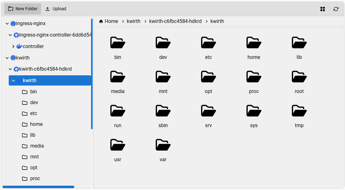
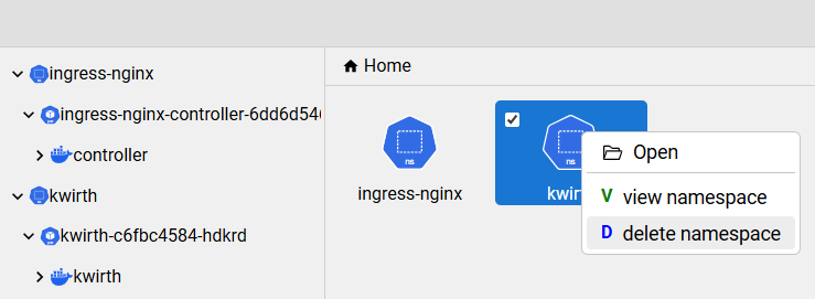
You can build interfaces like this (this one has been built for a kubernetes file navigator):
For achieving these objectives you need to add to each entry in the files object an optional property called class. So, for the top level,
the class property could be category. For the second level, the value of class could be something like topic,
and for the third level it could be something like book.
The next step is to add the icons for these objects. You must create a Map like this one:
  let icons = new Map();
  icons.set('category', { open: <JSX.Element />, closed: <JSX.Element />, list: <JSX.Element />, grid: <JSX.Element /> })
  icons.set('topic', { default: <JSX.Element /> })
  icons.set('book', { open: <JSX.Element />, closed: <JSX.Element /> })
This way, when rendering an object with the class category, react-file-manager will show the proper icon, in the folder tree and also in the file list,
wherever it be a grid or a list layout.
If you want to add specific actions for each class, you must create an actions map like this:
  let actions = new Map();
  actions.set('book', [
    {
      title: 'Read book',
      icon: <FaRead />,
      onClick: (files) => {
        console.log('onclick view:', files)
      }
    },
    {
      title: 'Book details',
      icon: <FaBook />,
      onClick: (files) => {
        console.log('onclick delete:', files)
      }
    }
  ])
The previous piece of code adds two actions to objects of class book:
- One for reading the book (the
onClick method should open an ebook reader on screen).
- Another one for viewing book details.
A typical action contains these properties (review the .d.td file):
title: the text to appear in context menus.icon: the icon to show next to the text.onClick: a function to process the action (one only parameter will be send: an array contianing the files which the action must be executed on).
Once you have defined your icons and your actions, you just need to add them to your FileManager object like this:
<FileManager files={files} icons={icons} actions={actions} />
...And you'll see the magic 🪄!!
What follows is an example with Kubernetes objects, icons and actions that we have implemented in Kwirth project.
🎨 UI Customization
react-file-manager can be easily customized to meet your React application UI styles.
The simplest way for customizing this component is as follows:
- Create a
.css file in your project directory (custom-fm.css, for example).
- Import it in the JSX or TSX file that contains your FileManager object:
import './custom-fm.css'
- Customize your FileManager by adding classes to the
custom-fm.css file. For example (please note we add our class name custom-fm on each style):
.custom-fm .toolbar {
  background-color: #e0e0e0;
  border-top-left-radius: 8px;
  border-top-right-radius: 8px;
}

.custom-fm .files-container {
  background-color: #f0f0f0;
}
- Add your class name to your
FileManager object this way:
<FileManager ... className='custom-fm'>
Et voilà !
⚙️ Props
acceptedFileTypes | string | (Optional) A comma-separated list of allowed file extensions for uploading specific file types (e.g., .txt, .png, .pdf). If omitted, all file types are accepted. |
actions | Map<string Action[]> | (Optional) A map of custom actions that would be added to the proper file classes. |
space | string | Initial data space the FileManager will work with. |
spaces | Map<string, Space> | (Optional) A map of custom actions that would be added to the proper file classes. |
className | string | CSS class names to apply to the FileManager root element. |
collapsibleNav | boolean | Enables a collapsible navigation pane on the left side. When true, a toggle will be shown to expand or collapse the navigation pane. default: false. |
defaultNavExpanded | boolean | Sets the default expanded (true) or collapsed (false) state of the navigation pane when collapsibleNav is enabled. This only affects the initial render. default: true. |
enableFilePreview | boolean | A boolean flag indicating whether to use the default file previewer in the file manager default: true. |
fileDownloadConfig | { url: string; headers?: { [key: string]: string } } | Configuration object for file downloads. It includes the download URL prefix (url) and an optional headers object for setting custom HTTP headers in the download request (for adding Authorization, for example). The headers object can accept any standard or custom headers required by the server. This configuration object is also used for file preview |
filePreviewPath | string | The base URL for file previews e.g.https://example.com, file path will be appended automatically to it i.e. https://example.com/yourFilePath. |
filePreviewComponent | (file: File) => React.ReactNode | (Optional) A callback function that provides a custom file preview. It receives the selected file as its argument and must return a valid React node, JSX element, or HTML. Use this prop to override the default file preview behavior. Example: Custom Preview Usage. |
fileUploadConfig | { url: string; method?: "POST" | "PUT"; headers?: { [key: string]: string } } | Configuration object for file uploads. It includes the upload URL (url), an optional HTTP method (method, default is "POST"), and an optional headers object for setting custom HTTP headers in the upload request. The method property allows only "POST" or "PUT" values. The headers object can accept any standard or custom headers required by the server. Example: { url: "https://example.com/fileupload", method: "PUT", headers: { Authorization: "Bearer " + TOKEN, "X-Custom-Header": "value" } } |
files | Array<File> | An array of file and folder objects representing the current directory structure. Each object includes name, isDirectory, and path properties. |
fontFamily | string | The font family to be used throughout the component. Accepts any valid CSS font family (e.g., 'Arial, sans-serif', 'Roboto'). You can customize the font styling to match your application's theme. default: 'Nunito Sans, sans-serif'. |
formatDate | (date: string | Date) => string | (Optional) A custom function used to format file and folder modification dates. If omitted, the component falls back to its built-in formatter from utils/formatDate. Useful for adapting the date display to different locales or formats. |
height | string | number | The height of the component default: 600px. Can be a string (e.g., '100%', '10rem') or a number (in pixels). |
icons | Map<string, { open:JSX.Element, closed:JSX.Element }> | (Optional) A map of custom icons that would be shown according to file classes. |
initialPath | string | The path of the directory to be loaded initially e.g. /Documents. This should be the path of a folder which is included in files array. Default value is "" |
isLoading | boolean | A boolean state indicating whether the application is currently performing an operation, such as creating, renaming, or deleting a file/folder. Displays a loading state if set true. |
language | string | A language code used for translations (e.g., "en-US", "fr-FR", "tr-TR"). Defaults to "en-US" for English. Allows the user to set the desired translation language manually.
Available languages:
🇸🇦 ar-SA (Arabic, Saudi Arabia)
🇩🇪 de-DE (German, Germany)
🇺🇸 en-US (English, United States)
🇪🇸 es-ES (Spanish, Spain)
🇫🇷 fr-FR (French, France)
🇮🇱 he-IL (Hebrew, Israel)
🇮🇳 hi-IN (Hindi, India)
🇮🇹 it-IT (Italian, Italy)
🇯🇵 ja-JP (Japanese, Japan)
🇰🇷 ko-KR (Korean, South Korea)
🇧🇷 pt-BR (Portuguese, Brazil)
🇵🇹 pt-PT (Portuguese, Portugal)
🇷🇺 ru-RU (Russian, Russia)
🇹🇷 tr-TR (Turkish, Turkey)
🇺🇦 uk-UA (Ukrainian, Ukraine)
🇵🇰 ur-UR (Urdu, Pakistan)
🇻🇳 vi-VN (Vietnamese, Vietnam)
🇨🇳 zh-CN (Chinese, Simplified)
🇵🇱 pl-PL (Polish, Poland) |
layout | "list" | "grid" | Specifies the default layout style for the file manager. Can be either "list" or "grid". Default value is "grid". |
maxFileSize | number | For limiting the maximum upload file size in bytes. |
onCopy | (files: Array<File>) => void | (Optional) A callback function triggered when one or more files or folders are copied providing copied files as an argument. Use this function to perform custom actions on copy event. |
onCut | (files: Array<File>) => void | (Optional) A callback function triggered when one or more files or folders are cut, providing the cut files as an argument. Use this function to perform custom actions on the cut event |
onCreateFolder | (name: string, parentFolder: File) => void | A callback function triggered when a new folder is created. Use this function to update the files state to include the new folder under the specified parent folder using create folder API call to your server. |
onDelete | (files: Array<File>) => void | A callback function is triggered when one or more files or folders are deleted. |
onDownload | (files: Array<File>) => void | A callback function triggered when one or more files or folders are downloaded. |
onError | (error: { type: string, message: string }, file: File) => void | A callback function triggered whenever there is an error in the file manager. Where error is an object containing type ("upload", etc.) and a descriptive error message. |
onFileOpen | (file: File) => void | A callback function triggered when a file or folder is opened. |
onFolderChange | (path: string) => void | A callback function triggered when the active folder changes. Receives the full path of the current folder as a string parameter. Useful for tracking the active folder path. |
onFileUploaded | (response: { [key: string]: any }) => void | A callback function triggered after a file is successfully uploaded. Provides JSON response holding uploaded file details, use it to extract the uploaded file details and add it to the files state e.g. setFiles((prev) => [...prev, JSON.parse(response)]); |
onFileUploading | (file: File, parentFolder: File) => { [key: string]: any } | A callback function triggered during the file upload process. You can also return an object with key-value pairs that will be appended to the FormData along with the file being uploaded. The object can contain any number of valid properties. |
onLayoutChange | (layout: "list" | "grid") => void | A callback function triggered when the layout of the file manager is changed. |
onPaste | (files: Array<File>, destinationFolder: File, operationType: "copy" | "move") => void | A callback function triggered when when one or more files or folders are pasted into a new location. Depending on operationType, use this to either copy or move the sourceItem to the destinationFolder, updating the files state accordingly. |
onRefresh | () => void | A callback function triggered when the file manager is refreshed. Use this to refresh the files state to reflect any changes or updates. |
onRename | (file: File, newName: string) => void | A callback function triggered when a file or folder is renamed. |
onSelectionChange | (files: Array<File>) => void | (Optional) A callback triggered whenever a file or folder is selected or deselected. The function receives the updated array of selected files or folders, allowing you to handle selection-related actions such as displaying file details, enabling toolbar actions, or updating the UI. |
onSelect⚠️(deprecated) | (files: Array<File>) => void | (Optional) Legacy callback triggered only when a file or folder is selected. This prop is deprecated and will be removed in the next major release. Please migrate to onSelectionChange. |
permissions | { create?: boolean; upload?: boolean; move?: boolean; copy?: boolean; rename?: boolean; download?: boolean; delete?: boolean; } | An object that controls the availability of specific file management actions. Setting an action to false hides it from the toolbar, context menu, and any relevant UI. All actions default to true if not specified. This is useful for implementing role-based access control or restricting certain operations. Example: { create: false, delete: false } disables folder creation and file deletion. |
primaryColor | string | The primary color for the component's theme. Accepts any valid CSS color format (e.g., 'blue', '#E97451', 'rgb(52, 152, 219)'). This color will be applied to buttons, highlights, and other key elements. default: #6155b4. |
style | object | Inline styles applied to the FileManager root element. |
width | string | number | The width of the component default: 100%. Can be a string (e.g., '100%', '10rem') or a number (in pixels). |
🗂️ Data strcutures
This is how a Space feels like:
export interface ISpace {
text?: string
source?: string
width?: number
sumSourceProperty?: string
sumReducer?: number
sumUnits?: string[]
leftItems?: ISpaceMenuItem[]
configurable?: boolean,
properties?: ISpaceProperty[]
}
Item actions, the actions that will be shown on the toolbar when one/some items are selected:
export interface ISpaceMenuItem {
name?: string,
icon?: any,
text: string,
permission: boolean,
multi?: boolean,
onClick?: (paths:string[], currentTraget:Element) => void
isVisible?: (name:string, path:string) => boolean
isEnabled?: (name:string, path:string) => boolean
}
The data that is part of an item in a space (the properties of the items):
export interface ISpaceProperty {
name: string,
text: string,
source: string|function,
format: 'string'|'function'|'age'|'number'|'storage',
sortable: boolean,
removable?: boolean,
width: number,
visible: boolean
}
NOTE: 'source' properties are obtained from the 'data' property of each item (an IFileObject in fact).
Global FileManager actions (shown on right side of the toolbar) are simple and easy to create:
export interface IFileManagerMenuItem {
name: string,
onClick?: (name:string, target:HTMLElement) => void,
onDraw?: (name:string) => void
}
Please check Kwirth project (front folder) for showing a working example.
⌨️ Keyboard Shortcuts
| New Folder | Alt + Shift + N |
| Upload Files | CTRL + U |
| Cut | CTRL + X |
| Copy | CTRL + C |
| Paste | CTRL + V |
| Rename | F2 |
| Download | CTRL + D |
| Delete | DEL |
| Select All Files | CTRL + A |
| Select Multiple Files | CTRL + Click |
| Select Range of Files | Shift + Click |
| Switch to List Layout | CTRL + Shift + 1 |
| Switch to Grid Layout | CTRL + Shift + 2 |
| Jump to First File in the List | Home |
| Jump to Last File in the List | End |
| Refresh File List | F5 |
| Clear Selection | Esc |
🛡️ Permissions
Control file management actions using the permissions prop (optional). Actions default to true
if not specified.
<FileManager
permissions={{
create: false,
delete: false,
download: true,
copy: true,
move: true,
rename: true,
upload: true,
}}
/>
</> Custom File Preview
The FileManager component allows you to provide a custom file preview by passing the
filePreviewComponent prop. This is an optional callback function that receives the selected file
as an argument and must return a valid React node, JSX element, or HTML.
Usage Example
const CustomImagePreviewer = ({ file }) => {
  return <img src={`${file.path}`} alt={file.name} />;
};

<FileManager
  // Other props...
  filePreviewComponent={(file) => <CustomImagePreviewer file={file} />}
/>;
🧭 Handling Current Path
By default, the file manager starts in the root directory (""). You can override this by passing
an initialPath prop. For example, to start in /Documents:
<FileManager initialPath="/Documents" />
Controlled usage with currentPath
If you want to track and control the current folder, you can pair initialPath with the
onFolderChange callback. A common pattern is to keep the path in React state:
import { useState } from "react";

function App() {
  const [currentPath, setCurrentPath] = useState("/Documents");

  return (
    <FileManager
      // other props...
      initialPath={currentPath}
      onFolderChange={setCurrentPath}
    />
  );
}


