Security News
curl Shuts Down Bug Bounty Program After Flood of AI Slop Reports
A surge of AI-generated vulnerability reports has pushed open source maintainers to rethink bug bounties and tighten security disclosure processes.
@kentcdodds/temp-react-loadable
Advanced tools
A higher order component for loading components with promises
react-loadableA higher order component for loading components with promises.
null until after a delay (default: 200ms)<LoadingComponent/> after delay and before loader() is successfulComponent returned by loader() on success<ErrorComponent/> any time the loader() fails until it succeeds.require()Example Project: https://github.com/thejameskyle/react-loadable-example
Introductory blog post: https://medium.com/@thejameskyle/react-loadable-2674c59de178#.6h46yjgwr
// @flow
import path from 'path';
import React from 'react';
import Loadable from 'react-loadable';

type Props = {
  isLoading: boolean,
  error: Error | null,
  pastDelay: null,
};

let MyLoadingComponent = ({isLoading, error, pastDelay}: Props) => {
  if (isLoading) {
    return pastDelay ? <div>Loading...</div> : null; // Don't flash "Loading..." when we don't need to.
  } else if (error) {
    return <div>Error! Component failed to load</div>;
  } else {
    return null;
  }
};

let LoadableMyComponent = Loadable({
  loader: () => import('./MyComponent'),
  LoadingComponent: MyLoadingComponent,
  // optional options...
  delay: 200,
  serverSideRequirePath: path.join(__dirname, './MyComponent'),
  webpackRequireWeakId: () => require.resolveWeak('./MyComponent'),
});

export default class Application extends React.Component {
  render() {
    return <LoadableMyComponent/>;
  }
}
Loadable({
  loader: () => Promise<React.Component>,
  LoadingComponent: React.Component,
  // optional options...
  delay?: number = 200,
  serverSideRequirePath?: string,
  webpackRequireWeakId?: () => number,
})
opts.loaderFunction returning promise returning a React component displayed on success.
Resulting React component receives all the props passed to the generated component.
opts.LoadingComponentReact component displayed after delay until loader() succeeds. Also
responsible for displaying errors.
type Props = {
  isLoading: boolean,
  error: Error | null,
  pastDelay: boolean,
};

let MyLoadingComponent = ({isLoading, error, pastDelay}: Props) => {
  if (isLoading) {
    return pastDelay ? <div>Loading...</div> : null; // Don't flash "Loading..." when we don't need to.
  } else if (error) {
    return <div>Error! Component failed to load</div>;
  } else {
    return null;
  }
};
opts.delay (optional, defaults to 200, in milliseconds)Only show the LoadingComponent if the loader() has taken this long to
succeed or error.
opts.serverSideRequirePath (optional)When rendering server-side, require() this path to load the component
instead, this way it happens synchronously. If you are rendering server-side
you should use this option.
opts.webpackRequireWeakId (optional)In order for Loadable to require() a component synchronously (when possible)
instead of waiting for the promise returned by import() to resolve. If you
are using Webpack you should use this option.
Loadable({
  // ...
  webpackRequireWeakId: () => require.resolveWeak('./MyComponent')
});
Loadable.preload()The generated component has a static method preload() for calling the loader
function ahead of time. This is useful for scenarios where you think the user
might do something next and want to load the next component eagerly.
Example:
let LoadableMyComponent = Loadable({
  loader: () => import('./MyComponent'),
  LoadingComponent: MyLoadingComponent,
});

class Application extends React.Component {
  state = { showComponent: false };

  onClick = () => {
    this.setState({ showComponent: true });
  };

  onMouseOver = () => {
    LoadableMyComponent.preload();
  };

  render() {
    return (
      <div>
        <button onClick={this.onClick} onMouseOver={this.onMouseOver}>
          Show loadable component
        </button>
        {this.state.showComponent && <LoadableMyComponent/>}
      </div>
    )
  }
}
FAQs
A higher order component for loading components with promises
We found that @kentcdodds/temp-react-loadable demonstrated a not healthy version release cadence and project activity because the last version was released a year ago. It has 1 open source maintainer collaborating on the project.
Did you know?

Socket for GitHub automatically highlights issues in each pull request and monitors the health of all your open source dependencies. Discover the contents of your packages and block harmful activity before you install or update your dependencies.

Security News
A surge of AI-generated vulnerability reports has pushed open source maintainers to rethink bug bounties and tighten security disclosure processes.

Product
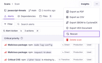
Scan results now load faster and remain consistent over time, with stable URLs and on-demand rescans for fresh security data.

Product
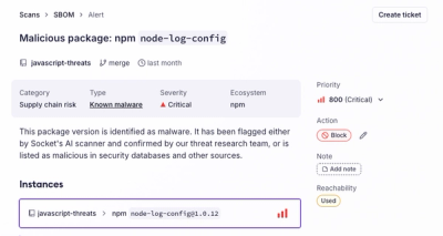
Socket's new Alert Details page is designed to surface more context, with a clearer layout, reachability dependency chains, and structured review.