Product
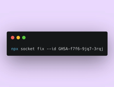
Announcing Socket Fix 2.0
Socket Fix 2.0 brings targeted CVE remediation, smarter upgrade planning, and broader ecosystem support to help developers get to zero alerts.
@knighttower/bootstrap-mini
Advanced tools
Built on top of Bootstrap but modified to have only the basic utilities classes and the grid system. This is a (very) lightweight CSS version that can be used to build websites and web applications.
It is not meant to replace the full functionality of Bootstrap, only to abstract the basic utilities to use in quick prototypes, small projects or to compliment other frameworks since it does not add any root styles, resets or normalize, colors or other theme styles that would override or conflict. It can also be customized with a few variables before importing the file to load only a few utilities or the full set.
Out the box it can be used from the cdn but to further reduce the size, it can be installed as a node module and imported as a sass file to be compiled with postcss.
Compressed: 60 KiB
Uncompressed: 90 KiB
GZip: 7 KiB
Brotli: 5 KiB
npm install @knighttower/bootstrap-mini -D
@import '~@knighttower/bootstrap-mini/dist/bootstrap-mini.css';
Or to use the sass file, and use the sass functions and utilities:
@import '~@knighttower/bootstrap-mini/src/bootstrap-mini.scss';
npm install knighttower
@import '~knighttower/bootstrap-mini/src/bootstrap-mini.scss';
If using the sass file, some variables are available to be modified before importing the file. These are the defaults
$miniPrefix: bs-;
$miniColumns: 12;
$miniGutterWidth: 1.5rem;
$miniRowColumns: 6;
$miniFontSizeBase: 1rem;

$miniEnableMargins: true;
$miniEnablePadding: true;
$miniEnableWidth: true;
$miniEnableHeight: true;
$miniEnableZIndex: true;
$miniEnableFlex: true;
$miniEnableFloat: true;
$miniEnablePosition: true;
$miniEnableDisplay: true;
$miniEnableVisibility: true;
$miniEnableContainer: true;
$miniEnableGridClasses: true;
$miniEnableCssGrid: true;
$miniEnableMargins: false;
//... other overrides before the import
@import '~@knighttower/bootstrap-mini/src/bootstrap-mini';
Note: standard bootstrap variables for the modules included are also possible to be used.
Ex: $container (for the container module), $grid-gutter-width (for the grid module), etc...
--> Told ya! It's tiny!
/**
* @mixin breakpoint
* BreakPoint print utility
* @param {String} $screen <breakdown name>|size in px
* @param {Null|String} $param Keywords:landscape, portrait|<custom query>ex:max-width:800px
* @param {Null|Bool} $exclude null | true to negate the query use with caution.
* @return Media Query
* @example
* @include breakpoint(<breakdown name>){rules...}; or
* @include breakpoint(000px,'max-width:800px'){rules...}; or
* @include breakpoint(<breakdown name>,landscape){rules...}; or
* @include breakpoint(<breakdown name>,'max-width:800px'){rules...};, etc...
* @example
* @include breakpoint(mobile){rules...}; or
* @include breakpoint(000px,'max-width:800px'){rules...}; or
* @include breakpoint(mobile,landscape){rules...};
* Includded breakpoints: mobile, phone, 320, 480, 520, tablet, 600, 700, odd, 800, desktop, desk, 920, 1000, 1200, 1440, 1600, fullscreen, nondesktop, sm, md, lg, xl, xxl
*/
.ex-class {
    @include breakpoint(lg) {
        // only applies to 992px and up
    }
    @include breakpoint(mobile) {
        // only applies to 0-599 px
        // rules
    }
    @include breakpoint(mobile, landscape) {
        // only applies to 0-599 px in landscape
        // rules
    }
    @include breakpoint(200, 'max-width:800px') {
        // only applies to 0-800 px
        // rules
    }
    @include breakpoint(200, 800) {
        // only applies to 0-800 px
        // rules
    }
    //advance
    @include breakpoint(200, 800, true) {
        // negates the query, like "not"
        // rules
    }
}


// /**
// * Merge maps
// * @param {Array} $maps Array or list of Arrays of maps to merge
// * @return {Array}
// * @example
// * $button-group: ($base-hiearchy, $base-states, $shared-states);
// * $buttons: mapMerge($button-group);
// */
@function mapMerge($maps...) {
    $m: ();

    // Check if single list of lists
    @if type-of(nth($maps, 1)) == "list" and length($maps) == 1 {
        @each $map in nth($maps, 1) {
            $m: map-merge($m, $map);
        }
    }
    // Multiple parameters
    @else {
        @each $map in $maps {
            $m: map-merge($m, $map);
        }
    }

    @return $m;
}

:root {
    --bs-disabled-bg: #e9ecef;
    --bs-disabled-text: #6c757d;
    --bs-disabled-border: #c8cbcf;
    --bs-disabled-line: #6c757d;
}
// /**
// * @mixin disabled
// * Add "disabled" state to an element
// * @return {String}
// * @example
// * // .class{ @include disabled();}
// */
@mixin disabled()

// /**
// * add transition effect to an element
// * @mixin transitionProp
// * @param {String} $property Property name
// * @param {Number} $duration 0.5s
// * @param {String} $method ease
// * @param {Number} $delay 0s
// * @return {String}
// * @example
// * // .class{ @include transitionProp(all, 0.5s, ease, 0s);}
// */
@mixin transitionProp($property, $duration: 0.5s, $method: ease, $delay: 0s)

// /**
// * ensure the is a px unit
// * @param {String|Number} $value
// * @return {String} {value}px
// */
@function ensure-px($value)
A set of utility classes that can be used to build websites and web applications. Only the most used classes are included. The rest can be added by the user.
-- Common Bootstrap classes:
--- Flex, Flexbox, Spacing, Text, Display, Position, Sizing, Margin, Padding, Columns
Modified classes:
-- ml (margin-left), mr (margin-right), pr (padding-right), pl (padding-left), float-left, float-right
Additional classes:
-- Width (w-) increments in 10, ex: w-10, w-20, w-30, etc... up to 100%
--- Widht special: w-25, w-33, w-50, w-66, w-75, w-100 (25%, 33%, 50%, 66%, 75%, 100%)
-- Height (h-) increments in 10, ex: h-10, h-20, h-30, etc... up to 100% and 'vh' for viewport height
-- Zindex (z-) increments in 10, ex: z-10, z-20, z-30, etc... up to 50
-- Colums: col-mob-{number}, col-tab-{number}, col-desk-{number} (ex: col-mob-6, col-tab-4, col-desk-3) (note that this columns only apply to the respective screen size and do not cascade)
Screen Sizes:
-- mob (mobile): 0-599px (targets only this braket)
-- tab (tablet): 600-1023px (targets only this braket)
-- desk (desktop): 1024 (targets from here up)
-- sm: 576 (targets from here up (bootstrap default behavior))
-- md: 768 (targets from here up (bootstrap default behavior))
-- lg: 992 (targets from here up (bootstrap default behavior))
-- xl: 1200 (targets from here up (bootstrap default behavior))
-- xxl: 1400 (targets from here up (bootstrap default behavior))
Utils:
.--nounderline: Removes text underline..--underline: Adds text underline..--titlecase: Capitalizes the first letter of each word..--uppercase: Converts text to uppercase..--italic: Applies italic style to text..--normal: Resets text transform to none..--nowrap: Prevents text wrapping..--no-wrap: Prevents text wrapping (duplicate of .--nowrap)..--wrap: Allows text wrapping..--bold: Applies bold weight to text..--text-left: Aligns text to the left..--text-right: Aligns text to the right..--text-center: Centers text..--text-justify: Justifies text..list: list style..list--inline: list style inline..list--unstyled: list style unstyled..hr: horizontal ruler..img: responsive images..max-div-width: max width for a div. min 320px, max 1200px.--show-on-{screenSize}: show Only on that screen size. (ex: --show-on-mob)--hide-on-{screenSize}: hide Only on that screen size. (ex: --hide-on-mob).spacer: with flag to add a spacer. (ex: .spacer --10 (10px height))Automatic rules added rules:
img: responsive imageshr: horizontal ruler 1px dashed #cccsvg: responsive svg images and maintain aspect ratiohr: horizontal ruler 1px dashed #ccc (alias .ruler, .divider) (flags: --semi, --half, --third)max container width
Most CSS frameworks come loaded with themes, or bulky in general that makes it hard the quick use without getting the full package or having to modified them to get only what you need. I also (IMO) think that the grid system bootstrap offers, has simple and versitile enough to be used in quick projects. (I'll discuss that in a future post).
Please notice, that there are things that are not included in this tyny version, the intention of this it to be basic, and if more functionality is needed, or theme styles need to be applied, then you should go full framework with Bootstrap [https://getbootstrap.com], Tachyons [https://tachyons.io], unoCSS [https://unocss.dev] (I have my eye on this one), etc...
PS: as of the writting of this, I have been implementing the minibootstrap (only the grid and cssgrid) along with UnoCss and this is a killer combo. (notice that UnoCss does not provide a strong grid but bootstrap does). I'll talk about this more at https://knighttower.io
Credits to the Bootstrap team for the great work they have done.
@knighttower/bootstrap-mini/src/utilities : brings Sass mixins and functions only, no classes.
@knighttower/bootstrap-mini/src/utils-only.scss : brings utility classes only, no mixins or functions.
for the utils-only.scss file, the following classes are included:
This stylesheet provides a set of base variables and utility classes for layout, typography, spacing, and visibility.
Note: All :root values listed below are CSS variables, not classes. They are intended to be overridden in themes or custom setups.
<i>, .icon, i[class^="icon-"]<div class="x-container">
<h1 class="h1 --text-center">Welcome</h1>
<p class="p --text-justify">
This is an example paragraph styled with utility classes.
</p>
<ul class="list list--inline">
<li>Fast</li>
<li>Responsive</li>
<li>Customizable</li>
</ul>
<hr class="--half" />
<p class="--italic --text-right">
Built with ❤️ and utility-first design
</p>
<div class="spacer --50"></div>
</div>
FAQs
Abstracted Bootstrap for utility prototypes
The npm package @knighttower/bootstrap-mini receives a total of 358 weekly downloads. As such, @knighttower/bootstrap-mini popularity was classified as not popular.
We found that @knighttower/bootstrap-mini demonstrated a healthy version release cadence and project activity because the last version was released less than a year ago. It has 1 open source maintainer collaborating on the project.
Did you know?

Socket for GitHub automatically highlights issues in each pull request and monitors the health of all your open source dependencies. Discover the contents of your packages and block harmful activity before you install or update your dependencies.

Product
Socket Fix 2.0 brings targeted CVE remediation, smarter upgrade planning, and broader ecosystem support to help developers get to zero alerts.

Security News
Socket CEO Feross Aboukhadijeh joins Risky Business Weekly to unpack recent npm phishing attacks, their limited impact, and the risks if attackers get smarter.

Product
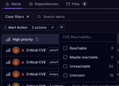
Socket’s new Tier 1 Reachability filters out up to 80% of irrelevant CVEs, so security teams can focus on the vulnerabilities that matter.