Product
Announcing Precomputed Reachability Analysis in Socket
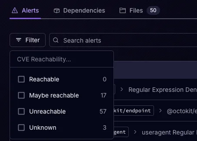
Socket’s precomputed reachability slashes false positives by flagging up to 80% of vulnerabilities as irrelevant, with no setup and instant results.
@levshitsvv/react-rangeslider
Advanced tools
A lightweight react component that acts as a HTML5 input range slider polyfill
A fast & lightweight react component as a drop in replacement for HTML5 input range slider element.
Using npm (use --save to include it in your package.json)
$ npm install react-rangeslider --save
Using yarn (this command also adds react-rangeslider to your package.json dependencies)
$ yarn add react-rangeslider
React-Rangeslider is bundled with a slider component & default styles which can be overridden depending on your design requirements.
With a module bundler like webpack that supports either CommonJS or ES2015 modules, use as you would anything else:
// Using an ES6 transpiler like Babel
import Slider from 'react-rangeslider'

// To include the default styles
import 'react-rangeslider/lib/index.css'

// Not using an ES6 transpiler
var Slider = require('react-rangeslider')
The UMD build is also available on unpkg:
<script src="https://unpkg.com/react-rangeslider/umd/rangeslider.min.js"></script>
You can find the library on window.ReactRangeslider. Optionally you can drop in the default styles by adding the stylesheet.
<link rel="stylesheet" href="https://unpkg.com/react-rangeslider/umd/rangeslider.min.css" />
Check out docs & examples.
import React, { Component } from 'react'
import Slider from 'react-rangeslider'

class VolumeSlider extends Component {
  constructor(props, context) {
    super(props, context)
    this.state = {
      volume: 0
    }
  }

  handleOnChange = (value) => {
    this.setState({
      volume: value
    })
  }

  render() {
    let { volume } = this.state
    return (
      <Slider
        value={volume}
        orientation="vertical"
        onChange={this.handleOnChange}
      />
    )
  }
}
Rangeslider is bundled as a single component, that accepts data and callbacks only as props.
import Slider from 'react-rangeslider'

// inside render
<Slider
  min={Number}
  max={Number}
  step={Number}
  value={Number}
  orientation={String}
  reverse={Boolean}
  tooltip={Boolean}
  labels={Object}
  handleLabel={String}
  format={Function}
  onChangeStart={Function}
  onChange={Function}
  onChangeComplete={Function}
/>
| Prop | Type | Default | Description |
|---|---|---|---|
min | number | 0 | minimum value the slider can hold |
max | number | 100 | maximum value the slider can hold |
step | number | 1 | step in which increments/decrements have to be made |
value | number | current value of the slider | |
orientation | string | horizontal | orientation of the slider |
tooltip | boolean | true | show or hide tooltip |
reverse | boolean | false | reverse direction of vertical slider (top-bottom) |
labels | object | {} | object containing key-value pairs. { 0: 'Low', 50: 'Medium', 100: 'High'} |
handleLabel | string | '' | string label to appear inside slider handles |
format | function | function to format and display the value in label or tooltip | |
onChangeStart | function | function gets called whenever the user starts dragging the slider handle | |
onChange | function | function gets called whenever the slider handle is being dragged or clicked | |
onChangeComplete | function | function gets called whenever the user stops dragging the slider handle. |
To work on the project locally, you need to pull its dependencies and run npm start.
$ npm install
$ npm start
Feel free to contribute. Submit a Pull Request or open an issue for further discussion.
MIT
FAQs
A lightweight react component that acts as a HTML5 input range slider polyfill
The npm package @levshitsvv/react-rangeslider receives a total of 80 weekly downloads. As such, @levshitsvv/react-rangeslider popularity was classified as not popular.
We found that @levshitsvv/react-rangeslider demonstrated a not healthy version release cadence and project activity because the last version was released a year ago. It has 1 open source maintainer collaborating on the project.
Did you know?

Socket for GitHub automatically highlights issues in each pull request and monitors the health of all your open source dependencies. Discover the contents of your packages and block harmful activity before you install or update your dependencies.

Product
Socket’s precomputed reachability slashes false positives by flagging up to 80% of vulnerabilities as irrelevant, with no setup and instant results.

Product
Socket is launching experimental protection for Chrome extensions, scanning for malware and risky permissions to prevent silent supply chain attacks.

Product
Add secure dependency scanning to Claude Desktop with Socket MCP, a one-click extension that keeps your coding conversations safe from malicious packages.