Product
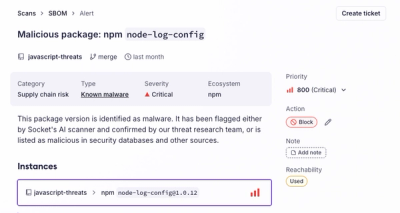
Introducing the Alert Details Page: A Better Way to Explore Alerts
Socket's new Alert Details page is designed to surface more context, with a clearer layout, reachability dependency chains, and structured review.
@livechat/design-system-react-components
Advanced tools

This package contains a library of reusable React components designed to be used in various projects. These components are the building blocks of our design system and can be easily integrated into your applications.
Run the following command using npm (or with you other favorite package manager, eg. yarn):
npm install @livechat/design-system-react-components @livechat/design-system-icons --save
It is required to import the CSS directly into your project so it could be applied to components:
import '@livechat/design-system-react-components/dist/style.css';
You can import components directly from the npm package:
import { Button } from '@livechat/design-system-react-components';
In case of icons there is a separate package (@livechat/design-system-icons) to be used in conjunction:
import { Edit } from '@livechat/design-system-icons';
import { Icon } from '@livechat/design-system-react-components';

<Icon source={Edit} kind="primary" />;
At this stage of the project we consider Storybook and Figma as parts of our documentation ecosystem.
Storybook - includes design system foundations, describes components API and allows to familiarize with the thier capabilities Figma - it's not an official documentation from design perspective but we follow a simple rule of working in public
Required version of node.js is 16.13.2.
If you're a volta user, the project maintains node version entry within package.json.
You should start with installing dependencies:
npm install
After that just execute the start command. It will build all necessary packages in watch mode. Storybook should start automatically (if not - try visiting http://localhost:6006).
npm start
If Storybook is not enough, you can additionaly run npm start:example which will run example-react package in watch mode. example-react is a simple React app based on vite-react boilterplate. It has a direct dependency on react-components package, so every change should be reflected in the app via auto-reload.
For the contribution/testing/releasing guides please refer to the main repository documentation.
FAQs
Unknown package
The npm package @livechat/design-system-react-components receives a total of 5,790 weekly downloads. As such, @livechat/design-system-react-components popularity was classified as popular.
We found that @livechat/design-system-react-components demonstrated a healthy version release cadence and project activity because the last version was released less than a year ago. It has 72 open source maintainers collaborating on the project.
Did you know?

Socket for GitHub automatically highlights issues in each pull request and monitors the health of all your open source dependencies. Discover the contents of your packages and block harmful activity before you install or update your dependencies.

Product
Socket's new Alert Details page is designed to surface more context, with a clearer layout, reachability dependency chains, and structured review.

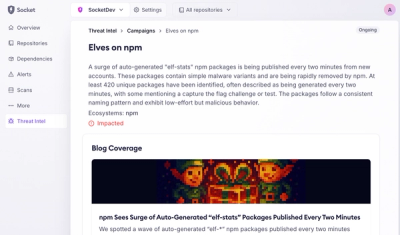
Product
Campaign-level threat intelligence in Socket now shows when active supply chain attacks affect your repositories and packages.

Research
Malicious PyPI package sympy-dev targets SymPy users, a Python symbolic math library with 85 million monthly downloads.