Security News
Crates.io Users Targeted by Phishing Emails
The Rust Security Response WG is warning of phishing emails from rustfoundation.dev targeting crates.io users.
@locomotivemtl/postcss-helpers-functions
Advanced tools
A set of useful PostCSS functions to help you write better CSS.
A set of useful PostCSS functions to help you write better CSS. This plugin allows you to simplify complex CSS expressions like grid spacing, responsive font sizes, and viewport-based calculations directly in your CSS.
npm install postcss-helpers-functions --save-dev
To use this plugin, include it in your PostCSS configuration file.
postcss.config.js):import postcssHelpersFunctions from 'postcss-helpers-functions';
export default {
plugins: [
postcssHelpersFunctions()
]
};
.example {
    width: grid-space(6/12, 1);
    font-size: responsive-value(16px, 32px, 1200);
    height: dvh(100);
    padding: svh(5);
    margin: rem(24px);
}
.example {
    width: calc(0.5 * (calc(var(--vw, 1vw) * 100) - 2 * var(--grid-margin, 0px)) - 0.5 * var(--grid-gutter, 0px) + 1 * var(--grid-gutter, 0px));
    font-size: clamp(16px, calc(0.02666666666666667 * var(--vw, 1vw) * 100), 32px);
    height: calc(100 * var(--dvh, 1dvh));
    padding: calc(5 * var(--svh, 1svh));
    margin: 1.5rem;
}
This plugin provides several helper functions to streamline CSS calculations.
| Function | Description | Example Usage | Example Output |
|---|---|---|---|
gridSpace(frac, inset) | Calculates grid spacing based on a fraction of the grid and an optional gutter inset. | grid-space(6/12, 1) | calc(0.5 * (calc(var(--vw) * 100) - 2 * var(--grid-margin)) - 0.5 * var(--grid-gutter) + 1 * var(--grid-gutter)) |
responsiveValue(min, max, breakpoint) | Creates a responsive value using CSS clamp() for fluid scaling. | responsive-value(16px, 32px, 1200) | clamp(16px, calc(0.026666 * var(--vw) * 100), 32px) |
rem(pixels, rootSize) | Converts pixel values to rem units based on a configurable root font size. | rem(24px) or rem(24) | 1.5rem |
dvh(percentage) | Calculates a percentage of the dynamic viewport height. | dvh(100) | calc(100 * var(--dvh, 1dvh)) |
svh(percentage) | Calculates a percentage of the small viewport height. | svh(50) | calc(50 * var(--svh, 1svh)) |
lvh(percentage) | Calculates a percentage of the large viewport height. | lvh(100) | calc(100 * var(--lvh, 1lvh)) |
vw(percentage) | Calculates a percentage of the viewport width. | vw(100) | calc(100 * var(--vw, 1vw)) |
gridSpace)Generates a CSS calc() string for calculating a fraction of the grid width with an optional gutter inset.
Syntax:
gridSpace(fraction, inset = 0)
Parameters:
fraction (number): The fraction of the grid (e.g., 6/12 or 0.5 for half the grid).inset (number, optional): Multiplier for the grid gutter (default: 0).Example:
width: grid-space(6/12, 1);
Output:
width: calc(0.5 * (calc(var(--vw) * 100) - 2 * var(--grid-margin)) - 0.5 * var(--grid-gutter) + 1 * var(--grid-gutter));
responsiveValue)Generates a CSS clamp() string for scaling values between a minimum and maximum size based on a breakpoint.
Syntax:
responsiveValue(minSize, maxSize, breakpoint)
Parameters:
minSize (string): Minimum value (e.g., 16px).maxSize (string): Maximum value (e.g., 32px).breakpoint (number): Maximum breakpoint value (e.g., 1200 for 1200px).Example:
font-size: responsive-value(16px, 32px, 1200);
Output:
font-size: clamp(16px, calc(0.026666 * var(--vw, 1vw) * 100), 32px);
rem)Converts pixel values to rem units based on a configurable root font size.
Syntax:
rem(pixels, rootSize = 16)
Parameters:
pixels (number | string): The pixel value to convert to rem (accepts both 24 and "24px").rootSize (number, optional): The root font size in pixels (default: 16).Example:
font-size: rem(24px);
margin: rem(16);
padding: rem(8px, 18);
Output:
font-size: 1.5rem;
margin: 1rem;
padding: 0.444rem;
dvh, svh, lvh)Generates a CSS calc() string for dynamic viewport height values.
Syntax:
dvh(percentage)
svh(percentage)
lvh(percentage)
Example:
height: dvh(100);
padding: svh(5);
Output:
height: calc(100 * var(--dvh, 1dvh));
padding: calc(5 * var(--svh, 1svh));
FAQs
A set of useful PostCSS functions to help you write better CSS.
We found that @locomotivemtl/postcss-helpers-functions demonstrated a healthy version release cadence and project activity because the last version was released less than a year ago. It has 5 open source maintainers collaborating on the project.
Did you know?

Socket for GitHub automatically highlights issues in each pull request and monitors the health of all your open source dependencies. Discover the contents of your packages and block harmful activity before you install or update your dependencies.

Security News
The Rust Security Response WG is warning of phishing emails from rustfoundation.dev targeting crates.io users.

Product
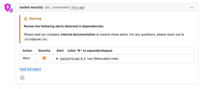
Socket now lets you customize pull request alert headers, helping security teams share clear guidance right in PRs to speed reviews and reduce back-and-forth.

Product
Socket's Rust support is moving to Beta: all users can scan Cargo projects and generate SBOMs, including Cargo.toml-only crates, with Rust-aware supply chain checks.