@maqe-vue/text-input
The Vue2 component for text-input

See demo on: Storybook
Installation
NPM
Install the npm package.
npm install @maqe-vue/text-input --save
Register the component
import VmqInput from '@maqe-vue/text-input'
import '@maqe-vue/text-input/dist/style.css'

Vue.component('vmq-input', VmqInput)
Usage
Basic

<vmq-input v-model="input" type="text"/>
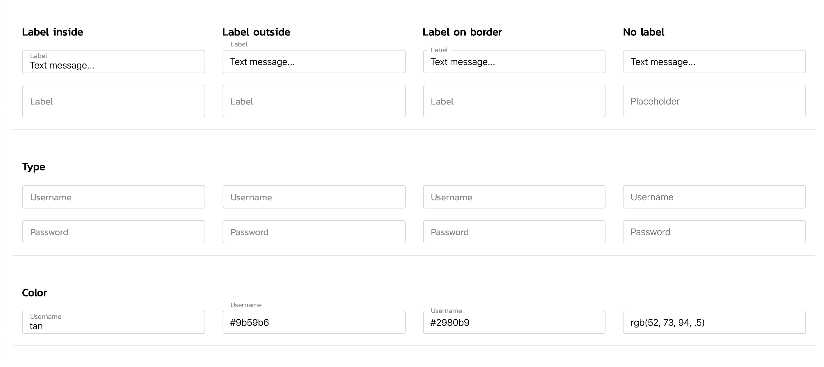
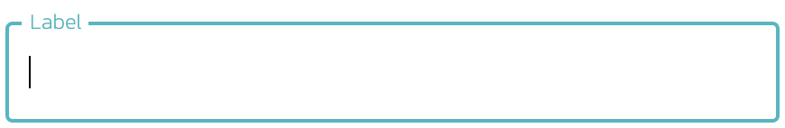
Lable style

<vmq-input
    v-model="input"
    type="text"
    label-style="label-inside"
/>

<vmq-input
    v-model="input"
    type="text"
    label-style="label-border"
/>
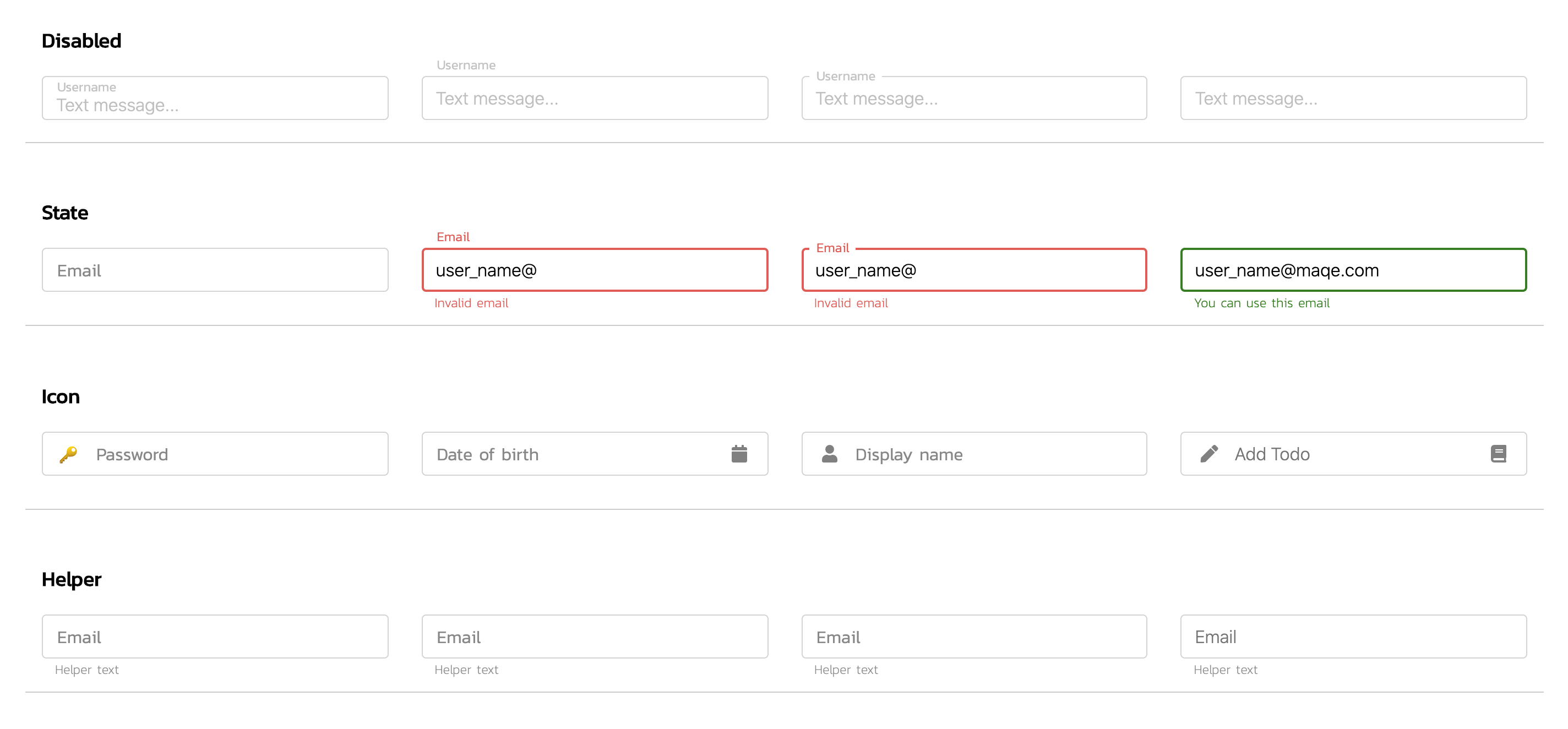
State

<vmq-input
    v-model="email"
    label-style="label-inside"
    :state="true"
    state-valid-text="You can use this email"
/>

<vmq-input
    v-model="email"
    label-style="label-inside"
    :state="false"
>
    <template v-slot:state-invalid-text>
        <span>
            Invalid
            <u>email</u>
        </span>
    </template>
</vmq-input>
API
Props
| Name | Type | Description | default |
|---|
v-model | bind | | |
type | string | `text | password` |
containerClass | string | | |
color | string | `name | hex |
label-style | string | `label-inside | |
label | string | | |
placeholder | string | | |
state | `boolean | null` | |
state-valid-text | string | | |
state-invalid-text | string | | |
helper-text | string | | |
icon-prepend | `string | array` | |
icon-append | `string | array` | |
disabled | boolean | | false |
loading | boolean | | false |
clearable | boolean | | false |
autofocus | boolean | | false |
readonly | boolean | | false |
trim | boolean | | false |
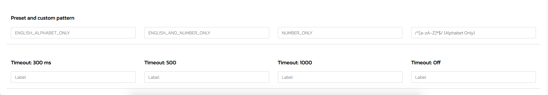
timeout | number | Timeout to trigger parent component in millisecond ex. 3000 | 0 |
regex | string | `ENGLISH_ALPHABET_ONLY | ENGLISH_AND_NUMBER_ONLY |
Slot
| Name | Type | Description | default |
|---|
state-valid-text | | | |
state-invalid-text | | | |
icon-prepend | | left side icon | |
icon-append | | right side icon | |
helper-text | | | |
Slot Example
<vmq-input v-model="input">
    <!-- custom icon-prepend -->
    <template v-slot:icon-prepend>
        <i class="fa fas-user"></i>
    </template>
</vmq-input>

<vmq-input v-model="input">
    <!-- custom helper text -->
    <template v-slot:helper-text>
        <span>
            Helper
            <u>Text</u>
        </span>
    </template>
</vmq-input>
Event
| Name | Type | Description | default |
|---|
select(value, event) | function | Invoked when input is selected. | |
focus(value, event) | function | Invoked when input gains focus. | |
blur(value, event) | function | Invoked when input loses focus. | |
change(value, event) | function | Invoked when input changes. | |
keyup(value, event) | function | Invoked when a key is released. | |
keydown(value, event) | function | Invoked when the user presses a keyboard key. | |
keypress(value, event) | function | Invoked when the user presses a key on the keyboard. | |
Event Example
<vmq-input
    type="text"
    label-style="label-border"
    @change="handleChange"
/>

methods: {
    handleChange(value, event) {
        // code here
    }
}
Style
Classes
.vmq-input-wrapper
.vmq-input-textfield
.vmq-input-label
.vmq-input-state
.vmq-input-icon-prepend
.vmq-input-icon-append
.vmq-input-helper
.vmq-input-clear
Custom Style
Custom input style with css variable

<vmq-input
    v-model="input"
    label-style="label-inside"
/>

// for example to set as a global
<style>
    :root {
        --vmq-text-input-colo: tan;
        --vmq-text-input-border-width 1px;
    }
</style>
Custom for dark mode.

<vmq-input
    v-model="input"
    type="text"
    label-style="label-border"
    containerClass="custom-text-input"
/>
<vmq-input
    v-model="input"
    type="password"
    label-style="label-border"
    containerClass="custom-text-input"
/>

<style lang="scss">
    body {
        background: #252524;
    }

    .custom-text-input {
        .vmq-input-textfield {
            color: #fff;
        }

        .vmq-input-label, .vmq-input-helper {
            color: rgba(255,255,255,.7);
        }
    }
</style>


