<mwc-button> 
IMPORTANT: The Material Web Components are a work in progress and subject to
major changes until 1.0 release.
Buttons allow users to take actions, and make choices, with a single tap.
Material Design Guidelines: Button
Installation
npm install @material/mwc-button
NOTE: The Material Web Components are distributed as ES2017 JavaScript
Modules, and use the Custom Elements API. They are compatible with all modern
browsers including Chrome, Firefox, Safari, Edge, and IE11, but an additional
tooling step is required to resolve bare module specifiers, as well as
transpilation and polyfills for Edge and IE11. See
here
for detailed instructions.
Example Usage
Standard
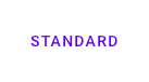
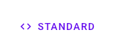
<mwc-button label="standard"></mwc-button>
<mwc-button label="standard" icon="code"></mwc-button>
Outlined
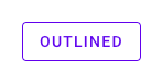
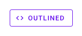
<mwc-button outlined label="outlined"></mwc-button>
<mwc-button outlined label="outlined" icon="code"></mwc-button>
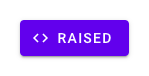
Raised
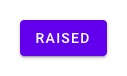
<mwc-button raised label="raised"></mwc-button>
<mwc-button raised label="raised" icon="code"></mwc-button>
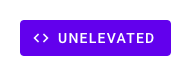
Unelevated
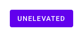
<mwc-button unelevated label="unelevated"></mwc-button>
<mwc-button unelevated label="unelevated" icon="code"></mwc-button>
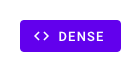
Dense
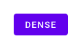
<mwc-button dense unelevated label="dense"></mwc-button>
<mwc-button dense unelevated label="dense" icon="code"></mwc-button>
Trailing Icon
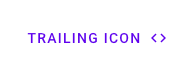
<mwc-button label="trailing icon" icon="code" trailingIcon></mwc-button>
Disabled
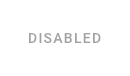
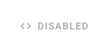
<mwc-button disabled label="disabled"></mwc-button>
<mwc-button disabled label="disabled" icon="code"></mwc-button>
Customize Colors
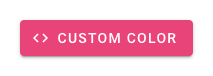
mwc-button {
  --mdc-theme-primary: #e9437a;
  --mdc-theme-on-primary: white;
}
API
Slots
None
Properties/Attributes
icon | string | '' | Icon to display, and aria-label value when label is not defined. |
label | string | '' | Label to display for the button, and aria-label |
raised | boolean | false | Creates a contained button that is elevated above the surface. |
unelevated | boolean | false | Creates a contained button that is flush with the surface. |
outlined | boolean | false | Creates an outlined button that is flush with the surface. |
dense | boolean | false | Makes the button text and container slightly smaller. |
disabled | boolean | false | Disabled buttons cannot be interacted with and have no visual interaction effect. |
trailingIcon | boolean | false | When true, icon will be displayed after label |
Methods
None
Events
None
CSS Custom Properties
--mdc-icon-font | Material Icons | Font to use for the icon. |
--mdc-theme-primary |  #6200ee | Background color of the button |
--mdc-theme-on-primary |  #ffffff | Text color of the button |
Additional references


