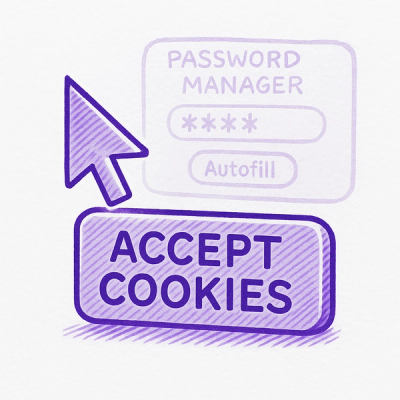
Security News
Researcher Exposes Zero-Day Clickjacking Vulnerabilities in Major Password Managers
Hacker Demonstrates How Easy It Is To Steal Data From Popular Password Managers
By Jonathan Leitschuh - Aug 19, 2025
@material/theme
Advanced tools
The Material Design color system can be used to create a color scheme that reflects your brand or style.
npm install @material/theme
You can define the theme color variables before importing any MDC Web components:
@use "@material/theme" with (
  $primary: #fcb8ab,
  $secondary: #feeae6,
  $on-primary: #442b2d,
  $on-secondary: #442b2d,
);
@use "@material/button/mdc-button";
We suggest you follow the Web Content Accessibility Guidelines 2.0 when picking the values for on-primary, on-secondary, etc. These values should be accessible on top of the corresponding value, e.g. primary and secondary.
Color scheme will only get you 80% of the way to a well-designed app. Inevitably there will be some components that do not work "out of the box". To fix problems with accessibility and design, we suggest you use our Sass mixins, such as button.filled-accessible(). For more information, consult the documentation for each component.
The text styles (referred to as <TEXT_STYLE> below) used in the color system:
| Text style | Description |
|---|---|
primary | Used for most text (e.g., text-primary-on-light) |
secondary | Used for text which is lower in the visual hierarchy (e.g., text-secondary-on-light) |
hint | Used for text hints, such as those in text fields and labels (e.g., text-hint-on-light) |
disabled | Used for text in disabled components and content (e.g., text-disabled-on-light) |
icon | Used for icons (e.g., text-icon-on-light) |
Here are the example usages of primary text style:
--mdc-theme-text-primary-on-lightmdc-theme--text-primary-on-lighttext-primary-on-lightOnly a very limited number of Material Design color customization features are supported for non-Sass clients. They are a set of CSS custom properties, and a set of CSS classes.
| CSS Custom property | Description |
|---|---|
--mdc-theme-primary | The theme primary color |
--mdc-theme-secondary | The theme secondary color |
--mdc-theme-background | The theme background color |
--mdc-theme-surface | The theme surface color |
--mdc-theme-on-primary | Text color on top of a primary background |
--mdc-theme-on-secondary | Text color on top of a secondary background |
--mdc-theme-on-surface | Text color on top of a surface background |
--mdc-theme-text-<TEXT_STYLE>-on-light | Text color for TEXT_STYLE on top of light background. Please see Text styles section. |
--mdc-theme-text-<TEXT_STYLE>-on-dark | Text color for TEXT_STYLE on top of dark background. Please see Text styles section. |
| CSS Class | Description |
|---|---|
mdc-theme--primary | Sets the text color to the theme primary color |
mdc-theme--secondary | Sets the text color to the theme secondary color |
mdc-theme--background | Sets the background color to the theme background color |
mdc-theme--surface | Sets the surface color to the theme surface color |
mdc-theme--on-primary | Sets the text color to the theme on-primary color |
mdc-theme--on-secondary | Sets the text color to the theme on-secondary color |
mdc-theme--on-surface | Sets the text color to the theme on-surface color |
mdc-theme--primary-bg | Sets the background color to the theme primary color |
mdc-theme--secondary-bg | Sets the background color to the theme secondary color |
mdc-theme--text-<TEXT_STYLE>-on-light | Sets text to a suitable color for TEXT_STYLE on top of light background. Please see Text styles section. |
mdc-theme--text-<TEXT_STYLE>-on-dark | Sets text to a suitable color for TEXT_STYLE on top of dark background. Please see Text styles section. |
| Mixin | Description |
|---|---|
property($property, $value, $gss, $important) | Applies a dynamic value to the specified property. The value may be a standard CSS value, a custom property Map, or a Material theme key. |
theme.property()Material theme key names below can be used as the $value argument for the theme.property() mixin. Some keys are dynamic, and change context depending on other key values. Keys may also translate to custom properties for dynamic runtime theming.
| Key Name | Description |
|---|---|
primary | The theme primary color |
secondary | The theme secondary color |
background | The theme background color |
surface | The theme surface color |
text-<TEXT_STYLE>-on-light | TEXT_STYLE on top of a light background. Please see Text styles section. |
text-<TEXT_STYLE>-on-dark | TEXT_STYLE on top of a dark background. Please see Text styles section. |
on-primary | A text/iconography color that is usable on top of primary color |
on-secondary | A text/iconography color that is usable on top of secondary color |
on-surface | A text/iconography color that is usable on top of surface color |
theme.property()The theme.property() mixin also accepts a custom property Map for the $value argument. The map must contain a varname key with the name of the custom property, and an optional fallback key with the value of the custom property.
Use the @material/theme/custom-properties module to create custom property Maps.
For example, the following Sass...
@use "@material/theme";
@use "@material/theme/custom-properties";

.foo {
  @include theme.property(color, custom-properties.create(--foo-color, red));
}
...will produce the following CSS...
.foo {
  color: red;
  color: var(--foo-color, red);
}
The above output CSS will apply the fallback field's value for all supported browsers (including IE11) while allowing for CSS custom property use as a progressive enhancement. Browsers like IE11 that do not support CSS custom properties will apply the color: red; and ignore the color: var(--foo-color, red);. This argument type is intended for clients who need custom color application outside of the existing theme properties.
theme.luminance($color)Calculates the luminance value (0 - 1) of a given color.
@debug theme.luminance(#9c27b0); // 0.11654
theme.contrast($back, $front)Calculates the contrast ratio between two colors.
@debug theme.contrast(#9c27b0, #000); // 3.33071
theme.tone($color)Determines whether the given color is "light" or "dark".
If the input color is a string literal equal to "light" or "dark", it will be returned verbatim.
@debug theme.tone(#9c27b0); // dark
@debug theme.tone(light);   // light
theme.contrast-tone($color)Determines whether to use light or dark text on top of a given color.
@debug theme.contrast-tone(#9c27b0); // light
theme.accessible-ink-color($fill-color, $text-style: primary)Returns an accessible ink color that has sufficient contrast against the given fill color.
Params:
$fill-color: Supports the same values as theme.prop-value$text-style: Value must be one of primary, secondary, hint, disabled, icon (see $text-colors)NOTE: This function is defined in
_variables.scssinstead of_functions.scssto avoid circular imports.
@debug theme.accessible-ink-color(secondary); // rgba(0, 0, 0, .87) (text-primary-on-light)
@debug theme.accessible-ink-color(blue);      // white              (text-primary-on-dark)
theme.text-emphasis($emphasis)Returns opacity value for given emphasis.
Params:
$emphasis: Type of emphasis such as high, medium & disabled.@debug theme.text-emphasis(high); // .87
@debug theme.text-emphasis(disabled); // .38
14.0.0 (2022-04-27)
unset is unsupported in IE. (f460e23)validateTooltipWithCaretDistances method. (3e30054)theme-styles mixin... the value being retreived from the $theme map and css property name was swapped. The mixin would request font-size/font-weight/letter-spacing from the $theme map (which expects size/weight/tracking)... so these values would always be null. (32b3913)attachTo. (05db65e)showTimeout is not set (indicating that this tooltip is about to be re-shown). (6ca8b8f)minRange param to range sliders to request a minimum gap between the two thumbs. (8fffcb5)valueToAriaValueTextFn and valueToValueIndicatorTextFn functions are called for. (b6510c8)PiperOrigin-RevId: 444830518
PiperOrigin-RevId: 419837612
FAQs
The Material Components for the web theming system
The npm package @material/theme receives a total of 529,092 weekly downloads. As such, @material/theme popularity was classified as popular.
We found that @material/theme demonstrated a not healthy version release cadence and project activity because the last version was released a year ago. It has 15 open source maintainers collaborating on the project.
Did you know?

Socket for GitHub automatically highlights issues in each pull request and monitors the health of all your open source dependencies. Discover the contents of your packages and block harmful activity before you install or update your dependencies.
Security News
Hacker Demonstrates How Easy It Is To Steal Data From Popular Password Managers

Security News
Oxlint’s new preview brings type-aware linting powered by typescript-go, combining advanced TypeScript rules with native-speed performance.

Security News
A new site reviews software projects to reveal if they’re truly FOSS, making complex licensing and distribution models easy to understand.