PageBuilder


lightweight page builder library designed for creating static web pages with a drag-and-drop interface. This component library generates HTML output and supports customization options. Built with TypeScript and vanilla JavaScript for performance, it includes modular components, responsive previews, and data handling for layout storage and retrieval.
Live Demo
Click the button below to open the project on StackBlitz.

Screenshot
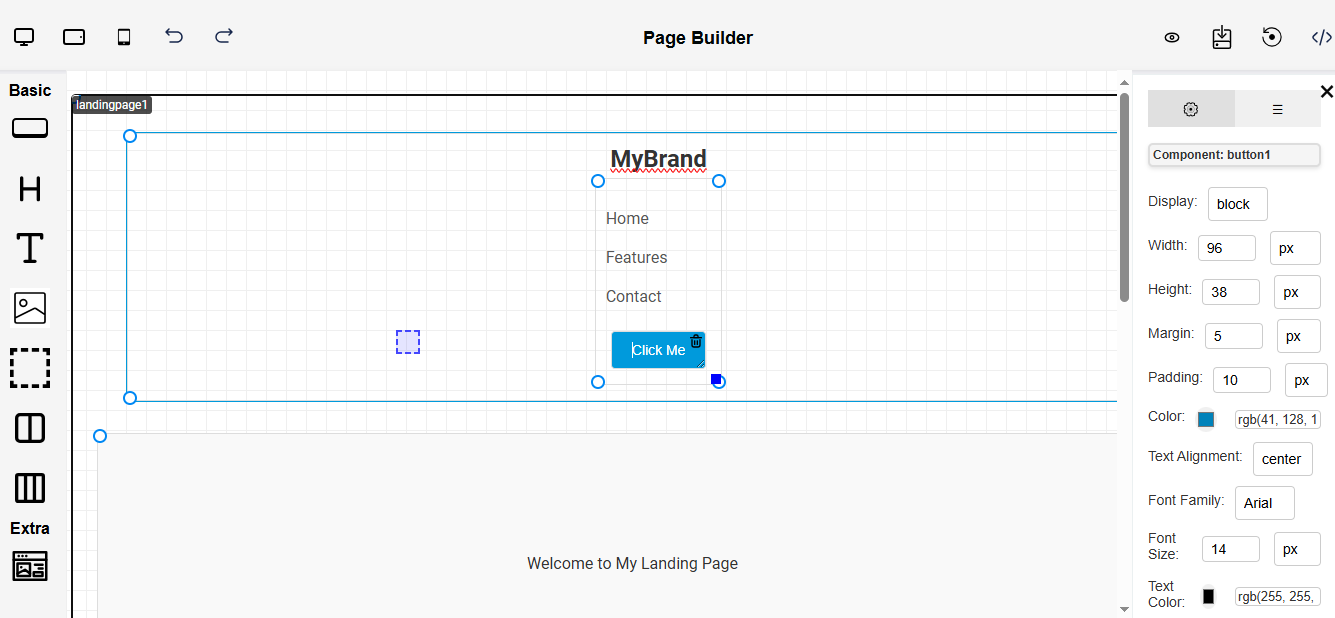
Table of Contents
Features
- Component Structure: Drag-and-drop components (text, images, buttons, headers, containers, etc.) to create a layout.
- Responsive Preview: Preview page layouts in different device modes (Desktop, Tablet, Mobile).
- Configuration Sidebar: Customize component properties like text, color, padding, and margin via a configuration sidebar.
- Data Storage: Save layout configurations in JSON format for easy retrieval and editing.
- Layers: Enabling users to manage component hierarchy visually.
- Output HTML: Export the final HTML layout for use in static web pages or other applications.
Installation
To install the @mindfiredigital/page-builder-react npm package in your project, use the following command:
npm install @mindfiredigital/page-builder-react
Getting Started with npm
- Initialization: Initialize the PageBuilder in your project.
Dynamic components
- The config prop is required and allows you to specify which built-in components should be available in the page builder
- For now we have 10 Basic components and 1 Extra component, we have provided the whole list below:
button, header, text, image, video, container, twoCol, threeCol, table, link, landingpage.
import { PageBuilderReact } from '@mindfiredigital/page-builder-react';
const App = () => {
const dynamicComponents = {
Basic: ['button', 'header', 'text', 'twoCol', 'threeCol'],
Extra: ['landingpage'],
};
return (
<div>
<PageBuilderReact config={dynamicComponents} />
</div>
);
};
export default App;
Custom Components (Optional)
- You can optionally add your own React components to the page builder using the customComponents prop:
- Each custom component requires:
component: Your React component
svg: An SVG icon for the builder toolbar
title: A display name for the component
import { PageBuilderReact } from '@mindfiredigital/page-builder-react';
import ColorPicker from './components/ColorPicker';
const App = () => {
const dynamicComponents = {
Basic: ['button', 'header', 'text', 'twoCol', 'threeCol'],
Extra: ['landingpage'],
};
const customComponents = {
ColorPicker: {
component: ColorPicker,
svg: `<svg path of your svg </svg>`,
title: 'Color Picker Component',
},
};
return (
<div>
<PageBuilderReact
config={dynamicComponents}
customComponents={customComponents}
/>
</div>
);
};
export default App;
Contributing
We welcome contributions from the community. If you'd like to contribute to the Pagebuilder npm package, please follow our Contributing Guidelines.
License
Copyright (c) Mindfire Digital llp. All rights reserved.
Licensed under the MIT license.


