Product
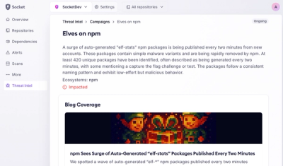
Introducing Supply Chain Attack Campaigns Tracking in the Socket Dashboard
Campaign-level threat intelligence in Socket now shows when active supply chain attacks affect your repositories and packages.
By Philipp Burckhardt - Jan 21, 2026
@moped/react-modal
Advanced tools
This is a react-modal component with no default styling. It takes care of the tricky problem of keeping your content around while you animate the hiding of the modal.
This is a react-modal component with no default styling. It takes care of the tricky problem of keeping your content around while you animate the hiding of the modal.
yarn add @moped/react-modal
import * as React from 'react';
import ModalDialog, {
  Dialog,
  ModalRenderProps,
  ModalProvider,
} from '@moped/react-modal';

function ModalDialogView(props: ModalRenderProps) {
  return (
    <div
      style={{
        opacity: props.open ? 1 : 0,
        visibility: props.open || props.animating ? 'visible' : 'hidden',
        overflowX: 'hidden',
        overflowY: 'auto',
        position: 'fixed',
        top: 0,
        right: 0,
        bottom: 0,
        left: 0,
        zIndex: 1050,
        background: 'hsla(0, 0%, 0%, 0.5)',
        transition: 'opacity 0.15s linear',
        display: 'flex',
        justifyContent: 'center',
        alignItems: 'center',
      }}
      onClick={props.onClose}
    >
      <Dialog
        open={props.open}
        style={{
          transform: props.open ? 'translate(0,0)' : 'translate(0,-100vh)',
          display: 'block',
          position: 'relative',
          flexShrink: 0,
          margin: '1em 25vw',
          color: 'inherit',
          border: '1px solid black',
          borderRadius: '0.25em',
          padding: '1em',
          background: 'white',

          height: 'auto',
          width: 'auto',
          transition: 'transform 0.3s ease-out',
        }}
        onClick={e => e.stopPropagation()}
      >
        {props.children}
      </Dialog>
    </div>
  );
}

class RestOfApplication extends React.Component {
  state = {open: false};
  _openModal = () => this.setState({open: true});
  _closeModal = () => this.setState({open: false});
  _renderModal = () => {
    // ideally here you would render the modal's title, close button etc.
    return <div>Hello World</div>;
  };
  render() {
    return (
      <React.Fragment>
        <Button onClick={this._openModal}>Open</Button>
        {this.state.open ? (
          <ModalDialog onClose={this._closeModal}>
            {this._renderModal}
          </ModalDialog>
        ) : null}
      </React.Fragment>
    );
  }
}
function App() {
  return (
    <ModalProvider animationDuration={300} renderModal={ModalDialogView}>
      <RestOfApplication />
    </ModalProvider>
  );
}
MIT
FAQs
This is a react-modal component with no default styling. It takes care of the tricky problem of keeping your content around while you animate the hiding of the modal.
The npm package @moped/react-modal receives a total of 0 weekly downloads. As such, @moped/react-modal popularity was classified as not popular.
We found that @moped/react-modal demonstrated a not healthy version release cadence and project activity because the last version was released a year ago. It has 1 open source maintainer collaborating on the project.
Did you know?

Socket for GitHub automatically highlights issues in each pull request and monitors the health of all your open source dependencies. Discover the contents of your packages and block harmful activity before you install or update your dependencies.
Product
Campaign-level threat intelligence in Socket now shows when active supply chain attacks affect your repositories and packages.

Research
Malicious PyPI package sympy-dev targets SymPy users, a Python symbolic math library with 85 million monthly downloads.

Security News
Node.js 25.4.0 makes require(esm) stable, formalizing CommonJS and ESM compatibility across supported Node versions.