NativeScript CollectionView widget


A NativeScript CollectionView widget. The CollectionView displays data in separate cells, each cell representing one data item. For iOS wraps up UICollectionView and for Android wraps up RecyclerView
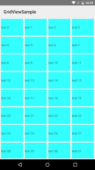
Screenshot
Installation
Run the following command from the root of your project:
tns plugin add nativescript-collectionview
This command automatically installs the necessary files, as well as stores nativescript-collectionview as a dependency in your project's package.json file.
Configuration
There is no additional configuration needed!
API
Events
-
itemLoading
Triggered when generating an item in the CollectionView.
-
itemTap
Triggered when the user taps on an item in the CollectionView.
-
loadMoreItems
Triggered when the generated items reached the end of the items property.
Static Properties
-
itemLoadingEvent - String
String value used when hooking to itemLoadingEvent event.
-
itemTapEvent - String
String value used when hooking to itemTapEvent event.
-
loadMoreItemsEvent - String
String value used when hooking to itemTapEvent event.
Instance Properties
-
ios - UICollectionView
Gets the native iOS view that represents the user interface for this component. Valid only when running on iOS.
-
android - android.support.v7.widget.RecyclerView
Gets the native android widget that represents the user interface for this component. Valid only when running on Android OS.
-
items - Array | ItemsSource
Gets or sets the items collection of the CollectionView. The items property can be set to an array or an object defining length and getItem(index) method.
-
itemTemplate - String
Gets or sets the item template of the CollectionView.
-
rowHeight - PercentLength
Gets or sets the height for every row in the CollectionView.
-
colWidth - PercentLength
Gets or sets the width for every column in the CollectionView.
Instance Methods
-
refresh()
Forces the CollectionView to reload all its items.
-
scrollToIndex(index: number, animated: boolean = true)
Scrolls the CollectionView to the item with the given index. This can be either animated or not. Defaults to animated.
Usage
You need to add xmlns:gv="nativescript-collectionview" to your page tag, and then simply use <gv:CollectionView/> in order to add the widget to your page. Use <gv:Gridview.itemTemplate/> to specify the template for each cell:
<Page xmlns="http://schemas.nativescript.org/tns.xsd" xmlns:gv="nativescript-collectionview" loaded="pageLoaded">
<GridLayout>
<gv:CollectionView items="{{ items }}" colWidth="24%" rowHeight="15%" padding="5" itemTap="gridViewItemTap" itemLoading="gridViewItemLoading" loadMoreItems="gridViewLoadMoreItems">
<gv:CollectionView.itemTemplate>
<GridLayout backgroundColor="#33ffff" style="margin: 5">
<Label text="{{ value }}" verticalAlignment="center"/>
</GridLayout>
</gv:CollectionView.itemTemplate>
</gv:CollectionView>
</GridLayout>
</Page>
import { EventData, Observable } from "data/observable";
import { ObservableArray } from "data/observable-array";
import { Page } from "ui/page";
import { CollectionViewItemEventData } from "nativescript-collectionview";
let viewModel: Observable;
export function pageLoaded(args: EventData) {
const page = args.object as Page;
const items = new ObservableArray();
for (let loop = 0; loop < 200; loop++) {
items.push({ value: "test " + loop.toString() });
}
viewModel = new Observable();
viewModel.set("items", items);
page.bindingContext = viewModel;
}
export function gridViewItemTap(args: CollectionViewItemEventData) {
console.log("tap index " + args.index.toString());
}
export function gridViewItemLoading(args: CollectionViewItemEventData) {
console.log("item loading " + args.index.toString());
}
export function gridViewLoadMoreItems(args: EventData) {
console.log("load more items");
}
You can also have multiple templates the same way you add them in the builtin ListView control:
<gv:CollectionView id="gv" row="0" class="{{ cssClass }}" items="{{ items }}"
                colWidth="{{ colWidth }}" rowHeight="{{ rowHeight }}" itemTemplateSelector="templateSelector"
                itemTap="gridViewItemTap" itemLoading="gridViewItemLoading" loadMoreItems="gridViewLoadMoreItems">
    <gv:CollectionView.itemTemplates>
        <template key="odd">
            <GridLayout backgroundColor="#33ffff" style="margin: 10 10 0 0">
                <Label text="{{ value }}" verticalAlignment="center"/>
            </GridLayout>
        </template>

        <template key="even">
            <GridLayout backgroundColor="#33ffff" rows="auto, auto" style="margin: 10 10 0 0">
                <Label row="0" text="{{ value }}" verticalAlignment="center"/>
                <Label row="1" text="{{ value }}" verticalAlignment="center"/>
            </GridLayout>
        </template>
    </gv:CollectionView.itemTemplates>
</gv:CollectionView>
export function templateSelector(item: any, index: number, items: any) {
    return index % 2 === 0 ? "even" : "odd";
}
Usage in Angular
Import CollectionViewModule in your NgModule:
import { CollectionViewModule } from 'nativescript-collectionview/angular';
@NgModule({
imports: [
CollectionViewModule,
],
})
Example Usage
import { CollectionViewModule } from "nativescript-collectionview/angular";
@NgModule({
bootstrap: [
AppComponent
],
imports: [
NativeScriptModule,
AppRoutingModule,
CollectionViewModule,
],
declarations: [
AppComponent,
ItemsComponent,
ItemDetailComponent
],
providers: [
ItemService
],
schemas: [
NO_ERRORS_SCHEMA
]
})
export class AppModule { }
<GridLayout class="page">
<CollectionView [items]="items" colWidth="30%" rowHeight="100">
<ng-template let-item="item" let-odd="odd">
<StackLayout margin="10" [nsRouterLink]="['/item', item.id]" borderColor="blue" borderWidth="2" borderRadius="5" verticalAlignment="stretch" class="list-group-item" [class.odd]="odd">
<Label verticalAlignment="center" [text]="item.name" class="list-group-item-text" textWrap="true"></Label>
</StackLayout>
</ng-template>
</CollectionView>
</GridLayout>
If you want to use multiple item templates, you can do that very similarly to how you do it for the builtin ListView control. The only difference is that due to current limitations instead of using the nsTemplateKey directive you need to use the cvTemplateKey directive that comes from the CollectionView. (In a future version, once the framework allows it this will be changed and you will be able to use the same directive for the CollectionView as well)
<CollectionView row="1" [items]="items" colWidth="33%" rowHeight="100" [itemTemplateSelector]="templateSelector">
    <ng-template cvTemplateKey="Defender" let-item="item" let-odd="odd">
        <StackLayout [nsRouterLink]="['/item', item.id]" borderColor="blue" borderWidth="2" borderRadius="5" verticalAlignment="stretch" class="list-group-item" [class.odd]="odd">
        <Label verticalAlignment="center" [text]="item.name" class="list-group-item-text" textWrap="true"></Label>
        </StackLayout>
    </ng-template>

    <ng-template cvTemplateKey="Goalkeeper" let-item="item" let-odd="odd">
        <StackLayout [nsRouterLink]="['/item', item.id]" borderColor="black" borderWidth="2" borderRadius="5" verticalAlignment="stretch" class="list-group-item" [class.odd]="odd">
        <Label verticalAlignment="center" [text]="item.name" class="list-group-item-text" textWrap="true"></Label>
        </StackLayout>
    </ng-template>

    <ng-template cvTemplateKey="Midfielder" let-item="item" let-odd="odd">
        <StackLayout [nsRouterLink]="['/item', item.id]" borderColor="yellow" borderWidth="2" borderRadius="5" verticalAlignment="stretch" class="list-group-item" [class.odd]="odd">
        <Label verticalAlignment="center" [text]="item.name" class="list-group-item-text" textWrap="true"></Label>
        </StackLayout>
    </ng-template>

    <ng-template cvTemplateKey="Forward" let-item="item" let-odd="odd">
        <StackLayout [nsRouterLink]="['/item', item.id]" borderColor="red" borderWidth="2" borderRadius="5" verticalAlignment="stretch" class="list-group-item" [class.odd]="odd">
        <Label verticalAlignment="center" [text]="item.name" class="list-group-item-text" textWrap="true"></Label>
        </StackLayout>
    </ng-template>
</CollectionView>
Working with Webpack+Uglify
In case you are uing webpack and also are minifying/uglifying your code, there are some specific names that should be excluded from the uglification for the widget to work properly. The CollectionView widget exports those and you need to add them to the mangle exclude option of the uglifyjs plugin in the webpack.common.js file:
var gridViewMangleExcludes = require("nativescript-collectionview/uglify-mangle-excludes").default;
module.exports = function (platform, destinationApp) {
if (process.env.npm_config_uglify) {
plugins.push(new webpack.LoaderOptionsPlugin({
minimize: true
}));
var compress = platform !== "android";
plugins.push(new webpack.optimize.UglifyJsPlugin({
mangle: {
except: nsWebpack.uglifyMangleExcludes.concat(gridViewMangleExcludes),
},
compress: compress,
}));
}
}
Demos
This repository includes both Angular and plain NativeScript demos. In order to run those execute the following in your shell:
$ git clone https://github.com/peterstaev/nativescript-collectionview
$ cd nativescript-collectionview
$ npm install
$ npm run demo-ios
This will run the plain NativeScript demo project on iOS. If you want to run it on Android simply use the -android instead of the -ios sufix.
If you want to run the Angular demo simply use the demo-ng- prefix instead of demo-.
Donate

bitcoin:14fjysmpwLvSsAskvLASw6ek5XfhTzskHC
