Product
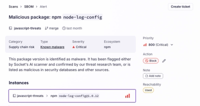
Introducing the Alert Details Page: A Better Way to Explore Alerts
Socket's new Alert Details page is designed to surface more context, with a clearer layout, reachability dependency chains, and structured review.
@nativescript-community/ui-material-bottomsheet
Advanced tools
Material Design Bottom Sheets slide up from the bottom of the screen to reveal more content. Bottom sheets integrate with the app to display supporting content or present deep-linked content from other apps.
Material Design's Bottom sheet component for NativeScript.
For NativeScript 7.0+
tns plugin add @nativescript-community/ui-material-bottomsheetFor NativeScript 6.x
tns plugin add nativescript-material-bottomsheetIf using tns-core-modules
tns plugin add nativescript-material-bottomsheet@2.5.4Be sure to run a new build after adding plugins to avoid any issues.
export interface BottomSheetOptions {
    view: string | ViewBase;
    // View instance to be shown in bottom sheet. Or the name of the module to load starting from the application root.
    context?: any;
    // Any context you want to pass to the view shown in bottom sheet. This same context will be available in the arguments of the shownInBottomSheet event handler.
    animated?: boolean;
    // An optional parameter specifying whether to show the sheet view with animation.
    dismissOnBackgroundTap?: boolean;
    // An optional parameter specifying whether to dismiss the sheet when clicking on background.
    dismissOnDraggingDownSheet?: boolean;
    // An optional parameter specifying whether to disable dragging the sheet to dismiss.
    dismissOnBackButton?: boolean;
    // An optional parameter that specifies whether to close the sheet when pressing the back button.
    closeCallback?: Function;
    //  A function that will be called when the view is closed. Any arguments provided when calling shownInBottomSheet.closeCallback will be available here.
    trackingScrollView?: string;
    // optional id of the scroll view to track
    transparent?: boolean;
    // optional parameter to make the bottomsheet transparent
    ignoreTopSafeArea?: boolean;
    // optional ios parameter to top safe area. Default is true
    ignoreBottomSafeArea?: boolean;
    // optional ios parameter to bottom safe area. Default is false
    disableDimBackground?: boolean;
    // optional parameter to remove the dim background
    skipCollapsedState?: boolean;
    // optional Android parameter to skip midway state when view is greater than 50%. Default is false
    peekHeight?: number;
    // optional parameter to set the collapsed sheet height. To work on iOS you need to set trackingScrollView. Also ensure the scrollView is taking the full height of the bottomsheet content. Otherwise the "full" height wont be computed correctly
    ignoreKeyboardHeight?: boolean;
    //(iOS only) A Boolean value that controls whether the height of the keyboard should affect the bottom sheet's frame when the keyboard shows on the screen. (Default: true)
    onChangeState?: onChangeStateBottomSheet;
    // One works to be called on the scroll of the sheet. Parameters: state (CLOSED, DRAGGING, DRAGGING, COLLAPSED) and slideOffset is the new offset of this bottom sheet within [-1,1] range. Offset increases as this bottom sheet is moving upward. From 0 to 1 the sheet is between collapsed and expanded states and from -1 to 0 it is between hidden and collapsed states.
    canTouchBehind?: boolean //(Android only) allows to interact with the screen behind the sheet. For it to work properly need dismissOnBackgroundTap set to true.
}
We need to do some wiring when your app starts, so open app.js and add this before creating any View/App/Frame:
var material = require("@nativescript-community/ui-material-bottomsheet");

material.install();
import { install } from "@nativescript-community/ui-material-bottomsheet";
install();
Uses the same kind of API as NativeScript Modals.
const modalViewModulets = "ns-ui-category/modal-view/basics/modal-ts-view-page";
export function openBottomSheet(args) {
    const mainView: Button = <Button>args.object;
    const context = { username: "test_username", password: "test" };
    const fullscreen = true;
    mainView.showBottomSheet({
        view: modalViewModulets,
        context,
        closeCallback: (username, password) => {
            bottom-sheet
            alert(`Username: ${username} : Password: ${password}`);
        },
        fullscreen
    });
}
import Vue from 'nativescript-vue';
import BottomSheetPlugin from '@nativescript-community/ui-material-bottomsheet/vue';
import { install } from "@nativescript-community/ui-material-bottomsheet";
install();

Vue.use(BottomSheetPlugin);
Then you can show a Vue component:
import MyComponent from 'MyComponent.vue';

//inside another Vue component
const options: VueBottomSheetOptions = {
    // props to be passed to MyComponent
    props: {
        someProp: true,
        anotherProp: false
    },
    // listeners to be connected to MyComponent
    on: {
        someEvent: (value) => { console.log(value) }
    }
};
this.$showBottomSheet(MyComponent, options)
import { createApp } from 'nativescript-vue';
import { BottomSheetPlugin } from '@nativescript-community/ui-material-bottomsheet/vue3';
import { install } from "@nativescript-community/ui-material-bottomsheet";
install();

const app = createApp(...);
app.use(BottomSheetPlugin);
Then you can show a Vue component:
import { useBottomSheet } from "@nativescript-community/ui-material-bottomsheet/vue3";
import MyComponent from 'MyComponent.vue';


const options: VueBottomSheetOptions = {
    // props to be passed to MyComponent
    props: {
        someProp: true,
        anotherProp: false
    },
    // listeners to be connected to MyComponent
    on: {
        someEvent: (value) => { console.log(value) }
    }
};

const { showBottomSheet, closeBottomSheet } = useBottomSheet()

showBottomSheet(MyComponent, options);
closeBottomSheet();
First you need to include the NativeScriptMaterialBottomSheetModule in your app.module.ts
import { NativeScriptMaterialBottomSheetModule} from "@nativescript-community/ui-material-bottomsheet/angular";

@NgModule({
    imports: [
        // This will call the install method and inject a global service called BottomSheetService
        NativeScriptMaterialBottomSheetModule.forRoot()
    ],
    ...
})
now you can show your custom BottomSheet using the BottomSheetService, this service follows the same implementation as the ModalService
import { Component,  ViewContainerRef } from '@angular/core';
import { BottomSheetOptions, BottomSheetService } from '@nativescript-community/ui-material-bottomsheet/angular';
import { ShareOptionsComponent } from './share-options.component';

@Component({
    selector: 'ns-item',
    templateUrl: './item.component.html',
    moduleId: module.id
})
export class ItemComponent {
    constructor(
        private bottomSheet: BottomSheetService,
        private containerRef: ViewContainerRef,
    ) {}

    showOptions() {
        const options: BottomSheetOptions = {
            viewContainerRef: this.containerRef,
            context: ['Facebook', 'Google', 'Twitter']
        };

        this.bottomSheet.show(ShareOptionsComponent, options).subscribe(result => {
            console.log('Option selected:', result);
        });
    }
}
<ListView
    [items]="options"
    (itemTap)="onTap($event)"
    separatorColor="white"
    class="list-group"
    height="200"
>
    <ng-template let-option="item">
        <Label
            class="list-group-item"
            [text]="option"
        ></Label>
    </ng-template>
</ListView>
import { Component, OnInit } from '@angular/core';
import { BottomSheetParams } from '@nativescript-community/ui-material-bottomsheet/angular';
import { ItemEventData } from '@nativescript/core/ui/list-view';

@Component({
    selector: 'ns-share-options',
    templateUrl: 'share-options.component.html'
})
export class ShareOptionsComponent implements OnInit {
    options: string[];

    // The BottomSheetService injects the BottomSheetParams to the component
    // so you can get the context and call the closeCallback method from the component displayed in your BottomSheet
    constructor(private params: BottomSheetParams) {}

    ngOnInit() {
        this.options = this.params.context;
    }

    onTap({ index }: ItemEventData) {
        this.params.closeCallback(this.options[index]);
    }
}
FAQs
Material Design Bottom Sheets slide up from the bottom of the screen to reveal more content. Bottom sheets integrate with the app to display supporting content or present deep-linked content from other apps.
We found that @nativescript-community/ui-material-bottomsheet demonstrated a healthy version release cadence and project activity because the last version was released less than a year ago. It has 19 open source maintainers collaborating on the project.
Did you know?

Socket for GitHub automatically highlights issues in each pull request and monitors the health of all your open source dependencies. Discover the contents of your packages and block harmful activity before you install or update your dependencies.

Product
Socket's new Alert Details page is designed to surface more context, with a clearer layout, reachability dependency chains, and structured review.

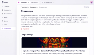
Product
Campaign-level threat intelligence in Socket now shows when active supply chain attacks affect your repositories and packages.

Research
Malicious PyPI package sympy-dev targets SymPy users, a Python symbolic math library with 85 million monthly downloads.