@nativescript/picker
A NativeScript plugin that provides ui element for picking an object/value from a list opened in a modal popup.
npm install @nativescript/picker
Usage
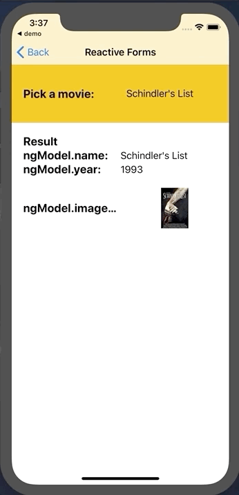
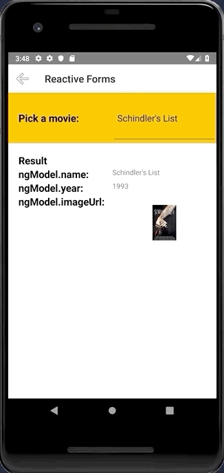
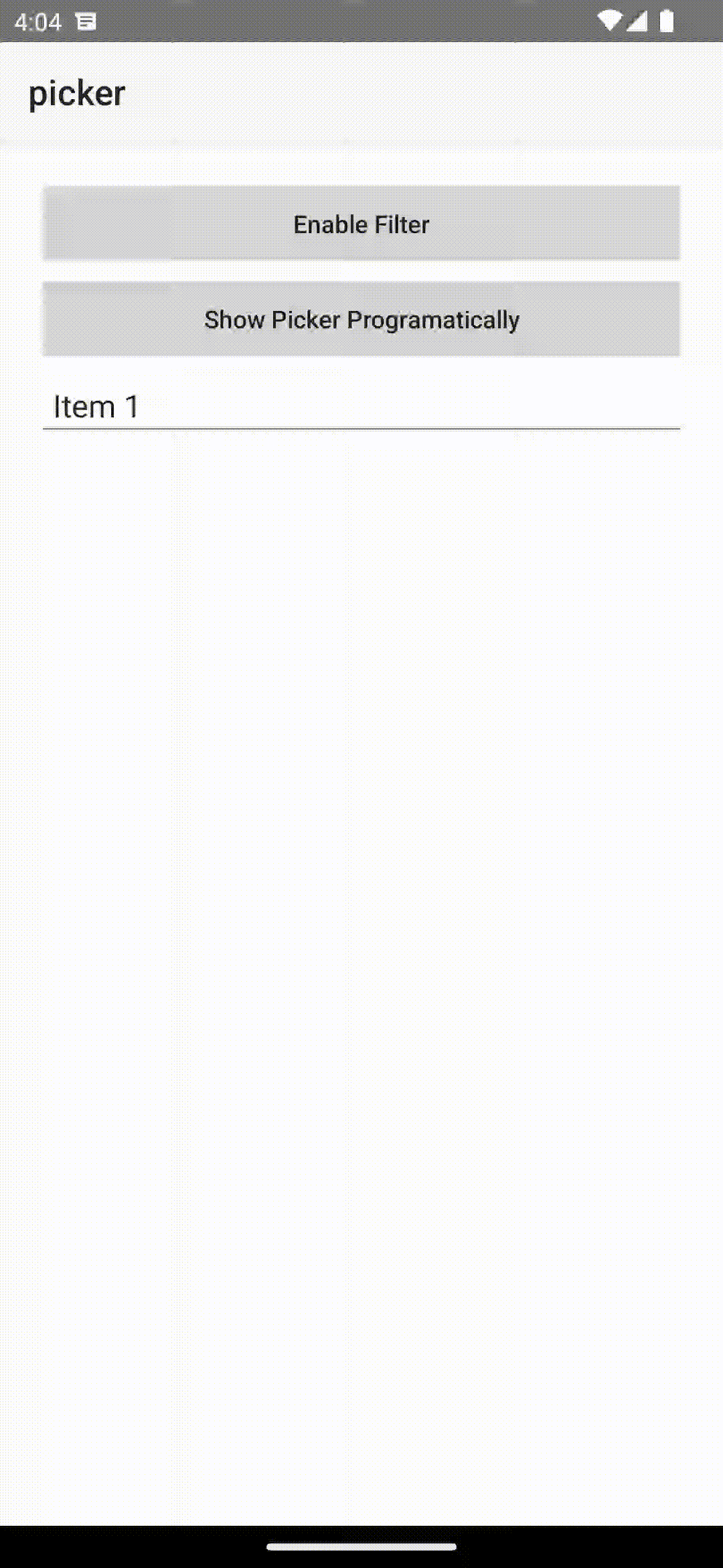
Screenshots
Configuration
No additional configuration required!
Usage
To use the PickerField in markup you need to:
- If you are developing a NativeScript Core app, you need to register the plugin namespace in the xml:
<Page
   xmlns="http://schemas.nativescript.org/tns.xsd"
   xmlns:picker="@nativescript/picker">
   <picker:PickerField hint="Click here" items="{{ pickerItems }}"/>
...
Or with item template
<picker:PickerField focusOnShow="true" filterKeyName="name" showFilter="{{ enableFilter }}" pickerTitle="Nativescript Picker" rowHeight="60" id="picker" hint="Click here" textField="name" padding="10" pickerOpened="{{ pickerOpened }}" pickerClosed="{{ pickerClosed }}"
                    items="{{ pickerItems }}" >
    <picker:PickerField.itemTemplate>
        <GridLayout height="60">
            <Label text="{{ name}}" textWrap="true" verticalAlignment="center" />

        </GridLayout>
    </picker:PickerField.itemTemplate>
</picker:PickerField>
Data filter
You can filter the data by setting showFilter="true", by default the plugin will look at the name key on the items source, but you can control this by setting filterKeyName="title" assuming your data Items contains a title key :
focus the search bar by setting focusOnShow="true"
let dataItems = new ObservableArray<{title: string, age: number}>();

for(let i = 0; i <= 30; i++) {
    dataItems.push({
        title: "Title" + i,
        age: 30 + i
    })
}
Get selected item
You need to register the callback from pickerClosed property pickerClosed="onSelectedItem" this will return the selectedIndex :
onSelectedItem(args) {
    let index = args.object?.selectedIndex;
    console.log('Picker > closed', index);
    console.log('Picker > closed', dataItems[index].title);
}
Style
You can targed the Picker via thoes css class ex: .pickerRootModal:
pickerRootModal targetting the ModalpickerPage targetting the PagepickerGridLayout targetting the GridLayout wraper that contains all the viewspickerListView targetting the ListViewpearchBarContainer targetting the search bar container StackLayoutpickerSearchBar targetting the search bar TextField
See here also
- If you are developing a NativeScript Angular app, you need to import the plugin module in the module of your component:
import { NativeScriptPickerModule } from "@nativescript/picker/angular";
...
@NgModule({
    imports: [
        NativeScriptPickerModule,
        ...
    ],
    ...
Then you will be able to declare the fields in the html of your component:
<PickerField hint="Click here" [items]="pickerItems"></PickerField>
Custom item template
You can also define your own item template in the list that is opened:
<PickerField hint="Click here" class="picker-field" textField="name" [pickerTitle]="'Select item from list'" [items]="items">
	<ng-template let-item="item">
		<GridLayout columns="auto, *" rows="auto, *">
			<Label text="Static text:" col="0"></Label>
			<Label [text]="item?.name" col="0" row="1"></Label>
			<Image [src]="item?.imageUrl" col="1" row="0" rowSpan="2"></Image>
		</GridLayout>
	</ng-template>
</PickerField>
With the following bindings:
interface IDataItem {
	name: string;
	id: number;
	description: string;
	imageUrl: string;
}

this.items = new ObservableArray<IDataItem>();
for (let i = 0; i < 20; i++) {
	this.items.push({
		name: 'Item ' + i,
		id: i,
		description: 'Description ' + i,
		imageUrl: 'https://picsum.photos/150/70/?random',
	});
}
- If you are developing a NativeScript Vue app, you need to install the plugin in you app.js file:
import Vue from 'nativescript-vue';
import PickerField from '@nativescript/picker/vue';

Vue.use(PickerField);
Then you will be able to declare the fields in the template of your component:
<PickerField hint="Click here"></PickerField>
Features
PickerField
The PickerField is a NativeScript TextField which means that any functionality the default TextField provides is also available in the PickerField component. The only difference is that by design it is in "read-only" mode, or simply put you cannot change its text by input or select that text. Changing the text of the PickerField is done by its main functionality which is opening a modal popup that shows a list of objects from which you can select one by tapping it.
API
pickerTitle | The title of the modal view. |
items | The source collection used to populate the list of the modal view. |
itemTemplate | Тhe UI template for list view items of the list of the modal view. |
modalAnimated | Optional parameter specifying whether to show the modal view with animation. |
textField | The 'property' of the object from the 'items' collection that will be used by the 'text' property of the PickerField. |
valueField | The 'property' of the object from the 'items' collection that will be used by when setting the 'selectedValue' property of the PickerField. |
selectedValue | The object selected from the list in the modal view. |
selectedIndex | The index of the object from the 'items' collection that has been selected from the list in the modal view. |
iOSCloseButtonPosition | The position of the 'close' button of the ActionBar of the modal view. |
iOSCloseButtonIcon | The icon of the 'close' button of the ActionBar of the modal view. |
androidCloseButtonPosition | The position of the 'close' button of the ActionBar of the modal view. |
androidCloseButtonIcon | The icon of the 'close' button of the ActionBar of the modal view. |
showFilter | Show the search bar |
filterKeyName | Set object key to use when filtering (see the doc) |
focusOnShow | Set the focus to the serach bar |
hintText | Set the hint of the search bar |
PickerField
The PickerField can be targeted in CSS through its element selector and additionally by setting a class. The PickerField also opens a modal window containing a Page element that contains an ActionBar and a ListView. This Page element can be targeted with the PickerPage selector and through it style all picker modals with selectors like PickerPage ActionBar and PickerPage ListView. In addition to that, if you set a class on the PickerField, it will be transferred on the PickerPage and with it you can style individual modals.


