Research
Security News
Lazarus Strikes npm Again with New Wave of Malicious Packages
The Socket Research Team has discovered six new malicious npm packages linked to North Korea’s Lazarus Group, designed to steal credentials and deploy backdoors.
@nextcloud/dialogs
Advanced tools
Nextcloud dialog helpers
npm i -S @nextcloud/dialogs
Since version 4.2 this package provides a Vue.js based file picker, so this package depends on @nextcloud/vue. So to not introduce style collisions stick with the supported versions:
@nextcloud/dialogs | @nextcloud/vue | Nextcloud server version |
|---|---|---|
| 5.x | 8.x | Nextcloud 28 and newer |
| 4.2+ | 7.12 | Nextcloud 25, 26, 27, 27.1 |
| 4.1 | any | any |
The styles for the components (Toasts and FilePicker) are provided in the style.css file.
So make sure that the @nextcloud/dialogs/style.css file is included in your app to make sure that the toasts or FilePicker have a proper styling applied.
import '@nextcloud/dialogs/style.css'
import { showMessage, showInfo, showSuccess, showWarning, showError } from '@nextcloud/dialogs'
import '@nextcloud/dialogs/style.css'
If you using @nextcloud/dialogs >= 4.0 you don't need any svg or scss loader in you projects anymore.
There are different toast styles available, that are exposed in separate functions:
showMessage('Message without a specific styling')
showInfo('Information')
showSuccess('Success')
showWarning('Warning')
showError('Error')
There are several options that can be passed in as a second parameter, like the timeout of a toast:
showError('This is an error shown without a timeout', { timeout: -1 })
A full list of available options can be found in the documentation.
There are two ways to spawn a FilePicker provided by the library:
This way you do not need to use Vue, but can programatically spawn a FilePicker. The FilePickerBuilder is included in the main entry point of this library, so you can use it like this:
import { getFilePickerBuilder } from '@nextcloud/dialogs'
const filepicker = getFilePickerBuilder('Pick plain text files')
    .addMimeTypeFilter('text/plain')
    .addButton({
        label: 'Pick',
        callback: (nodes) => console.log('Picked', nodes),
    })
    .build()

// You get the file nodes by the button callback, but also the pick yields the paths of the picked files
const paths = await filepicker.pick()
We also provide the @nextcloud/dialogs/filepicker.js entry point to allow using the Vue component directly:
<template>
  <FilePicker name="Pick some files" :buttons="buttons" />
</template>
<script setup lang="ts">
  import {
    FilePickerVue as FilePicker,
    type IFilePickerButton,
  } from '@nextcloud/dialogs/filepicker.js'
  import type { Node } from '@nextcloud/files'
  import IconShare from 'vue-material-design-icons/Share.vue'

  const buttons: IFilePickerButton[] = [
    {
      label: 'Pick',
      callback: (nodes: Node[]) => console.log('Picked', nodes),
      type: 'primary'
    },
    {
      label: 'Share',
      callback: (nodes: Node[]) => console.log('Share picked files', nodes),
      type: 'secondary',
      icon: IconShare,
    }
  ]
</script>
For testing all components provide data-testid attributes as selectors, so the tests are independent from code or styling changes.
data-testid | Intended purpose |
|---|---|
select-all-checkbox | The select all checkbox of the file list |
file-list-row | A row in the file list (tr), can be identified by data-filename |
row-checkbox | Checkbox for selecting a row |
row-name | Name of the row / file |
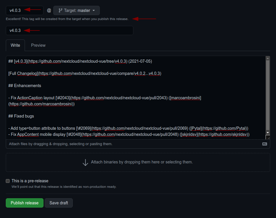
main or stableX;v4.0.1): git checkout -b v<version>;npm version patch --no-git-tag-version (npm version minor --no-git-tag-version if minor). This will return a new version name, make sure it matches what you expect;CHANGELOG.md;v4.0.1) and add the changelog content as description
v5.3.3 (2024-06-21)
shallowRef instead of shallowReactive because Vue 2 limitation@nextcloud/files is now aware of public shares also now have @nextcloud/sharing #1361 (susnux)FAQs
Nextcloud dialog helpers
The npm package @nextcloud/dialogs receives a total of 7,676 weekly downloads. As such, @nextcloud/dialogs popularity was classified as popular.
We found that @nextcloud/dialogs demonstrated a healthy version release cadence and project activity because the last version was released less than a year ago. It has 0 open source maintainers collaborating on the project.
Did you know?

Socket for GitHub automatically highlights issues in each pull request and monitors the health of all your open source dependencies. Discover the contents of your packages and block harmful activity before you install or update your dependencies.

Research
Security News
The Socket Research Team has discovered six new malicious npm packages linked to North Korea’s Lazarus Group, designed to steal credentials and deploy backdoors.

Security News
Socket CEO Feross Aboukhadijeh discusses the open web, open source security, and how Socket tackles software supply chain attacks on The Pair Program podcast.

Security News
Opengrep continues building momentum with the alpha release of its Playground tool, demonstrating the project's rapid evolution just two months after its initial launch.