Security News
curl Shuts Down Bug Bounty Program After Flood of AI Slop Reports
A surge of AI-generated vulnerability reports has pushed open source maintainers to rethink bug bounties and tighten security disclosure processes.
@ngspot/ngx-errors
Advanced tools

Reactive forms validation for pros
I very much missed the ng-messages directive from AngularJS, so I created a similar set of directives to use in Angular 2+.
In contrast to the directives from AngularJS, the directives in this library require passing the control name to the directive, instead of the control's errors.
This allowed me to hook into the status of control, such as its dirty state, and display validation messages according to that status.
The design of this library promotes less boilerplate code, which keeps your templates clean.
There are a few rules that the library follows to determine when to display errors:
touched.
formIsSubmitted, but dealing with a control that does not have a parent form, the config for this control will fall back to touched.For more info about this see Advanced configuration.
npm install @ngspot/ngx-errors
yarn add @ngspot/ngx-errors
Import library into application module:
import { NgxErrorsModule } from '@ngspot/ngx-errors'; // <-- import the module

@NgModule({
  imports: [
    NgxErrorsModule, // <-- include imported module in app module
  ],
})
export class MyAppModule {}
@Component({
  selector: 'my-component',
  template: `
    <form [formGroup]="myForm">
      <input formControlName="email" type="email" />

      <div ngxErrors="email">
        <div ngxError="required">Email is required</div>
      </div>
    </form>
  `,
})
export class MyComponent implements OnInit {
  myForm: FormGroup;

  constructor(private fb: FormBuilder) {
    this.myForm = this.fb.group({
      email: ['', Validators.required],
    });
  }
}
@Component({
  selector: 'my-component',
  template: `
    <input [formControl]="email" placeholder="Email" type="email" />

    <div [ngxErrors]="email">
      <div ngxError="required">Email is required</div>
    </div>
  `,
})
export class MyComponent implements OnInit {
  email = new FormControl('', Validators.required);
}
@Component({
  selector: 'my-component',
  template: `
    <input [(ngModel)]="email" #emailModel="ngModel" required type="email" />

    <div [ngxErrors]="emailModel.control">
      <div ngxError="required">Email is required</div>
    </div>
  `,
})
export class MyComponent implements OnInit {
  email: string;
}
Configure when to show messages for whole module by using .configure() method:
@NgModule({
  imports: [
    NgxErrorsModule.configure({ ... }) // <- provide configuration here
  ],
})
export class MyAppModule {}
Alternatively, use dependency injection to provide configuration at a component level:
import { ErrorsConfiguration, IErrorsConfiguration } from '@ngspot/ngx-errors';

const myConfig: IErrorsConfiguration = { ... }; // <- specify config

@Component({
  ...
  providers: [
    { provide: ErrorsConfiguration, useValue: myConfig }
  ]
})
export class MyComponent { }
Here's the configuration object interface:
export interface IErrorsConfiguration {
  /**
   * Configures when to display an error for an invalid control. Options that
   * are available by default are listed below. Note, custom options can be
   * provided using CUSTOM_ERROR_STATE_MATCHERS injection token.
   *
   * `'touched'` - *[default]* shows an error when control is marked as touched. For example, user focused on the input and clicked away or tabbed through the input.
   *
   * `'dirty'` - shows an error when control is marked as dirty. For example, when user has typed something in.
   *
   * `'touchedAndDirty'` - shows an error when control is marked as both - touched and dirty.
   *
   * `'formIsSubmitted'` - shows an error when parent form was submitted.
   */
  showErrorsWhenInput: string;

  /**
   * The maximum amount of errors to display per ngxErrors block.
   */
  showMaxErrors?: number;
}
By default, the following error state matchers for displaying errors can be used: 'touched', 'dirty', 'touchedAndDirty', 'formIsSubmitted'.
Custom error state matchers can be added using the CUSTOM_ERROR_STATE_MATCHERS injection token.
First, define the new error state matcher:
@Injectable({ providedIn: 'root' })
export class MyAwesomeErrorStateMatcher implements ErrorStateMatcher {
  isErrorState(
    control: AbstractControl | null,
    form: FormGroupDirective | NgForm | null
  ): boolean {
    return !!(control && control.value && /* my awesome logic is here */);
  }
}
Second, use the new error state matcher when providing CUSTOM_ERROR_STATE_MATCHERS in the AppModule:
providers: [
  {
    provide: CUSTOM_ERROR_STATE_MATCHERS,
    deps: [MyAwesomeErrorStateMatcher],
    useFactory: (myAwesomeErrorStateMatcher: MyAwesomeErrorStateMatcher) => {
      return {
        myAwesome: myAwesomeErrorStateMatcher,
      };
    },
  },
];
Now the string 'myAwesome' can be used either in the showErrorsWhenInput property of the configuration object or in the [showWhen] inputs.
In the example above, notice the use of the
ErrorStateMatcherclass. This class actually comes from@angular/material/core. Under the hood, @ngspot/ngx-errors uses theErrorStateMatcherclass to implement all available error state matchers allowing @ngspot/ngx-errors to integrate with Angular Material inputs smoothly.
Looking at the documentation, Angular Material inputs have their own way of setting logic for determining if the input needs to be highlighted red or not. If custom behavior is needed, a developer needs to provide appropriate configuration. @ngspot/ngx-errors configures this functionality for the developer under the hood.
You can override the configuration specified at the module level by using [showWhen] input on [ngxErrors] and on [ngxError] directives:
<div ngxErrors="control" showWhen="touchedAndDirty">
  <div ngxError="required" showWhen="dirty">
    This will be shown when control is dirty
  </div>

  <div ngxError="min">This will be shown when control is touched and dirty</div>
</div>
Often there's a requirement to submit a form when user presses Enter. Under the hood ngxError relies on form submit event to display errors. That is why it's important to trigger form submission properly rather than binding (keyup.enter) event to the method in your component class directly. Here's how to do that:
<form
  [formGroup]="form"
  (ngSubmit)="yourMethod()"
  (keyup.enter)="submitBtn.click()"
>
  ...

  <button #submitBtn>Submit</button>
</form>
Each control error in Angular may contain additional details. For example, here's what min error looks like:
const control = new FormControl(3, Validators.min(10));
const error = control.getError('min');
console.log(error); // prints: { min: 10, actual: 3 }
You can easily get access to these details in the template:
<div ngxErrors="control">
  <div ngxError="min" #myMin="ngxError">
    Number should be greater than {{myMin.err.min}}. You've typed
    {{myMin.err.actual}}.
  </div>
</div>
In the example above we're assigning a variable myMin (can be anything you want) to the directive ngxError. Using this variable we can access the context of the directive. The directive has property err that contains all the error details.
Include something similar to the following in global CSS file:
[ngxerrors] {
  color: red;
}
ngx-errors library provides a couple of misc function that ease your work with forms.
Makes it easy to trigger validation on the control, that depends on a value of a different control
Example with using FormBuilder:
import { dependentValidator } from '@ngspot/ngx-errors';

export class LazyComponent {
  constructor(fb: FormBuilder) {
    this.form = fb.group({
      password: ['', Validators.required],
      confirmPassword: [
        '',
        dependentValidator<string>({
          watchControl: (f) => f!.get('password')!,
          validator: (passwordValue) => isEqualToValidator(passwordValue),
        }),
      ],
    });
  }
}

function isEqualToValidator<T>(compareVal: T): ValidatorFn {
  return function (control: AbstractControl): ValidationErrors | null {
    return control.value === compareVal
      ? null
      : { match: { expected: compareVal, actual: control.value } };
  };
}
The dependentValidator may also take condition. If provided, it needs to return true for the validator to be used.
const controlA = new FormControl('');
const controlB = new FormControl(
  '',
  dependentValidator<string>({
    watchControl: () => controlA,
    validator: () => Validators.required,
    condition: (val) => val === 'fire',
  })
);
In the example above, the controlB will only be required when controlA value is 'fire'
As of today, the FormControl does not provide a way to subscribe to the changes of touched status. This function lets you do just that:
* const touchedChanged$ = extractTouchedChanges(formControl);
As of today, the FormControl does not provide a way to mark the control and all its children as dirty. This function lets you do just that:
markDescendantsAsDirty(formControl);
One time config: git config --global push.followTags true
npm run test:libnpm run commit and choose fix or featurenpm run releasenpm run build:libnpm publishgit pushbuild:lib - Builds the librarytest:lib - Runs teststest:lib:headless - Runs tests in headless mode with Chromerelease - Releases a new version; this will bump the library's version and update the CHANGE_LOG file based on the commit messagerelease:first - Creates the first releasecommit - Creates a new commit message based on Angular commit message conventioncontributors:add - Adds a new contributor to the README fileMIT © Dmitry Efimenko
Thanks goes to these wonderful people (emoji key):
Dmitry A. Efimenko 💻 🎨 📖 🤔 | Ana Boca 📖 |
This project follows the all-contributors specification. Contributions of any kind welcome!
FAQs
Unknown package
The npm package @ngspot/ngx-errors receives a total of 1,971 weekly downloads. As such, @ngspot/ngx-errors popularity was classified as popular.
We found that @ngspot/ngx-errors demonstrated a healthy version release cadence and project activity because the last version was released less than a year ago. It has 1 open source maintainer collaborating on the project.
Did you know?

Socket for GitHub automatically highlights issues in each pull request and monitors the health of all your open source dependencies. Discover the contents of your packages and block harmful activity before you install or update your dependencies.

Security News
A surge of AI-generated vulnerability reports has pushed open source maintainers to rethink bug bounties and tighten security disclosure processes.

Product
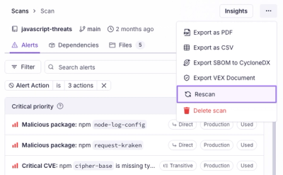
Scan results now load faster and remain consistent over time, with stable URLs and on-demand rescans for fresh security data.

Product
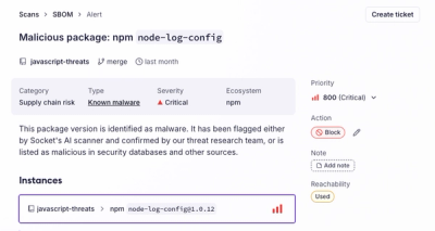
Socket's new Alert Details page is designed to surface more context, with a clearer layout, reachability dependency chains, and structured review.