
Product
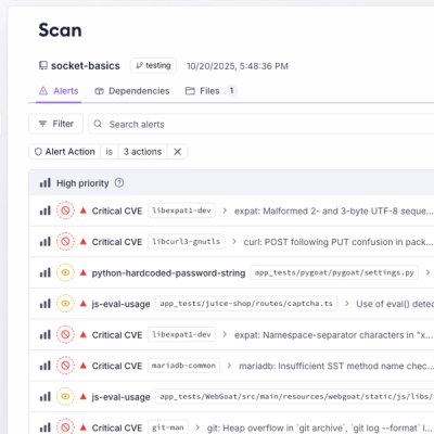
Introducing Webhook Events for Pull Request Scans
Add real-time Socket webhook events to your workflows to automatically receive pull request scan results and security alerts in real time.
By Jeppe Hasseriis - Oct 22, 2025
@ni/nimble-tokens
Advanced tools
ni | nimble | tokens

NI base design tokens. Design tokens are primitive elements of component style like color, typography, and spacing. These should generally not be consumed directly by applications. See below for guidance.
If you are using one of the following frameworks you should consume tokens via components implemented in the following libraries. These libraries provide styled components that use the design tokens to implement several color themes.
The above libraries also offer a theming system which is independent of other components from the library. Adopting this theming system can be a cheaper way to update a legacy application to approximate the NI brand without the development and testing burden of adopting a new component library.
Applications should typically use this theming system rather than depending on nimble-tokens directly. See the theming documentation in nimble-components for more information.
In limited special cases, you may consume base Nimble tokens directly. This is only recommended in cases where the theme-aware tokens don't work (for example desktop applications or legacy browsers that don't support custom elements) as these tokens are unaware of themes and don't contain guidance mapping them to specific component parts.
To add the Nimble tokens package to your application, install it from the public NPM registry by running npm install @ni/nimble-tokens.
You can view the available color tokens here. To understand their meaning, explore other pages of the document in Specs Mode (click the </> icon on the right side) and view how color tokens are applied to Nimble components.
The tokens are available in several formats:
Tokens like colors, font families, and spacing are available as CSS and SCSS variables.
@import url('@ni/nimble-tokens/dist/styledictionary/css/variables.css'); (replacing css with scss as needed).body { background-color: var(--ni-nimble-base-white); }
Tokens like colors, font families, and spacing are also available as JavaScript and TypeScript string constants.
#ff8126Roboto, Microsoft YaHei, Hiragino Kaku Gothic Pro, sans-serif12pxIn your application JavaScript or TypeScript code, import the token strings you want to use:
import { White } from '@ni/nimble-tokens/dist/styledictionary/js/tokens';
Icons are included in the nimble-tokens package, but (like tokens) icons should primarily consumed through framework-specific components.
Nimble provides font definitions for every font family used by a token. To ensure these fonts are available to your application, include @ni/nimble-tokens/dist/fonts/css/fonts.css in your application code.
Follow the instructions in CONTRIBUTING.md to modify this library.
FAQs
Design tokens for the NI Nimble Design System
The npm package @ni/nimble-tokens receives a total of 649 weekly downloads. As such, @ni/nimble-tokens popularity was classified as not popular.
We found that @ni/nimble-tokens demonstrated a healthy version release cadence and project activity because the last version was released less than a year ago. It has 2 open source maintainers collaborating on the project.
Did you know?

Socket for GitHub automatically highlights issues in each pull request and monitors the health of all your open source dependencies. Discover the contents of your packages and block harmful activity before you install or update your dependencies.
Product
Add real-time Socket webhook events to your workflows to automatically receive pull request scan results and security alerts in real time.

Research
The Socket Threat Research Team uncovered malicious NuGet packages typosquatting the popular Nethereum project to steal wallet keys.
Product
A single platform for static analysis, secrets detection, container scanning, and CVE checks—built on trusted open source tools, ready to run out of the box.