Research
Malicious NuGet Packages Typosquat Nethereum to Exfiltrate Wallet Keys
The Socket Threat Research Team uncovered malicious NuGet packages typosquatting the popular Nethereum project to steal wallet keys.
@one-platform/opc-menu-drawer
Advanced tools
opc-menu-drawer is a customizable drawer web component which shows the menu's and user profile
Opc-menu-drawer is a webcomponent developed using Lit elements for Red Hat One Platform. It's a customizable drawer component that contains header, menu buttons, links.
Opc-menu-drawer is implemented under Red Hat design guidelines. Therefore the component uses Red Hat official font. This can be easily imported with google cdn at the top of HTML document.
<link rel="preconnect" href="https://fonts.googleapis.com" />
<link rel="preconnect" href="https://fonts.gstatic.com" crossorigin />
<link
href="https://fonts.googleapis.com/css2?family=Red+Hat+Display&display=swap"
rel="stylesheet"
/>
<link
href="https://fonts.googleapis.com/css2?family=Red+Hat+Text&display=swap"
rel="stylesheet"
/>
Opc-menu-drawer contains mainly two component. A backdrop and a drawer component expanded from rightside of the screen. The drawer can be controlled using isOpen attribute. Backdrop color can be controlled by --opc-menu-drawer__backdrop-color css variable.
The menu is the bottom element seen on the drawer body. It contains a collapsable box with a title from the attribute menuTitle and an optional slot avatar to provide an avatar of the user. The header also accepts buttons through the slot menu that provide primary actions of the drawer, which is revealed by expanding the header title. The header container could be replaced with the slot header.
<opc-menu-drawer menuTitle="Akhil Mohan">
  <span slot="avatar">AM</span>
  <button slot="menu">Log In</button>
</opc-menu-drawer>
document.querySelector('opc-menu-drawer').open();
The drawer component accepts links grouped into categories for users to navigate easily. Links can be set via the links attribute. When the links are more than 5 for a group, the rest of them will be hidden in a collapsable box. It can be revealed by clicking on the show more button for that category.
The default slot gets passed to the drawer body. It will be shown after the links section if links are provided.
<opc-menu-drawer menuTitle="Akhil Mohan">
  <span slot="avatar">AM</span>
  <div>
    <h6>Main Body</h6>
  </div>
</opc-menu-drawer>
const links = [
  {
    title: 'BUILT-IN SERVICES',
    links: [
      { name: 'Blog', href: '#' },
      { name: 'Documentation', href: '#', isDisabled: true },
      { name: 'Something #1', href: '#' },
      { name: 'Something #2', href: '#' },
      { name: 'Something #3', href: '#' },
      { name: 'Something #4', href: '#' },
      { name: 'Something #5', href: '#' },
      { name: 'Something #6', href: '#' },
    ],
  },
  {
    title: 'BUILT-IN SERVICES',
    links: [
      { name: 'blog', href: '#' },
      { name: 'Documentation', href: '#' },
    ],
  },
];

document.querySelector('opc-menu-drawer').links = links;
document.querySelector('opc-menu-drawer').open();
The footer component will be at the bottom of the drawer body. It can be added using the slot footer. When the contents of the drawer cause overflow, the footer will be at the bottom.
<opc-menu-drawer menuTitle="Akhil Mohan">
  <span slot="avatar">AM</span>
  <span slot="footer">2021 Red Hat </span>
</opc-menu-drawer>
document.querySelector('opc-menu-drawer').open();
There are total 5 slots available in this component
Default slot: Default slot will be component inside body of the drawer componenent.
header: Container component that contains the header component.
header-body: Body component for the header. Eg: Filter chips can be placed here
avatar: The avatar component on drawer header.
menu: The menu button on expanding drawer header.
footer: Footer component of the drawer body.
links
Arraydocument.querySelector("opc-menu-drawer").links = {
title: "BUILT-IN SERVICES",
links: [
{ name: "Blog#2", href: "#", isDisabled: true },
{ name: "Documentation#1", href: "#" },
],
},;
title
StringMenu <opc-menu-drawer title="Menu Drawer"></opc-menu-drawer isOpen>
menuTitle
String'' <opc-menu-drawer menuTitle="Akhil Mohan"></opc-menu-drawer isOpen>
isOpen
Booleanfalsedocument.querySelector('opc-menu-drawer').isOpen;
open
document.querySelector('opc-menu-drawer').open();
close
document.querySelector('opc-menu-drawer').close();
toggle
document.querySelector('opc-menu-drawer').toggle();
There are two events emitted by opc-menu-drawer emitter when drawer state changes.
opc-menu-drawer:openDispatched when drawer opens.
Example:
document
  .querySelector('opc-menu-drawer')
  .addEventListener('opc-menu-drawer:open', function (event) {
    alert('drawer opened');
  });
opc-menu-drawer:closeDispatched when drawer closed.
Example:
document
  .querySelector('opc-menu-drawer')
  .addEventListener('opc-menu-drawer:close', function (event) {
    alert('drawer closed');
  });
| CSS Variable name | Value |
|---|---|
--opc-menu-drawer__backdrop-color | #00000060 |
--opc-menu-drawer__btn-hover-color | #efefef |
--opc-menu-drawer__z-index | 9 |
--opc-menu-drawer__width | 360px |
--opc-menu-drawer__top | 0px |
--opc-menu-drawer__right | #000 |
--opc-menu-drawer__menu-padding | 8px 21px |
--opc-menu-drawer__link-group-title-color | #6a6e73 |
--opc-menu-drawer__transition--default | 120ms ease-in-out |
npm install
npm install --save @one-platform/opc-menu-drawer
import '@one-platform/opc-menu-drawer/dist/opc-menu-drawer';
<opc-menu-drawer> </opc-menu-drawer>
CUSTOM_ELEMENTS_SCHEMA and import the componentimport { NgModule, CUSTOM_ELEMENTS_SCHEMA } from '@angular/core';
import '@one-platform/opc-menu-drawer/dist/opc-menu-drawer';
@NgModule({
declarations: [AppComponent],
imports: [BrowserModule],
schemas: [CUSTOM_ELEMENTS_SCHEMA],
providers: [],
bootstrap: [AppComponent],
})
export class AppModule {}
<opc-menu-drawer> </opc-menu-drawer>
import '@one-platform/opc-menu-drawer/dist/opc-menu-drawer';
<opc-menu-drawer> </opc-menu-drawer>
npm run dev opc-menu-drawer
npm run build opc-menu-drawer
npm run test
FAQs
Did you know?

Socket for GitHub automatically highlights issues in each pull request and monitors the health of all your open source dependencies. Discover the contents of your packages and block harmful activity before you install or update your dependencies.

Research
The Socket Threat Research Team uncovered malicious NuGet packages typosquatting the popular Nethereum project to steal wallet keys.

Product
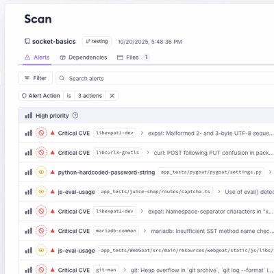
A single platform for static analysis, secrets detection, container scanning, and CVE checks—built on trusted open source tools, ready to run out of the box.

Product
Socket is launching experimental protection for the Hugging Face ecosystem, scanning for malware and malicious payload injections inside model files to prevent silent AI supply chain attacks.