Product
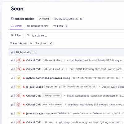
Unify Your Security Stack with Socket Basics
A single platform for static analysis, secrets detection, container scanning, and CVE checks—built on trusted open source tools, ready to run out of the box.
@paprika/collapsible
Advanced tools
Collapsible component, allows the user to expand and collapse some enclosed content.
Collapsible component, allows the user to expand and collapse some enclosed content.
yarn add @paprika/collapsible
or with npm:
npm install @paprika/collapsible
| Prop | Type | required | default | Description |
|---|---|---|---|---|
| a11yText | string | false | null | Descriptive a11y text for assistive technologies. By default, text from children node will be used. |
| children | node | false | null | Body content of the collapsible. |
| iconAlign | [ "left", "right"] | false | "left" | Set's icon alignment left or right. |
| iconCollapse | node | false | Sets RightArrowIcon if true. | |
| iconExpand | node | false | Sets DownArrowIcon if true. | |
| isCollapsed | bool | false | true | State of the collapsible. |
| isDisabled | bool | false | false | If the collapsible is disabled. |
| hasOnlyIconToggle | bool | false | false | |
| label | node | true | - | Sets the label that will display in the collapsible |
| onClick | func | false | () => {} | Callback to be executed when the button is clicked or activated by keyboard. |
| triggerAriaDescribedby | string | false | null | aria-describedby on the trigger element. |
import Collapsible from "@paprika/collapsible";
const [isCollapsed, setIsCollapsed] = React.useState(false);
const yourComponent = () => {
return (
<Collapsible
a11yText="collapsible section"
isCollapsed={isCollapsed}
isDisabled={false}
label="Click me to show/hide the content"
iconAlign="left"
onClick={() => setIsCollapsed(!isCollapsed)}
>
<p>
<strong>Content</strong> – children of the <Collapsible> is hidden while the collapsible is collapsed, and
visible with it is expanded.
</p>
</Collapsible>
);
};
export default yourComponent;
FAQs
Collapsible component, allows the user to expand and collapse some enclosed content.
The npm package @paprika/collapsible receives a total of 1,744 weekly downloads. As such, @paprika/collapsible popularity was classified as popular.
We found that @paprika/collapsible demonstrated a healthy version release cadence and project activity because the last version was released less than a year ago. It has 4 open source maintainers collaborating on the project.
Did you know?

Socket for GitHub automatically highlights issues in each pull request and monitors the health of all your open source dependencies. Discover the contents of your packages and block harmful activity before you install or update your dependencies.

Product
A single platform for static analysis, secrets detection, container scanning, and CVE checks—built on trusted open source tools, ready to run out of the box.

Product
Socket is launching experimental protection for the Hugging Face ecosystem, scanning for malware and malicious payload injections inside model files to prevent silent AI supply chain attacks.

Research
/Security News
The Socket Threat Research Team uncovered a coordinated campaign that floods the Chrome Web Store with 131 rebranded clones of a WhatsApp Web automation extension to spam Brazilian users.