Product
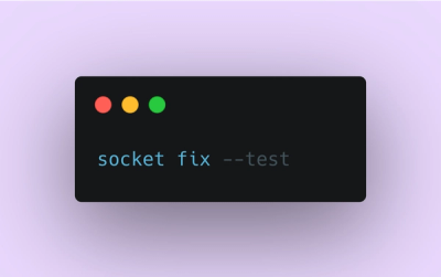
Introducing Socket Fix for Safe, Automated Dependency Upgrades
Automatically fix and test dependency updates with socket fix—a new CLI tool that turns CVE alerts into safe, automated upgrades.
By John-David Dalton - Apr 25, 2025
@pega/custom-ui-components
Advanced tools
This project provides you with an environment to extend Constellation by giving you tools to create and publish custom components that are not available from the Constellation installation.
Ensure you have access to the following in your system:
Pega Infinity Server version 8.7 and above
Git version 2.30 and above
System node version 14 and above
System npm version 6 and above
Initialize the project by performing the following procedure in a terminal:
Enter the following commands to create a directory for your component and connect to the directory.
mkdir <component_name>
cd <component_name>
Enter the following command to initialize the project. npx @pega/custom-ui-components init
If prompted, enter y to install the Custom UI Components package.
You will then be asked to set up the project by entering the required details.
Enter the following details:
mycustomcomponentscustomorg1.0.0This project is intended to create and publish a custom component.https://git.custom-components.io/custom-cc.gitMichelleThe workspace is now set up to create custom components and publish them to the server.
Create custom components using the following procedure:
Enter the following command to create a component: npm run create. You will then be asked to enter or review the following details of the component:
customcomp0custom componentbasic0.0.1FieldTextThis is a customized searchbox that filters data.
The component is created in the following path: /Users/your_user_name/project_name/src/components/component_name
You can also pre-configure the values for the above options in a tasks.config.json file as shown below.{
"component": {
"library": "basic",
"type": "field",
"subtype": "text",
"description": "basic field for capturing textual data",
"icon": "basic-field-text.svg"
}
}
Note: Alternatively, you can enter the following command to skip entering the details of the component now and can manually enter the details in the config.json file after the component is created:
npm run create <enter_component_name>
A src/components folder is created and the necessary files required to build the component are initialized as seen below.
├── src
   ├── components
        ├── <component_name>
            ├── index.js
            ├── demo.stories.js
            ├── config.json
The index.js file contains the actual component rendering logic. The demo.stories.js file contains the demo that can be viewed in the storybook. The config.json file contains the mapping of properties for configuring the auto generated property panel. This property panel appears in AppStudio when an application is being authored to use the custom component.
Enter the following command to start the storybook to view the demo. npm start
Modify the source files to build your own component. You can also install and import third-party libraries if required for your component.
The custom component is now created. We use the information provided to create uniquely namespaced components in this convention - <organization>_<library>_<component name>.
Before we publish the custom component to the Pega Infinity Server, authorize the user to access the resources in the Pega Infinity Server.
Note: It is required that you configure a value for clientId, clientSecret, and accessTokenUri.
Login to Pega Infinity Server
Navigate to Records / Security / OAuth 2.0 Client Registration landing page and open the PegaApp_<your_app_name> record.
Click Regenerate Client Secret
Download the Client Credentials (as the Client ID, Client Secret, and Access token endpoint will be needed)
Enable "Password credentials" checkbox and save the record.
Update the the the service-config object in the task.config.json file with these downloaded values
"server-config": {
    "server": "https://127.0.0.1:8080/prweb",
    "user": "customcomponentoperator",
    "password": "pwd",
    "clientId": "<mention client ID here>",
    "clientSecret": "<mention client secret here>",
    "accessTokenUri": "https://127.0.0.1:8080/prweb/PRRestService/oauth2/v1/token"
}
Enter the following command to initiate authorization.
npm run authenticate
The user is now authorized and can proceed to either list or publish the components.
View the available components in the local machine or the server.
Enter the following command to list custom components:
npm run list
You will then be asked to enter the following details to set up the oauth 2.0 token:
Serverhttps://127.0.0.1:8080/prwebcustomcomponentoperatorpwd<mention client ID here><mention client secret here>https://127.0.0.1:8080/prweb/PRRestService/oauth2/v1/tokenThe custom components will now be listed in the terminal.
Publish the finalized custom components changes to Pega Infinity Server so that it can be discoverable in view authoring.
Enter the following command to publish custom components to Pega Infinity Server: npm run publish. You will then be asked to enter the following details:
You can also pre-configure the values for the above options in a tasks.config.json file as shown below.
{
    "server-config": {
        "server": "http://127.0.0.1:8080/prweb",
        "user": "customcomponentoperator",
        "password": "pwd",
        "rulesetName": "TestPega-C11nGall",
        "rulesetVersion": "01-01-03",
        "sourceOfComponents": "Server",
        "devBuild": false,
    }
}
When the component is successfully published, you can use the newly published component in App Studio's view authoring.
Note: The Rule-UI-Component instance (with component name) is created on the Pega Infinity Server after publishing the component.
View custom components in a storybook by performing the following procedure:
Enter the following command to open the project.
cd <enter your project's name>
Enter the following command to start the storybook in development mode.
npm start
The storybook is launched in a browser where you can view the components working in isolation.
FAQs
Utility for building custom UI components
The npm package @pega/custom-ui-components receives a total of 10 weekly downloads. As such, @pega/custom-ui-components popularity was classified as not popular.
We found that @pega/custom-ui-components demonstrated a not healthy version release cadence and project activity because the last version was released a year ago. It has 3 open source maintainers collaborating on the project.
Did you know?

Socket for GitHub automatically highlights issues in each pull request and monitors the health of all your open source dependencies. Discover the contents of your packages and block harmful activity before you install or update your dependencies.
Product
Automatically fix and test dependency updates with socket fix—a new CLI tool that turns CVE alerts into safe, automated upgrades.

Security News
CISA denies CVE funding issues amid backlash over a new CVE foundation formed by board members, raising concerns about transparency and program governance.
Product
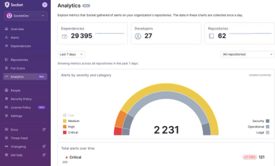
We’re excited to announce a powerful new capability in Socket: historical data and enhanced analytics.