Product
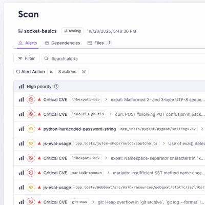
Unify Your Security Stack with Socket Basics
A single platform for static analysis, secrets detection, container scanning, and CVE checks—built on trusted open source tools, ready to run out of the box.
@pixleight/tailwindcss-aspect-ratio
Advanced tools
This plugin generates utility classes to help create responsive elements that will maintain a specific aspect ratio. Useful for embedded content like videos from YouTube.
# Using npm
npm install @pixleight/tailwindcss-aspect-ratio
# Using Yarn
yarn add @pixleight/tailwindcss-aspect-ratio
// tailwind.config.js

module.exports = {
  plugins: [
    // ...
    require('@pixleight/tailwindcss-aspect-ratio'),
    // ...
  ]
}
.aspect-ratio generates the initial styling, with additional classes for setting the width and height ratios.
The .aspect-ratio-item class also styles the child element to fit the container (this could also be achieved with .absolute.inset-0)
This plugin comes with ratios from 1–16 for both width and height. Using both of these classes along with the .aspect-ratio allows you customize the aspect ratio however you like without needing to configure new classes.
<div class="aspect-ratio aspect-ratio-w-16 aspect-ratio-h-9">
  <div class="aspect-ratio-item">
    <iframe src="https://www.youtube.com/embed/dQw4w9WgXcQ"></iframe>
  </div>
</div>
Generates:
.aspect-ratio: {
  --aspect-ratio-w: 1;
  --aspect-ratio-h: 1;
  position: relative;
  height: 0;
  overflow: hidden;
  padding-bottom: calc(var(--aspect-ratio-h) / var(--aspect-ratio-w) * 100%);
}

.aspect-ratio-item: {
  position: absolute;
  width: 100%;
  height: 100%;
}

.aspect-ratio-w-16 {
  --aspect-ratio-w: 16;
}

.aspect-ratio-h-9 {
  --aspect-ratio-h: 9;
}
We also include some helpful defaults for common sizes:
.aspect-ratio-16/9
.aspect-ratio-video.aspect-ratio-1/1
.aspect-ratio-square.aspect-ratio-4/3.aspect-ratio-3/2Sizes can be configured in the theme section of your Tailwind config file:
// tailwind.config.js

module.exports = {
  // ...
  theme: {
    // ...
    extend: {
      // ...
      aspectRatio: {
        '21/9': [21, 9], // Generates `.aspect-ratio-21/9` for a 21:9 ratio

        /**
         * Integers in the `w` and `h` arrays generate classes for that dimension and ratio:
         * .aspect-ratio-{d}-{r}
         */
        w: [
          21,
          30,
        ],
        h: [
          19,
          22,
        ]
      },
      // ...
    },
  },
  // ...
}
Because values in the theme.extend section are only merged shallowly, you will need to include the values from the plugin's default theme if you wish to add more ratios to w or h instead of replacing them:
// tailwind.config.js

const aspectRatioTheme = require('@pixleight/tailwindcss-aspect-ratio/defaultTheme')

module.exports = {
  // ...
  theme: {
    // ...
    extend: {
      // ...
      aspectRatio: {
        w: [
          ...aspectRatioTheme.w, // include ratios from 1–16
          21,
        ],
      },
      // ...
    },
  },
  // ...
}
FAQs
An aspect ratio plugin for Tailwind CSS
We found that @pixleight/tailwindcss-aspect-ratio demonstrated a not healthy version release cadence and project activity because the last version was released a year ago. It has 1 open source maintainer collaborating on the project.
Did you know?

Socket for GitHub automatically highlights issues in each pull request and monitors the health of all your open source dependencies. Discover the contents of your packages and block harmful activity before you install or update your dependencies.

Product
A single platform for static analysis, secrets detection, container scanning, and CVE checks—built on trusted open source tools, ready to run out of the box.

Product
Socket is launching experimental protection for the Hugging Face ecosystem, scanning for malware and malicious payload injections inside model files to prevent silent AI supply chain attacks.

Research
/Security News
The Socket Threat Research Team uncovered a coordinated campaign that floods the Chrome Web Store with 131 rebranded clones of a WhatsApp Web automation extension to spam Brazilian users.