
Kendo UI for Angular Date Inputs Package (DatePicker, TimePicker, DateInput, DateRangePicker, DateTimePicker, Calendar, and MultiViewCalendar Components)
- This package is part of Kendo UI for Angular—a commercial UI library.
- To use this package, you must install a license key file, whether you are on a paid license or a 30-day free trial. To receive a license key, either purchase a license or start a free trial.
- Adding a valid license key file ensures a seamless experience during the trial period—no watermarks, no warnings, and full access to all components and features.
- Trial users can register for a free license key file. Without it, your trial may be interrupted by visual indicators or functionality limitations.
- Additionally, for the period of your license, you get access to our legendary technical support provided directly by the Kendo UI for Angular team!
- Learn more: https://www.telerik.com/kendo-angular-ui/components/licensing
Start using Kendo UI for Angular and speed up your development process!
The Kendo UI for Angular Date Inputs package is a collection of seven components designed to add date selection functionality to your applications. Whether you need date input fields or calendar pickers, everything is inside. Each component is highly customizable, high-performance, and well-documented.
What's Included in the Angular Date Inputs Package
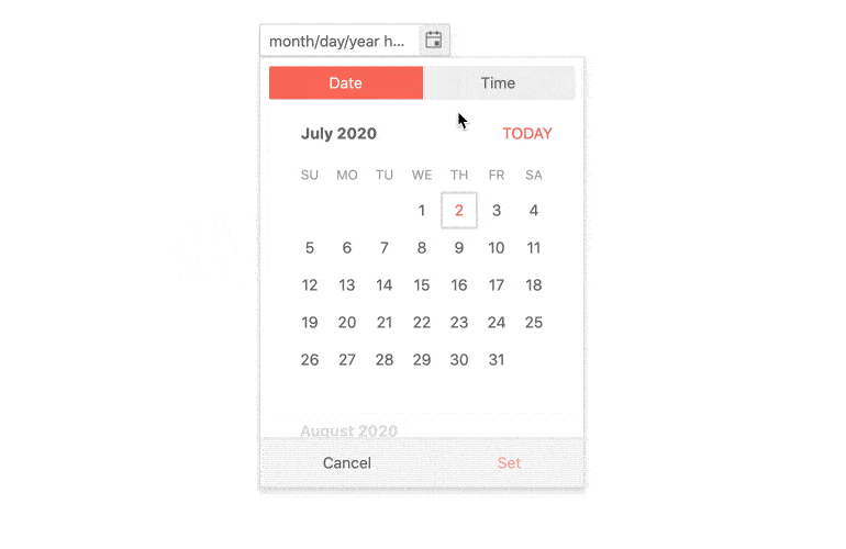
- Angular Calendar Component—Renders a visual calendar used for date selection and navigation.
- Angular DateInput Component—Renders an input field that recognizes and enforces date formats.
- Angular DatePicker Component—Combines the DateInput and Calendar components to provide an interactive form element for picking dates. Users can pick a date from the Calendar and it will appear as text in the DateInput field or they can type in a date and it will be automatically selected in the Calendar.
- Angular DateTimePicker Component—Combines the DateInput, Calendar, and TimePicker components to provide an interactive form element for picking dates and specific times.
- Angular DateRange Component—This is a container that holds start and end date input fields and a date range popup calendar.
- Angular MultiViewCalendar Component—Renders multiple calendars in one container for the purposes of selecting and navigating dates. It is most often used for setting start and end dates.
- Angular TimePicker Component—This is an input field that allows the user to enter or pick time values from a time-list.
Key Features
Among the many features which the Kendo UI for Angular Date Inputs deliver are:
- Forms Support—The package provides support for both asynchronous template-driven Angular forms and predominantly synchronous reactive Angular forms. This feature allows you to make use of the logic set either in the template or in the component's TypeScript code.
- Date and Time Ranges—Except for the MultiViewCalendar, all Date Inputs provide configuration options for setting a start and end date or time and, in this way, defining date or time ranges.
- Disabled Date Inputs—You can choose to render the Date Inputs in their disabled state so that they are read-only.
- Selection Modes—The Date Inputs provide a number of selection modes which allow users to select a single date, a range of dates, or multiple dates.
- Formats—The components in the Date Inputs package provide the ability to configure a desired date format for the displayed value.
- Placeholders—The Date Inputs conveniently enable you to render a text hint inside the their input field to give the users an indication of what type of value they should provide and in what format.
- Typing—You can control the user typing experience of the input-based Date Inputs by configuring the available typing options depending on your specific requirements.
- View Options—There are various options provided for configuring the type of calendar, the initially displayed view, the currently focused date, and the view depth to which the user can navigate.
- Templates—Customize the content and overall appearance of the calendar-based Date Inputs by utilizing ready-to-use templates and applying them to the individual cells of the components—for example, to the month, year, decade, or century calendar cells.
- Integration with JSON—Since the Date Inputs only work with JavaScript Date instances, and the data received from the server is serialized in JSON format, the components provide options for binding to dates that are serialized as strings.
- Globalization—The included components support globalization to ensure that they can fit well in any application, no matter what languages and locales need to be supported. Additionally, the Date Inputs support rendering in a right-to-left (RTL) direction.
- Accessibility—The Date Inputs are accessible for screen readers and support WAI-ARIA attributes.
- Keyboard Navigation—The Date Inputs support a number of keyboard shortcuts which alow users to accomplish various commands.
Support Options
For any issues you might encounter while working with the Kendo UI for Angular Date Inputs, you have the following support channels available:
Resources
Copyright © 2026 Progress Software Corporation and/or one of its subsidiaries or affiliates. All rights reserved.
Progress, Telerik, and certain product names used herein are trademarks or registered trademarks of Progress Software Corporation and/or one of its subsidiaries or affiliates in the U.S. and/or other countries.


