Kendo UI for Angular Tooltips Package (Tooltip and Popover Components)
- This package is part of Kendo UI for Angular—a commercial UI library.
- To use this package, you must install a license key file, whether you are on a paid license or a 30-day free trial. To receive a license key, either purchase a license or start a free trial.
- Adding a valid license key file ensures a seamless experience during the trial period—no watermarks, no warnings, and full access to all components and features.
- Trial users can register for a free license key file. Without it, your trial may be interrupted by visual indicators or functionality limitations.
- Additionally, for the period of your license, you get access to our legendary technical support provided directly by the Kendo UI for Angular team!
- Learn more: https://www.telerik.com/kendo-angular-ui/components/licensing
Start using Kendo UI for Angular and speed up your development process!
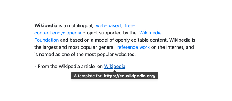
The Kendo UI for Angular Tooltips package contains two components, the Angular Tooltip and the Angular Popover. They both render popups with information related to UI elements and can be displayed when the element is focused or hovered over (or clicked in the Popover case). With tons of configuration options, they allow building custom tooltips in Angular.
What's Included in the Angular Tooltips Package
- Angular Tooltip Component—Renders a customizable tooltip that can be used stand alone of with other Kendo UI for Angular components.

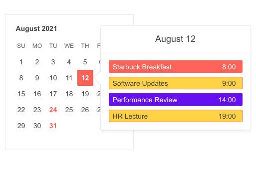
- Angular Popover Component—It is nearly identical to the Angular Tooltip component, except it is designed to display richer content and it can be opened via click. For example, it is possible to host a calendar or a grid in the Popover while the Tooltop is designed mostly for text.

Key Features
Among the many features which the Kendo UI for Angular Tooltips deliver are:
- Anchor Elements—Specify which elements (anchors) will render the popup element.
- Programmatic Control—The Tooltips provide options for consuming the components' API programmatically.
- Closable—Optionally add a close button.
- Positioning—Choose the position on the screen that the Tooltips appear.
- Templates—Provide your own layout and style templates for the Tooltips content.
- Accessibility—The Tooltips are accessible for screen readers and supports WAI-ARIA attributes.
- Keyboard Navigation—The Tooltips support a number of keyboard shortcuts which allows users to accomplish various commands.
Support Options
For any issues you might encounter while working with the Kendo UI for Angular Tooltips, you have the following support channels available:
Resources
Copyright © 2026 Progress Software Corporation and/or one of its subsidiaries or affiliates. All rights reserved.
Progress, Telerik, and certain product names used herein are trademarks or registered trademarks of Progress Software Corporation and/or one of its subsidiaries or affiliates in the U.S. and/or other countries.


