Product
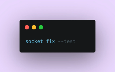
Introducing Socket Fix for Safe, Automated Dependency Upgrades
Automatically fix and test dependency updates with socket fix—a new CLI tool that turns CVE alerts into safe, automated upgrades.
By John-David Dalton - Apr 25, 2025
@progress/kendo-react-layout
Advanced tools
React Layout components enable you to create a perceptive and intuitive layout of web projects. KendoReact Layout package

Important
- This package is а part of KendoReact—an enterprise-grade UI library with 120+ free and premium components.
- It contains both free and premium KendoReact components and tools. To use the premium components, you will need to purchase a license or register for a free trial. You can use the free components without having to sign up or get a license key.
- If you're looking for free React components, check out Get Started with KendoReact Free.
- If you have an active license, visit the KendoReact My License page to learn how to configure your KendoReact licensing.
- Installing and working with this package indicates that you accept the KendoReact License Agreement.
- The 30-day free trial gives you access to all KendoReact components and their full functionality. Additionally, for the period of your trial, you can use our legendary technical support provided directly by the KendoReact dev team!
Start using KendoReact and speed up your development process!
The React Layout components, part of KendoReact, enable you to create a perceptive and intuitive layout of web projects and provide an easier navigation.
How to start:
npm i @progress/kendo-react-layout
What's in this package:
Additional information:
Among the many features which the KendoReact Layout deliver are:
This is a free React component—no sign-up or license required.
The KendoReact ActionSheet component lets you display a
The ActionSheet component allows you to display a mobile-friendly quick menu with user actions. The options display in a modal view.
Key features:
How to use the ActionSheet layout in your apps (no data binding):
import { ActionSheet, ActionSheetItem } from '@progress/kendo-react-layout';
...
/**
* Handle the open and close logic. Handle item selection.
*/
<ActionSheet open={open}>
    <ActionSheetItem text="Option 1" onClick={handleItemClick} />
    /**
    * Add as many ActionSheetItems as needed.
    */
</ActionSheet>
How to use the ActionSheet layout in your apps (simple data binding):
import { ActionSheet, ActionSheetItemProps } from '@progress/kendo-react-layout';
...
/**
* Provide a list of actions to show in the ActionSheet. These must be provided in a format that matches ActionSheetItemProps.
* Handle the open and close logic. Handle item selection.
*/
<ActionSheet
    open={open}
    items={items}
/>
This is a free React component—no sign-up or license required.
The KendoReact AppBar component serves as the main navigation of your application, containing navigation elements and the title of the application or current page.
Key features:
How to use the AppBar layout in your apps:
import {
    AppBar,
    AppBarSection,
    AppBarSpacer,
} from '@progress/kendo-react-layout';
...
<AppBar themeColor={color}>
    <AppBarSection>
      /**
      * Implement the sections in your AppBar. Add as many buttons or other elements as you need.
      */
    </AppBarSection>
    <AppBarSpacer/>
    /**
    * Implement as many sections, separated with AppBarSpacers as you need.
    */
</AppBar>
This is a free React component—no sign-up or license required.
The KendoReact Avatar component is a perfect for displaying images, icons or initials to represent people or other entities within your React applications.
How to use the Avatar layout in your apps:
import { Avatar } from '@progress/kendo-react-layout';
...
<Avatar type="text|icon|image">
	/**
    * Wrap the Avatar around the image, icon, or text that you will want to display as an Avatar.
    */
</Avatar>
This is a free React component—no sign-up or license required.
The KendoReact BottomNavigation component is the perfect navigation UI element for responsive web and mobile applications. Each navigation item within the React component features the ability to define a combination of icons and text to best illustrate where it leads.
Key features:
How to use the BottomNavigation layout in your apps:
import { BottomNavigation } from '@progress/kendo-react-layout';
...
/**
* Provide a list of items to show in the BottomNavigation.
*/
<BottomNavigation
    items={items}
/>
This is a free React component—no sign-up or license required.
The KendoReact Breadcrumb component allows you to navigate within a folder structure or web page. It provides an easy way to navigate backwards by one or multiple steps.
How to use the Breadcrumb layout in your apps:
import { Breadcrumb } from "@progress/kendo-react-layout";
...
/**
* Provide a list of items to show in the Breadcrumb.
*/
<Breadcrumb
    data={items}
/>
This is a free React component—no sign-up or license required.
The KendoReact Card component represents a common layout item in many modern design languages. The React Card component contains content and actions about a single subject and can work well on its own, as well as when combined with components like the KendoReact ListView to display a collection of cards.
Key features:
How to use the Card layout in your apps:
import {
    Card,
    CardHeader,
    CardTitle,
    CardSubtitle,
    CardBody,
    CardActions
} from '@progress/kendo-react-layout';
...
/**
* Provide an image for the CardImage part of the Card.
*/
<Card>
    <CardImage src={image} />
    <CardHeader>
        <CardTitle>Title</CardTitle>
        <CardSubtitle>Subtitle</CardSubtitle>
    </CardHeader>
    <CardBody>
        /**
        * The contens of the CardBody.
        */
    </CardBody>
    <CardActions>
        /**
        * The contens of the actions related to the Card.
        */
    </CardActions>
</Card>
This is a free React component—no sign-up or license required.
The KendoReact ContextMenu component delivers a context menu that pops when a user right-clicks within the UI. It’s best used when you want to add common or advanced commands for the user to execute while preserving screen space for more important information.
How to use the ContextMenu layout in your apps:
import {
    ContextMenu,
    MenuItem
} from '@progress/kendo-react-layout';
...
/**
* Handle the logic for showing the menu and item selection.
*/
<ContextMenu
    onSelect={handleOnSelect}
    show={show}
>
    <MenuItem text="Option" />
    /**
    * Provide as many menu items as needed.
    */
</ContextMenu>
This is a free React component—no sign-up or license required.
The KendoReact Drawer component offers a navigation that can be permanently displayed, shown and hidden on command, and offers various styles for presenting navigation items.
Key features:
How to use the Drawer layout in your apps:
import {
    Drawer,
    DrawerContent
} from '@progress/kendo-react-layout';
...
/**
* Provide a list of items to show when the Drawer is expanded.
* Handle the logic for showing the menu and item selection.
*/
<Drawer
  expanded={expanded}
  position='end|start'
  mode='push|overlay'
  items={items}
  onSelect={handleSelect}
  >
  <DrawerContent>
    /**
    * Render the drawer content.
    */
  </DrawerContent>
</Drawer>
This is a free React component—no sign-up or license required.
The KendoReact ExpansionPanel component delivers an easy way for implementing what’s usually a tedious process—a context menu that pops when a user right-clicks on your UI. It’s best used when you want to add common or advanced commands for the user to execute while preserving screen space for more important information.
How to use the ExpansionPanel layout in your apps:
import { ExpansionPanel, ExpansionPanelContent } from '@progress/kendo-react-layout';
...
<ExpansionPanel
  title="Expansion Panel Title"
  subtitle="Subtitle"
>
    <ExpansionPanelContent>
        /**
        * Render the content that shows when the panel is expanded.
        * You can also wrap the entire ExpansionPanelContent component in an animation.
        */
    </ExpansionPanelContent>
</ExpansionPanel>
This is a free React component—no sign-up or license required.
The KendoReact GridLayout component allows you to easily arrange the contents of the component in rows and columns in a grid structure.
How to use the GridLayout layout in your apps:
import { GridLayout, GridLayoutItem } from '@progress/kendo-react-layout';
...
<GridLayout
    cols={[{width: 150}, {width: 150}]}
    gap={10}
>
    <GridLayoutItem>Item </GridLayoutItem>
    <GridLayoutItem>Item</GridLayoutItem>
</GridLayout>
This is a free React component—no sign-up or license required.
The KendoReact Menu component is great to provide nice navigation for the web application. The component can have many sub-menu options making it very easy to navigate through applications with multiple levels of pages.
Key features:
How to use the Menu layout in your apps:
import { Menu, MenuItem } from '@progress/kendo-react-layout';
...
<Menu>
    <MenuItem text="Item 1" />
    <MenuItem text="Item 2" />
</Menu>
This is a KendoReact premium component and requires a commercial license or an active trial license.
The KendoReact PanelBar component is a great choice when we must show hierarchical expandable data.
Key features:
How to use the PanelBar layout in your apps:
import { PanelBar, PanelBarItem } from '@progress/kendo-react-layout';
...
<PanelBar>
  <PanelBarItem title="Item 1">
    /**
    * Render the contens shown within the panel.
    */
  </PanelBarItem>
  /**
  * Add as many PanelBarItems as needed.
  */
</PanelBar>
This is a KendoReact premium component and requires a commercial license or an active trial license.
The KendoReact Splitter component enables developers to define sections of a page in a column and row structure.
Key features:
How to use the Splitter layout in your apps:
import { Splitter, SplitterOnChangeEvent } from '@progress/kendo-react-layout';
...
/**
* Define your panes and their initial state.
* Handle the logic for pane resizing when the end user interacts with the Splitter.
*/
<Splitter
  panes={panes}
  onChange={onHorizontalChange}
>
  /**
  * Provide the content that will be used to populate the panes. For example: <h> or <div> elements. The number of provided elements must match the number of panes.
  */
</Splitter>
This is a free React component—no sign-up or license required.
The KendoReact StackLayout component allows you to easily align vertically or horizontally multiple elements in a stack.
How to use the StackLayout in your apps:
import { StackLayout } from '@progress/kendo-react-layout';
...
<StackLayout>
    /**
    * Wrap the content that you need to show with the StackLayout component.
    */
</StackLayout>
This is a free React component—no sign-up or license required.
The KendoReact Stepper component enables developers to create a set of logical steps in sequential order and visualizes the progress throughout the steps.
Key features:
How to use the Stepper layout in your apps:
import { Stepper, StepperChangeEvent } from '@progress/kendo-react-layout';
...
/**
* Provide the items that you want to show in the Stepper.
* Handle the logic for step selection.
*/
<Stepper items={items} />
This is a free React component—no sign-up or license required.
With the KendoReact TabStrip component you can display a collection of tabs each with its own associated content. Each tab within the KendoReact TabStrip component comes with multiple configuration options. This includes setting the text of the tabs, displaying or not displaying tabs on initial loading, setting the tab position, as well as implementing closable tabs.
How to use the TabStrip layout in your apps:
import {
    TabStrip,
    TabStripSelectEventArguments,
    TabStripTab
    } from '@progress/kendo-react-layout';
...
/**
* Handle the logic for tab selection.
*/
<TabStrip onSelect={handleSelect}>
    <TabStripItem></TabStripItem>
    /**
    * Show as many TabStripItems as needed.
    */
   </TabStripItem>
</TabStrip>
This is a free React component—no sign-up or license required.
The KendoReact TileLayout component is perfect for creating interactive dashboards using a single UI component with a flexible set of configuration options.
Key features:
How to use the TabStrip layout in your apps:
import { TileLayout, TileLayoutRepositionEvent } from '@progress/kendo-react-layout';
...
/**
* Handle the logic for tile repositioning.
* Provide the content for the tiles that you want to show.
*/
<TileLayout
    columns={4}
    rowHeight={255}
    positions={data}
    gap={{ rows: 10, columns: 10 }}
    items={tiles}
    onReposition={handleReposition}
/>
This is a KendoReact premium component and requires a commercial license or an active trial license.
The KendoReact Timeline component enables you to display events in chronological order, making it suitable for showcasing company history or visualizing significant milestones. The component offers a horizontal and a vertical mode in which the events can be collapsed for a neat and structured view.
How to use the Timeline layout in your apps:
import { Timeline } from '@progress/kendo-react-layout';
...
/**
* Provide the list of events that you want to show on the Timeline.
*/
<Timeline events={events} />
For any issues you might encounter while working with the KendoReact Layout, use any of the available support channels:
High-level component overview pages:
Copyright © 2025 Progress Software Corporation and/or its subsidiaries or affiliates. All Rights Reserved.
Progress, Telerik, and certain product names used herein are trademarks or registered trademarks of Progress Software Corporation and/or one of its subsidiaries or affiliates in the U.S. and/or other countries.
FAQs
React Layout components enable you to create a perceptive and intuitive layout of web projects. KendoReact Layout package
The npm package @progress/kendo-react-layout receives a total of 84,016 weekly downloads. As such, @progress/kendo-react-layout popularity was classified as popular.
We found that @progress/kendo-react-layout demonstrated a healthy version release cadence and project activity because the last version was released less than a year ago. It has 1 open source maintainer collaborating on the project.
Did you know?

Socket for GitHub automatically highlights issues in each pull request and monitors the health of all your open source dependencies. Discover the contents of your packages and block harmful activity before you install or update your dependencies.
Product
Automatically fix and test dependency updates with socket fix—a new CLI tool that turns CVE alerts into safe, automated upgrades.

Security News
CISA denies CVE funding issues amid backlash over a new CVE foundation formed by board members, raising concerns about transparency and program governance.
Product
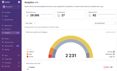
We’re excited to announce a powerful new capability in Socket: historical data and enhanced analytics.