Product
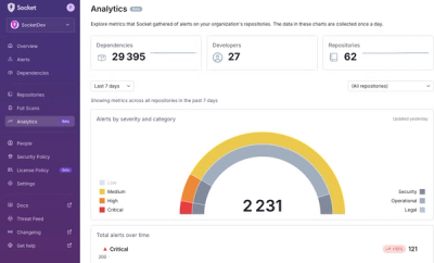
Introducing Historical Analytics – Now in Beta
We’re excited to announce a powerful new capability in Socket: historical data and enhanced analytics.
By Phil Gates-Idem - Apr 24, 2025
@progress/kendo-react-tooltip
Advanced tools
React Tooltips library represents popups with information that is related to a UI element. KendoReact Tooltips package

Important
- This package is а part of KendoReact—an enterprise-grade UI library with 120+ free and premium components.
- This package contains free KendoReact components. You can use it even in production, no sign-up or license required. If you're looking for more free React components, check out Get Started with KendoReact Free.
- Installing and working with this package indicates that you accept the KendoReact License Agreement.
- The 30-day free trial gives you access to all KendoReact components and their full functionality. Additionally, for the period of your trial, you can use our legendary technical support provided directly by the KendoReact dev team!
The React Tooltips library, part of KendoReact, represents popups with information that is related to a UI element. They get displayed when the user clicks or hovers over this UI element.
How to start:
npm i @progress/kendo-react-tooltip
What's in this package:
Additional information:
Among the features which the KendoReact Tooltips are:
This is a free React component—no sign-up or license required.
The KendoReact Tooltip component, part of KendoReact, provides a popup with information that is related to a particular UI element. The React Tooltip can be displayed when hovering over or clicking on an element.
Key features:
How to use the Tooltip component in your apps:
import { Tooltip } from '@progress/kendo-react-tooltip';
...
<Target
    anchorElement="pointer|target"
    position="auto|right|left|bottom|top"
>
    /**
    * Wrap the Tooltip component around the UI element for which you want to show the Tooltip.
    */
</Target>
This is a free React component—no sign-up or license required.
The KendoReact Popover component, part of KendoReact, is a popup with rich interactable content, which is displayed when a user clicks or hovers over the related UI element.
How to use the Popover component in your apps:
import { Popover, PopoverActionsBar } from '@progress/kendo-react-tooltip';
import { Button } from '@progress/kendo-react-buttons'; // You can import any other component that allows user interaction within the PopoverActionsBar. You may need to install additional dependencies, if you're not using components from the Buttons package.
...
/** Handle the logic for showing the Popover.
* Handle setting the anchor for the Popover.
*/
<Popover
  show={show}
  anchor={anchor.current && anchor.current.element}
  title={'Title'}
>
  /**
  * Show additional content in the Popover. For example, images or text.
  */
  <PopoverActionsBar>
    /**
    * Provide UI elements for user actions. For example, buttons.
    */
  </PopoverActionsBar>
</Popover>
For any issues you might encounter while working with the KendoReact Tooltip, use any of the available support channels:
High-level component overview pages:
Copyright © 2025 Progress Software Corporation and/or its subsidiaries or affiliates. All Rights Reserved.
Progress, Telerik, and certain product names used herein are trademarks or registered trademarks of Progress Software Corporation and/or one of its subsidiaries or affiliates in the U.S. and/or other countries.
FAQs
React Tooltips library represents popups with information that is related to a UI element. KendoReact Tooltips package
The npm package @progress/kendo-react-tooltip receives a total of 32,928 weekly downloads. As such, @progress/kendo-react-tooltip popularity was classified as popular.
We found that @progress/kendo-react-tooltip demonstrated a healthy version release cadence and project activity because the last version was released less than a year ago. It has 1 open source maintainer collaborating on the project.
Did you know?

Socket for GitHub automatically highlights issues in each pull request and monitors the health of all your open source dependencies. Discover the contents of your packages and block harmful activity before you install or update your dependencies.
Product
We’re excited to announce a powerful new capability in Socket: historical data and enhanced analytics.
Product
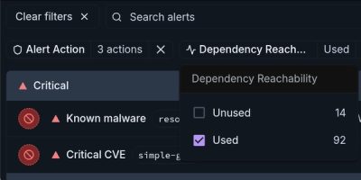
Module Reachability filters out unreachable CVEs so you can focus on vulnerabilities that actually matter to your application.

Company News
Socket is bringing best-in-class reachability analysis into the platform — cutting false positives, accelerating triage, and cementing our place as the leader in software supply chain security.