Security Fundamentals
Turtles, Clams, and Cyber Threat Actors: Shell Usage
The Socket Threat Research Team uncovers how threat actors weaponize shell techniques across npm, PyPI, and Go ecosystems to maintain persistence and exfiltrate data.
@radix-ui/react-checkbox
Advanced tools
@radix-ui/react-checkbox is a React component library that provides accessible and customizable checkbox components. It is part of the Radix UI suite, which focuses on providing unstyled, accessible components that can be easily styled to fit any design system.
Basic Checkbox
This code demonstrates a basic checkbox component using @radix-ui/react-checkbox. The Checkbox.Root component is the main container, and Checkbox.Indicator is used to display the checkmark or other indicator.
import * as Checkbox from '@radix-ui/react-checkbox';
function BasicCheckbox() {
return (
<Checkbox.Root>
<Checkbox.Indicator />
</Checkbox.Root>
);
}Custom Styling
This example shows how to apply custom styles to the checkbox component. By adding className properties, you can style the checkbox and its indicator using CSS.
import * as Checkbox from '@radix-ui/react-checkbox';
import './styles.css';

function CustomStyledCheckbox() {
  return (
    <Checkbox.Root className="custom-checkbox">
      <Checkbox.Indicator className="custom-indicator" />
    </Checkbox.Root>
  );
}
Controlled Checkbox
This code demonstrates a controlled checkbox component where the checked state is managed by React's useState hook. The onCheckedChange event handler updates the state when the checkbox is toggled.
import * as Checkbox from '@radix-ui/react-checkbox';
import { useState } from 'react';

function ControlledCheckbox() {
  const [checked, setChecked] = useState(false);

  return (
    <Checkbox.Root checked={checked} onCheckedChange={setChecked}>
      <Checkbox.Indicator />
    </Checkbox.Root>
  );
}react-checkbox-group is a simple React component for creating groups of checkboxes. It provides a straightforward API for managing the state of multiple checkboxes. Compared to @radix-ui/react-checkbox, it is more focused on grouping checkboxes rather than providing individual, highly customizable checkbox components.
react-toggle is a React component for creating toggle switches. While it is not a direct replacement for checkboxes, it serves a similar purpose in allowing users to toggle between two states. It offers a different visual representation compared to @radix-ui/react-checkbox.
rc-checkbox is a React component for creating customizable checkboxes. It provides a basic checkbox component with support for custom styles and controlled/uncontrolled states. It is similar to @radix-ui/react-checkbox in terms of functionality but may not offer the same level of accessibility features.
react-checkbox$ yarn add @radix-ui/react-checkbox
# or
$ npm install @radix-ui/react-checkbox
View docs here.
FAQs
Unknown package
The npm package @radix-ui/react-checkbox receives a total of 6,674,300 weekly downloads. As such, @radix-ui/react-checkbox popularity was classified as popular.
We found that @radix-ui/react-checkbox demonstrated a healthy version release cadence and project activity because the last version was released less than a year ago. It has 6 open source maintainers collaborating on the project.
Did you know?

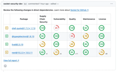
Socket for GitHub automatically highlights issues in each pull request and monitors the health of all your open source dependencies. Discover the contents of your packages and block harmful activity before you install or update your dependencies.

Security Fundamentals
The Socket Threat Research Team uncovers how threat actors weaponize shell techniques across npm, PyPI, and Go ecosystems to maintain persistence and exfiltrate data.

Security News
At VulnCon 2025, NIST scrapped its NVD consortium plans, admitted it can't keep up with CVEs, and outlined automation efforts amid a mounting backlog.

Product
We redesigned our GitHub PR comments to deliver clear, actionable security insights without adding noise to your workflow.