Product
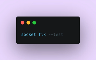
Introducing Socket Fix for Safe, Automated Dependency Upgrades
Automatically fix and test dependency updates with socket fix—a new CLI tool that turns CVE alerts into safe, automated upgrades.
By John-David Dalton - Apr 25, 2025
@radix-ui/react-hover-card
Advanced tools
@radix-ui/react-hover-card is a React component library that provides a customizable hover card component. It allows developers to create interactive hover cards that display additional information when a user hovers over a target element. This can be useful for tooltips, previews, and other UI elements that require additional context on hover.
Basic Hover Card
This example demonstrates a basic hover card setup where additional information is displayed when the user hovers over the trigger element.
```jsx
import { HoverCard, HoverCardTrigger, HoverCardContent } from '@radix-ui/react-hover-card';
function App() {
return (
<HoverCard>
<HoverCardTrigger>Hover over me</HoverCardTrigger>
<HoverCardContent>
<div>Additional information displayed on hover</div>
</HoverCardContent>
</HoverCard>
);
}
export default App;
```Custom Styling
This example shows how to apply custom styles to the hover card components using CSS classes.
```jsx
import { HoverCard, HoverCardTrigger, HoverCardContent } from '@radix-ui/react-hover-card';
import './App.css'; // Assume custom styles are defined here

function App() {
  return (
    <HoverCard>
      <HoverCardTrigger className="custom-trigger">Hover over me</HoverCardTrigger>
      <HoverCardContent className="custom-content">
        <div>Styled additional information</div>
      </HoverCardContent>
    </HoverCard>
  );
}

export default App;
```
Delay Configuration
This example demonstrates how to configure the delay before the hover card opens and closes, providing a smoother user experience.
```jsx
import { HoverCard, HoverCardTrigger, HoverCardContent } from '@radix-ui/react-hover-card';

function App() {
  return (
    <HoverCard openDelay={300} closeDelay={200}>
      <HoverCardTrigger>Hover over me</HoverCardTrigger>
      <HoverCardContent>
        <div>Information with delay</div>
      </HoverCardContent>
    </HoverCard>
  );
}

export default App;
```react-tooltip is a popular library for creating tooltips in React applications. It offers a wide range of customization options and supports various trigger events. Compared to @radix-ui/react-hover-card, react-tooltip is more focused on tooltips rather than hover cards, but it can be used to achieve similar functionality.
react-popper is a library that provides positioning logic for tooltips, popovers, and other floating elements. It is highly customizable and can be used to create complex hover card components. While it requires more setup compared to @radix-ui/react-hover-card, it offers greater flexibility in positioning and behavior.
react-hover-card$ yarn add @radix-ui/react-hover-card
# or
$ npm install @radix-ui/react-hover-card
View docs here.
FAQs
View docs [here](https://radix-ui.com/primitives/docs/components/hover-card).
The npm package @radix-ui/react-hover-card receives a total of 3,875,887 weekly downloads. As such, @radix-ui/react-hover-card popularity was classified as popular.
We found that @radix-ui/react-hover-card demonstrated a healthy version release cadence and project activity because the last version was released less than a year ago. It has 6 open source maintainers collaborating on the project.
Did you know?

Socket for GitHub automatically highlights issues in each pull request and monitors the health of all your open source dependencies. Discover the contents of your packages and block harmful activity before you install or update your dependencies.
Product
Automatically fix and test dependency updates with socket fix—a new CLI tool that turns CVE alerts into safe, automated upgrades.

Security News
CISA denies CVE funding issues amid backlash over a new CVE foundation formed by board members, raising concerns about transparency and program governance.

Product
We’re excited to announce a powerful new capability in Socket: historical data and enhanced analytics.