🧑🚀 Introduction
React-Symbols is a library for React with the icons of the VSCode theme Symbols created by Miguel Solorio (@miguelsolorio):
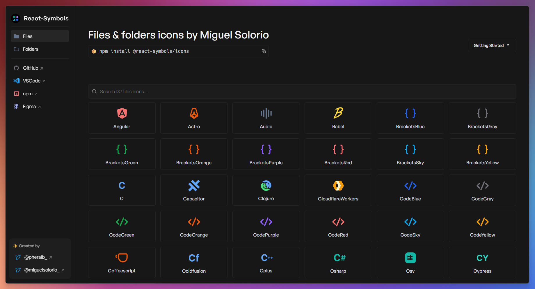
- 📦 +200 files & folders icons.
- ☁️ Support for React Server Components (RSC).
- 🍃 Lightweight & tree-shakable.
- 💙 Built with TypeScript.
- 🚀 SVG optimized and minified.
🚀 Getting Started
React-Symbols require React >=16.8.0.
- Install
npm install @react-symbols/icons
pnpm add @react-symbols/icons
yarn add @react-symbols/icons
bun add @react-symbols/icons
- Usage
Using file and folder icons:
import { Astro, FolderBlue } from "@react-symbols/icons";

const MyComponent = () => {
  return (
    <>
      <Astro width={128} height={128} />
      <FolderBlue width={128} height={128} />
    </>
  );
};

export default MyComponent;
Only file icons:
import { Astro, Docker } from "@react-symbols/icons/files";

const MyComponent = () => {
  return (
    <>
      <Astro width={128} height={128} />
      <Docker width={128} height={128} />
    </>
  );
};

export default MyComponent;
Only folder icons:
import { FolderConfig, FolderApp } from "@react-symbols/icons/folders";

const MyComponent = () => {
  return (
    <>
      <FolderConfig width={128} height={128} />
      <FolderApp width={128} height={128} />
    </>
  );
};

export default MyComponent;
💿 Config for use the library with Remix Old Compiler if you are using CJS (v1 uses CJS by default, v2 uses ESM):
module.exports = {
...
serverDependenciesToBundle: ["@react-symbols/icons"],
...
};
✍️ Change the name of the icon:
import { Bun as BunIcon } from "@react-symbols/icons";

const MyComponent = () => {
  return (
    <>
      <BunIcon width={128} height={128} />
    </>
  );
};

export default MyComponent;
⚙️ Utilities
FileIcon
Get the file icon component for a given file name or extension.
getIconForFile function:
import { getIconForFile } from "@react-symbols/icons/utils";

const Page = () => {
  return (
    <main>
      {getIconForFile({
        fileName: "example.ts",
      })}
    </main>
  );
};
FileIcon component:
import { FileIcon } from "@react-symbols/icons/utils";

const Page = () => {
  return (
    <main>
      <FileIcon fileName="example.ts" />
    </main>
  );
};
Options:
import { FileIcon } from "@react-symbols/icons/utils";

<FileIcon fileName="example.ts" />;
autoAssign (boolean, optional): If true, the utility will automatically assign the icon based on the file name (e.g., "vite.config.js" -> Vite icon). The full list of file names can be found here. If does not match any file name, it will fallback to the file extension mapping.
import { FileIcon } from "@react-symbols/icons/utils";

<FileIcon fileName="package.json" autoAssign={true} />;
editFileExtensionData (ExtensionType, optional): An object that allows you to extend or override the default file extension to icon mapping.
import { Js } from "@react-symbols/icons/files";
import { FileIcon } from "@react-symbols/icons/utils";

<FileIcon
  fileName="customfile.ts"
  editFileExtensionData={{
    ts: Js,
  }}
/>;
editFileNameData (ExtensionType, optional. Activate autoAssign first): An object that allows you to extend or override the default file name to icon mapping.
import { Ts } from "@react-symbols/icons/files";
import { FileIcon } from "@react-symbols/icons/utils";

<FileIcon
  autoAssign={true}
  fileName="eslint.config.ts"
  editFileNameData={{
    "eslint.config.ts": Ts,
  }}
/>;
SVGProps<SVGSVGElement>: SVG properties to customize the icon.
import { FileIcon } from "@react-symbols/icons/utils";

<FileIcon fileName="myfile.ts" width={48} height={48} />;
FolderIcon
Get the folder icon component for a given folder name.
getIconForFolder function:
import { getIconForFolder } from "@react-symbols/icons/utils";

const Page = () => {
  return (
    <main>
      {getIconForFolder({
        folderName: "node_modules",
      })}
    </main>
  );
};
FolderIcon component:
import { FolderIcon } from "@react-symbols/icons/utils";

const Page = () => {
  return (
    <main>
      <FolderIcon folderName="node_modules" />
    </main>
  );
};
Options:
import { FolderIcon } from "@react-symbols/icons/utils";

<FolderIcon folderName="src" />;
editFolderNameData (ExtensionType, optional): An object that allows you to extend or override the default folder name to icon mapping.
import { FolderIcon } from "@react-symbols/icons/utils";
import { FolderAngular } from "@react-symbols/icons/folders";

<FolderIcon
  editFolderNameData={{
    app: FolderAngular,
  }}
/>;
SVGProps<SVGSVGElement>: SVG properties to customize the icon.
import { FolderIcon } from "@react-symbols/icons/utils";

<FolderIcon folderName="app" width={48} height={48} />;
ExtensionType
Type definition for extending or overriding the default file/folder name to icon mapping.
import type { ExtensionType } from "@react-symbols/icons/utils";

const moreExtensions: ExtensionType = {
  "customfile.ext": CustomFileIcon,
  customfolder: CustomFolderIcon,
};
Icons for file explorers
DefaultFileIcon: The default icon component for unknown files.
import { DefaultFileIcon } from "@react-symbols/icons/utils";

<DefaultFileIcon width={48} height={48} />;
DefaultFolderIcon: The default icon component for unknown folders.
import { DefaultFolderIcon } from "@react-symbols/icons/utils";

<DefaultFolderIcon width={48} height={48} />;
DefaultFolderOpenedIcon: The default icon component for opened folders.
import { DefaultFolderOpenedIcon } from "@react-symbols/icons/utils";

<DefaultFolderOpenedIcon width={48} height={48} />;
📦 Stack
This is a monorepo project created with:
For monorepo:
For library:
- tsdown - The elegant bundler for libraries powered by Rolldown.
- React 19 - A JavaScript library for building user interfaces.
- Typescript - TypeScript is JavaScript with syntax for types.
For website:
- React Router v7 - Create modern, resilient user experiences with web fundamentals.
- Typescript - TypeScript is JavaScript with syntax for types.
- Tailwind CSS - A utility-first CSS framework for rapidly building custom designs.
- shadcn/ui + Radix UI - An opinionated toast component for React.
- pheralb/toast - An accessible and beautiful toast library for React.
🙌 Contribute
git clone git@github.com:YOUR_USERNAME/react-symbols.git
- Install the dependencies:
npm install -g pnpm
pnpm install
- Run the development server:
pnpm dev
and open localhost:5173 with your browser to see the website 🚀

🔑 License
MIT License.


