Research
/Security News
DuckDB npm Account Compromised in Continuing Supply Chain Attack
Ongoing npm supply chain attack spreads to DuckDB: multiple packages compromised with the same wallet-drainer malware.
@sassi/breakpoints
Advanced tools
Simple @media breakpoints in Sass/SCSS.
.block {
color: #1771f1;
// Use preset breakpoints
@include breakpoint-up(tablet) {
color: #052555;
}
// or pixels
@include breakpoint-up(400) {
color: #2300b0;
}
// or combination
@include breakpoint-range(mobile, 600px) {
position: relative;
}
}
Also @sassi/breakpoints supports rem — see configuration for details.
npm i @sassi/breakpoints --save-dev
There are at least two connection options:
Note! Do not forget to put down your own path to node_modules.
@import '../node_modules/@sassi/breakpoints/sassi-breakpoints';
Create task:
const sass = require('sass');
const breakpoints = require('@sassi/breakpoints');

gulp.task('styles', () => (
  gulp.src('src/styles/app.scss')
    .pipe(sass({ includePaths: [breakpoints] }))
    .pipe(gulp.dest('dest'))
));
And @import anywhere in your Sass/SCSS:
@import 'sassi-breakpoints';
If you do not configure breakpoints yourself, default values are applied:
$sassi-bp: (
  bp: (
    sm: 320,
    md: 768,
    lg: 1024,
    wide: 1200
  ),
  base-font-size: 16,
  units: px,
  disallow-min-breakpoint: false
);
For more information, see configuration.
Almost all mixins can work with both numeric values (pixels) and preset breakpoints.
Note! All numeric values are specified in pixels even if they are translated into rems.
breakpoint-up(measure)Alias: bp-up(measure).
Numeric:

0        200px      400px      600px      800px      1000px
├─────────┼──————————┼——————————┼——————————┼——————————┼——————————>
                     ·
                     ·
                     ·
                     ·        breakpoint-up(400)
                     ├───────────────────────────────────────────>
Preset breakpoint:

0        sm       md                           lg       wide
├────────┼────────┼────────────────────────────┼────────┼────────>
                  ·
                  ·
                  ·
                  ·           breakpoint-up(md)
                  ├──────────────────────────────────────────────>
breakpoint-range(measure)Alias: bp-range(measure).
Numeric:

0        200px      400px      600px      800px      1000px
├─────────┼──————————┼——————————┼——————————┼——————————┼——————————>
                     ·                                ·
                     ·                                ·
                     ·                                ·
                     ·   breakpoint-range(400, 1000)  ·
                     ├────────────────────────────────┤
Preset breakpoint:

0        sm       md                           lg       wide
├────────┼────────┼────────────────────────────┼────────┼────────>
                  ·                                     ·
                  ·                                     ·
                  ·                                     ·
                  ·      breakpoint-range(md, lg)       ·
                  ├─────────────────────────────────────┤
Note! breakpoint-range(bp) cannot be used with maximal preset breakpoint as the upper boundary.
breakpoint-only(bp)Alias: bp-only(bp).
Note! This is the only mixin that can only be used with preset breakpoints.
Preset breakpoint:

0        sm       md                           lg       wide
├────────┼────────┼────────────────────────────┼────────┼────────>
                  ·                            ·
                  ·                            ·
                  ·                            ·
                  ·     breakpoint-only(md)    ·
                  ├────────────────────────────┤
If you use SCSS syntax you can just override the configuration variable $sassi-bp.
But if you use Sass syntax, you will have to use the setter-functions.
In all mixins above, you can use a preset breakpoint called by name. To overwrite the default configuration, use set-bp():
$sassi-bp: set-bp((mobile: 300, tablet: 640, laptop: 1000, widescreen: 1200));
Note #1! The result of all setter-functions must be written to the $sassi-bp variable.
Note #2! All numeric values are specified in pixels even if they are translated into rems.
rem and pxBy default, @sassi/breakpoints uses pixels, but you can reassign them to rems.
$sassi-bp: set-bp-units(rem);
For example:
$sassi-bp: set-bp-units(rem);

.block {
  color: #1771f1;

  @include breakpoint-range(md, lg) {
    color: #052555;
  }
}
Will be compiled to:
.block {
  color: #1771f1;
}

/*                          768 / 16       (1024 - 0.02) / 16  */
@media screen and (min-width: 48rem) and (max-width: 63.99875rem) {
  .block {
    color: #052555;
  }
}
Important! In the code above max-width is calculated as (1024 - 0.02) / 16. More about it in the Overlap section.
For numeric measures you must specify mixins' arguments in pixels: breakpoint-up(160) --> (min-width: 1rem).
Base font size is the number by which rems are calculated.
For example:
$sassi-bp: set-bp-units(rem);
$sassi-bp: set-bp-base-font-size(20);

block {
  color: #1771f1;

  @include breakpoint-up(200) {
    color: #052555;
  }
}
Will be compiled to:
.block {
  color: #1771f1;
}

/*                          200 / 20 */
@media screen and (min-width: 10rem) {
  .block {
    color: #052555;
  }
}
disallow-min-breakpointThis is false by default .
disallow-min-breakpoint: true prevents using breakpoint-up with minimal preset breakpoint.
$sassi-bp: set-bp-disallow-min-breakpoint(true);
For example (with default configuration):
$sassi-bp: set-bp-disallow-min-breakpoint(true);

.block {

  @include breakpoint-up(sm) { // --> Error!
    color: #052555;
  }

  @include breakpoint-up(md) {
    color: #1771f1;
  }
}
Preferably:
.block {
  color: #052555;

  @include breakpoint-up(md) {
    color: #1771f1;
  }
}
Also when using breakpoint-only and breakpoint-range, the minimal breakpoint will be replaced by 0.
For example:
.block {

  @include breakpoint-only(sm) {
    color: #1771f1;
  }
}

.another-block {

  @include breakpoint-range(sm, md) {
    color: #1771f1;
  }
}
Will be compiled to:
@media screen and (min-width: 0) and (max-width: 768px) {
  .block {
    color: #052555;
  }
}

@media screen and (min-width: 0) and (max-width: 1024px) {
  .another-block {
    color: #1771f1;
  }
}
For example (from 400px to lg):
.block {

  @include breakpoint-range(400, lg) {
    color: #052555;
  }
}
get-bp()The function returns the numerical value of the breakpoint (without 'px').
For example:
.block {
  content: get-bp(md);
}
Will be compiled to:
.block {
  content: 768;
}
@sassi/breakpoints prevents breakpoint slices overlapping with a neighbouring slices by reducing the upper boundary by 0.02 px.
Not OK
/*                                        ___________↓____  */
@media screen and (min-width: 200px) and (max-width: 640px) {
  .block {
    color: #052555;
  }
}

/*                 ___________↓____                         */
@media screen and (min-width: 640px) and (max-width: 920px) {
  .block {
    color: #1771f1;
  }
}
OK
/*                                        ___________↓____  */
@media screen and (min-width: 200px) and (max-width: 639.98px) {
  .block {
    color: #052555;
  }
}

/*                 ___________↓____                         */
@media screen and (min-width: 640px) and (max-width: 920px) {
  .block {
    color: #1771f1;
  }
}
FAQs
Simple @media breakpoints in Sass/SCSS.
We found that @sassi/breakpoints demonstrated a not healthy version release cadence and project activity because the last version was released a year ago. It has 1 open source maintainer collaborating on the project.
Did you know?

Socket for GitHub automatically highlights issues in each pull request and monitors the health of all your open source dependencies. Discover the contents of your packages and block harmful activity before you install or update your dependencies.

Research
/Security News
Ongoing npm supply chain attack spreads to DuckDB: multiple packages compromised with the same wallet-drainer malware.

Security News
The MCP Steering Committee has launched the official MCP Registry in preview, a central hub for discovering and publishing MCP servers.

Product
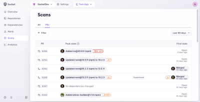
Socket’s new Pull Request Stories give security teams clear visibility into dependency risks and outcomes across scanned pull requests.