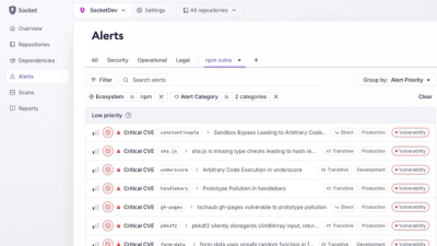
Product
Introducing Custom Tabs for Org Alerts
Create and share saved alert views with custom tabs on the org alerts page, making it easier for teams to return to consistent, named filter sets.
By André Staltz - Jan 20, 2026
@sb1/ffe-datepicker
Advanced tools
This package contains styles for the ffe-datepicker.
npm install --save @sb1/ffe-datepicker
Full documentation on datepicker usage is available at https://design.sparebank1.no/komponenter/skjemaelementer/#datepicker.
The styles for this package can be used in 3 different ways depending on what you want.
For All styles or Only date input you will need the @sb1/ffe-form package in your project.
You need styles for both the dateinput field and the calendar.
@import 'node_modules/@sb1/ffe-datepicker/less/datepicker.less';
@import 'node_modules/@sb1/ffe-form/less/form.less';
If your project does not use Less, you can import the compiled styling:
@import '~@sb1/ffe-datepicker/css/datepicker.css';
Example HTML stucture with classes. (Aria-tags and other attributes have been removed for clarity)
<div class="ffe-datepicker">
    <!-- see dateinput section below -->
    <!-- see calendar section below -->
</div>
@import 'node_modules/@sb1/ffe-datepicker/less/dateinput.less';
@import 'node_modules/@sb1/ffe-form/less/form.less';
Example HTML stucture with classes. (Aria-tags and other attributes have been removed for clarity)
<div class="ffe-dateinput">
    <input class="ffe-dateinput__field ffe-input-field" type="text" />
    <svg class="ffe-dateinput__icon">
        <path ... />
    </svg>
</div>
@import 'node_modules/@sb1/ffe-datepicker/less/calendar.less';
Example HTML stucture with classes. (Aria-tags and other attributes have been removed for clarity)
<div class="ffe-calendar ffe-calendar--datepicker">
    <div class="ffe-calendar__header">
        <div class="ffe-calendar__header-inner-wrapper">
            <button class="ffe-calendar__month-nav ffe-calendar__previous">
                <svg class="ffe-calendar__icon-prev">
                    <path ... />
                </svg>
            </button>
            <header class="ffe-calendar__title">
                <div id="ffe-calendar-499__month-label">
                    <span class="ffe-calendar__month">Juni</span>
                    <span class="ffe-calendar__year">2016</span>
                </div>
            </header>
            <button class="ffe-calendar__month-nav ffe-calendar__next">
                <svg class="ffe-calendar__icon-next">
                    <path ... />
                </svg>
            </button>
        </div>
    </div>
    <table class="ffe-calendar__grid">
        <thead>
            <tr>
                <th class="ffe-calendar__weekday">
                    <span>Man</span>
                </th>
                <th class="ffe-calendar__weekday">
                    <span>Tir</span>
                </th>
                <th class="ffe-calendar__weekday">
                    <span>Ons</span>
                </th>
                <th class="ffe-calendar__weekday">
                    <span>Tor</span>
                </th>
                <th class="ffe-calendar__weekday">
                    <span>Fre</span>
                </th>
                <th class="ffe-calendar__weekday">
                    <span>Lør</span>
                </th>
                <th class="ffe-calendar__weekday">
                    <span>Søn</span>
                </th>
            </tr>
        </thead>
        <tbody>
            <tr>
                <td class="ffe-calendar__day">
                    <span class="ffe-calendar__date">1</span>
                </td>
                <td class="ffe-calendar__day">
                    <span class="ffe-calendar__date">2</span>
                </td>
                <td class="ffe-calendar__day">
                    <span class="ffe-calendar__date">3</span>
                </td>
                <td class="ffe-calendar__day">
                    <span class="ffe-calendar__date">4</span>
                </td>
                <td class="ffe-calendar__day">
                    <span class="ffe-calendar__date">5</span>
                </td>
                <td class="ffe-calendar__day">
                    <span class="ffe-calendar__date">6</span>
                </td>
                <td class="ffe-calendar__day">
                    <span class="ffe-calendar__date">7</span>
                </td>
            </tr>
            <tr>
                ... More td
            </tr>
            <tr>
                ... More td
            </tr>
            <tr>
                ... More td
            </tr>
            <tr>
                ... More td
            </tr>
        </tbody>
    </table>
</div>
In order to support theming of components, this package contains styling that depends on a set of custom properties, defined in less/theme.less. These properties in turn depend on a base theme defined in ffe-core.
If your project uses the ffe-core, you're probably good to go. If not, make sure to import the core properties in theme.less:
@import '~@sb1/ffe-core/less/theme';
To start a local development server, run the following from the designsystem root folder:
npm install
npm run build
npm start
A local instance of component-overview with live reloading will run at http://localhost:1234/.
Example implementations using the latest versions of all components are also available at https://sparebank1.github.io/designsystem.
FAQs
FFE Datepicker
The npm package @sb1/ffe-datepicker receives a total of 174 weekly downloads. As such, @sb1/ffe-datepicker popularity was classified as not popular.
We found that @sb1/ffe-datepicker demonstrated a healthy version release cadence and project activity because the last version was released less than a year ago. It has 4 open source maintainers collaborating on the project.
Did you know?

Socket for GitHub automatically highlights issues in each pull request and monitors the health of all your open source dependencies. Discover the contents of your packages and block harmful activity before you install or update your dependencies.
Product
Create and share saved alert views with custom tabs on the org alerts page, making it easier for teams to return to consistent, named filter sets.

Product
Socket’s Rust and Cargo support is now generally available, providing dependency analysis and supply chain visibility for Rust projects.

Security News
Chrome 144 introduces the Temporal API, a modern approach to date and time handling designed to fix long-standing issues with JavaScript’s Date object.