React-cookieConsent
This react cookie consent library provides you with a fully customizable banner or modal


Installation 🧑🏽💻
Install the component library using:
npm install @schlomoh/react-cookieConsent
Features ✨
- Two seperate components (modal and banner)
- Fully customizable via css
- Define custom text to inform the user
- Pass in callbacks for denial and acception
- Enable or disable cookie preferences
Preview 👀
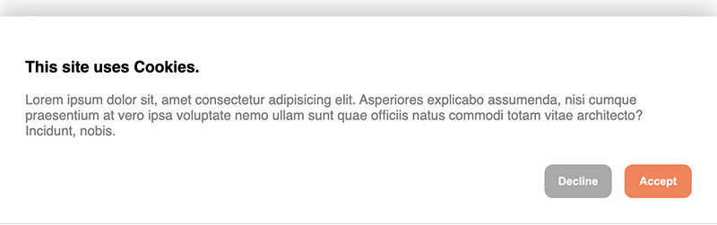
Default cookie banner
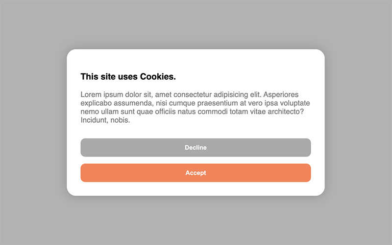
Default cookie Modal
Usage / Examples ✏️
You can either use the components right out of the box without setting any properties or completely customize either one of the consent components in your own taste.
Cookie modal 💚
Basic
import { CookieModal } from '@schlomoh/react-cookieConsent'

const MyApp = () => (
    <>
        <CookieBanner > // above the rest of the page
        <MyPage />
    </>
)
Cookie banner 💙
Basic
import { CookieBanner } from '@schlomoh/react-cookieConsent'

const MyApp = () => (
    <>
        <CookieModal > // above the rest of the page
        <MyPage />
    </>
)
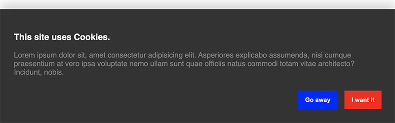
Customized 📐
(All properties work for both modal and banner)
...

const Content = () => (
    <>
        <h3>I'm using cookies on my site.</h3>
        <p>Bla Bla Bla this is my own informational text.</p>
    </>
)

const containerStyle = {backgroundColor: '#333'};
const buttonStyle = {borderRadius: 0}
const primaryButtonStyle={...buttonStyle, backgroundColoe:'red'}
const secondaryButtonStyle={...buttonStyle, backgroundColoe:'blue'}

const MyApp = () => (
    <>
        <CookieBanner
            acceptButtonText='I want it'
            declineButtonText='Go away'
            headingColor='white'
            paragraphColor='grey'
            containerStyle={containerStyle}
            primaryButtonStyle={primaryButtonStyle}
            secondaryButtonStyle={secondaryButtonStyle}
            infoContent={<Content />}
        />
        <MyPage />
    </>
)
... it then looks like this (dont mind the text👀 earlier screenshot):
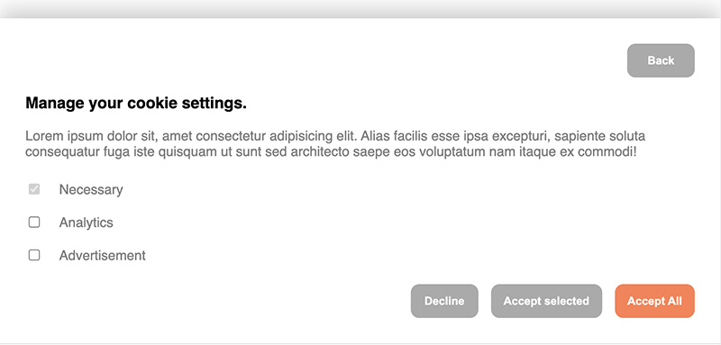
Enabling cookie preferences 🔧
To let a visitor select their cookie preferences the property enableManagement has to be set to true.
You can then set an array of cookie categories which the user can select from. There is always the category "Necessary" predefined and set to true and disabled by default.
When enableManagement is set you can also override the default text of the button by setting managementButtonText='whatever'. This button is a secondary button.
For example
<>
    <CookieBanner
        enableManagement
        managementButtonText='manage cookie preferences'
        cookieCategories={['analytics', 'advertisement']}
    />
</>
Callbacks 👉🏼
You can define callbacks which are called on either accept or decline. Simply pass a function into the onAccept or onDecline property which is executed accordingly.
The onAccept event can pass an object with the selected cookies as ICookieObject into your accept callback.
const onAccept = (cookies : ICookieObject) => {
console.log(cookies);
};
const onDecline = () => {
console.log('declined');
}
const MyApp = () => (
<>
<CookieBanner
onAccept={onAccept}
onDecline={onDecline}
/>
<>
)
Reference 🔎
The ICookieObject:
interface ICookieObject {
  [key: string]: boolean;
}
Example:
{ "advertisement": false, "analytics": true }
| Prop | Type | Default | Description |
|---|
| onAccept | function(cookies?: ICookieObject){} | ()=>{} | Function called when user clicks "accept" |
| onDecline | function(){} | ()=>{} | Function called when user clicks "decline" |
| infoContent | JSX.Element | - | A JSX component that should contain the heading and paragraph of the greeting view |
| managementContent | JSX.Element | - | A JSX component rendered in the management view above the cookie checkboxes best containing heading and paragraph text. |
| acceptButtonText | string | "Accept" | String displayed in the accept button |
| declineButtonText | string | "Decline" | String displayed in the decline button |
| managementButtonText | string | "Manage Cookies" | String displayed in the management toggle button |
| enableManagement | boolean | false | Set to true to display the third button which toggles the management view (where visitors select their cookie preferences). |
| cookieCategories | string[] (array of strings) | [] | An array listing the available cookie preferences to choose from. |
| accentColor | string (React.CSSProperties.backgroundColor) | 'coral' | The accent color used for the primary butttons |
| headingColor | string (React.CSSProperties.color) | 'black' | The color applied to h1, h2, h3, h4 elements inside the views |
| paragraphColor | string (React.CSSProperties.color) | 'grey' | The color applied to p elements inside the views |
| containerStyle | object (React.CSSProperties) | - | Style object overriding the banner or modal style |
| primaryButtonStyle | object (React.CSSProperties) | - | Style object overriding the primary buttons' style |
| secondaryButtonStyle | object (React.CSSProperties) | - | Style object overriding the secondary buttons' style |


