Security News
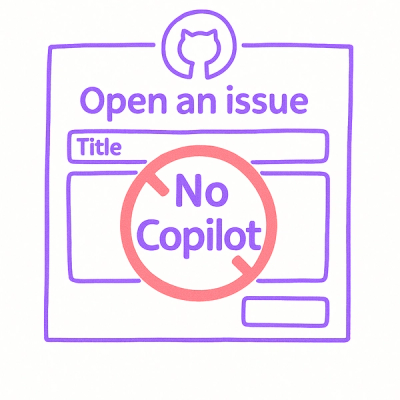
Open Source Maintainers Demand Ability to Block Copilot-Generated Issues and PRs
Open source maintainers are urging GitHub to let them block Copilot from submitting AI-generated issues and pull requests to their repositories.
@scrollmeter/core
Advanced tools
Scrollmeter is a lightweight JavaScript library that visually displays scroll progress on web pages.


Scrollmeter is a lightweight JavaScript library that visually displays the scroll progress of web pages.
npm install @scrollmeter/core
or
yarn add @scrollmeter/core
Specify an ID for the container element where you want to display scroll progress, and call the createScrollmeter function with that ID as the targetId option.
In vanilla JavaScript environments, call the createScrollmeter function after the DOM is fully loaded.
import { createScrollmeter } from '@scrollmeter/core'
import '@scrollmeter/core/dist/index.css'

window.onload = function () {
    createScrollmeter({
        targetId: 'container_id_to_measure',
        useTimeline: true,
        useTooltip: true,
        usePreview: true,
    })
}
In React environments, use the useEffect hook to call the createScrollmeter function when the component mounts.
import { useEffect } from 'react'
import { createScrollmeter } from '@scrollmeter/core'
import '@scrollmeter/core/dist/index.css'

function App() {
    const [scrollOptions, setScrollOptions] = useState({
        targetId: 'container_id_to_measure',
        useTimeline: true,
        useTooltip: true,
        usePreview: true,
    })

    useEffect(() => {
        createScrollmeter(scrollOptions)
    }, [])

    return <div id='container_id_to_measure'>{/* Content you want to measure scroll for */}</div>
}
import { createScrollmeter } from '@scrollmeter/core'
import '@scrollmeter/core/dist/index.css'

window.onload = function () {
    let scrollOptions = {
        targetId: 'container_id_to_measure',
        useTimeline: true,
        useTooltip: true,
        usePreview: true,
    }

    const scrollmeter = createScrollmeter(scrollOptions)

    scrollOptions = {
        ...scrollOptions,
        barOptions: {
            color: '#4A90E2',
            height: 10,
            background: 'rgba(0, 0, 0, 0)',
        },
    }

    scrollmeter.updateScrollmeterStyle(scrollOptions)
}
import { useEffect } from 'react';
import { createScrollmeter, ScrollmeterOptions } from '@scrollmeter/core'
import '@scrollmeter/core/dist/index.css';

function App() {
    const scrollmeter = useRef<ReturnType<typeof createScrollmeter> | null>(null);
    const [scrollOptions, setScrollOptions] = useState<ScrollmeterOptions>({
        targetId: 'container_id_to_measure',
        useTimeline: true,
        useTooltip: true,
        usePreview: true,
    });

    useEffect(() => {
        if (scrollmeter.current) return;
        scrollmeter.current = createScrollmeter(scrollOptions);
    }, []);

    useEffect(() => {
        if (scrollmeter.current) {
            scrollmeter.current.updateScrollmeterStyle(scrollOptions);
        }
    }, [scrollOptions]);

    return (
        <div id="container_id_to_measure">
            {/* Content you want to measure scroll for */}
        </div>
    );
}
| Property | Type | Description | Default |
|---|---|---|---|
| color | string | Progress bar color | rgba(74, 144, 226, 0.9) |
| height | number | Progress bar height | 10 |
| background | string | Progress bar background | rgba(0, 0, 0, 0) |
| Property | Type | Description | Default |
|---|---|---|---|
| color | string | Timeline color | #838383 |
| width | number | Timeline width | 4 |
| Property | Type | Description | Default |
|---|---|---|---|
| background | string | Tooltip background | #333 |
| fontColor | string | Tooltip text color | white |
| fontSize | number | Tooltip font size | 12 |
| paddingInline | number | Tooltip inline padding | 8 |
| paddingBlock | number | Tooltip block padding | 6 |
| width | number | Tooltip width | 150 |
MIT License
Copyright (c) 2024 suhyeon-jeon
FAQs
Scrollmeter is a lightweight JavaScript library that visually displays scroll progress on web pages.
The npm package @scrollmeter/core receives a total of 3 weekly downloads. As such, @scrollmeter/core popularity was classified as not popular.
We found that @scrollmeter/core demonstrated a healthy version release cadence and project activity because the last version was released less than a year ago. It has 0 open source maintainers collaborating on the project.
Did you know?

Socket for GitHub automatically highlights issues in each pull request and monitors the health of all your open source dependencies. Discover the contents of your packages and block harmful activity before you install or update your dependencies.

Security News
Open source maintainers are urging GitHub to let them block Copilot from submitting AI-generated issues and pull requests to their repositories.

Research
Security News
Malicious Koishi plugin silently exfiltrates messages with hex strings to a hardcoded QQ account, exposing secrets in chatbots across platforms.

Research
Security News
Malicious PyPI checkers validate stolen emails against TikTok and Instagram APIs, enabling targeted account attacks and dark web credential sales.