


Developed with the software and tools below.


What is this for?
This is a Sendbird Chat AI Widget implemented on top of React UiKit.
NOTE: Proper utilization through code build is available starting from the "AI Chatbot Pro" plan or higher of the Sendbird AI Chatbot pricing plan.
Demo
How to use
-
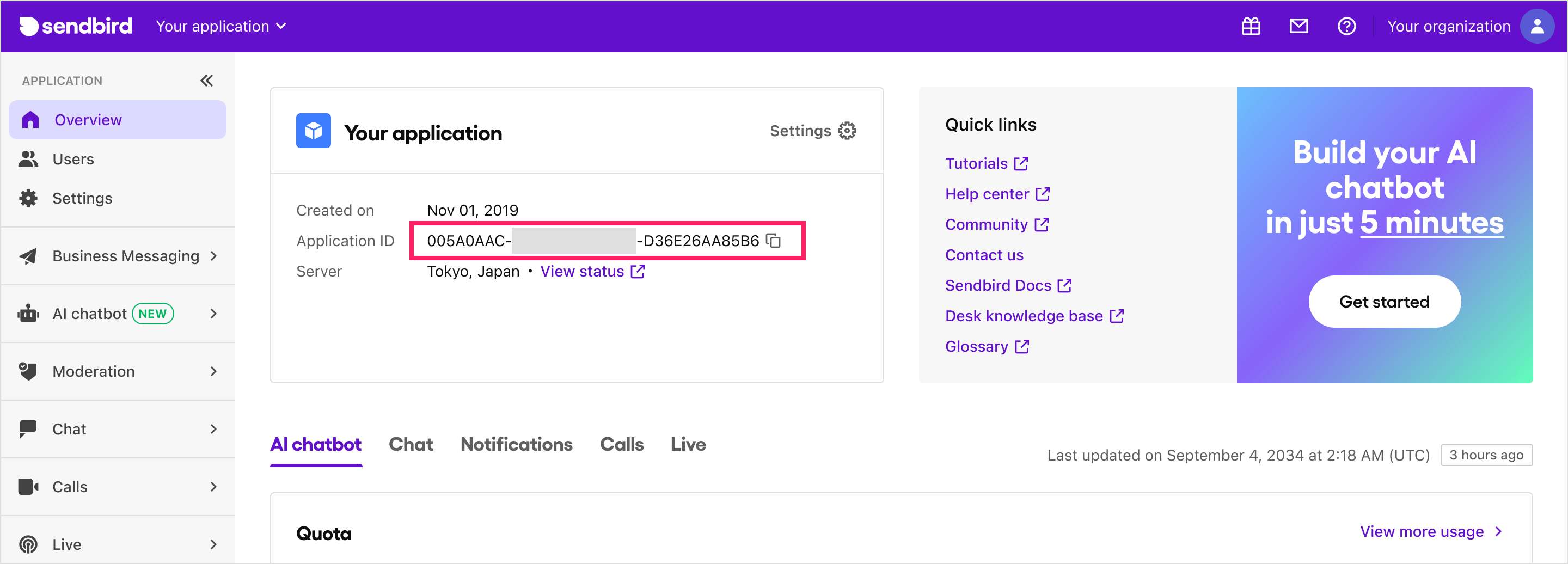
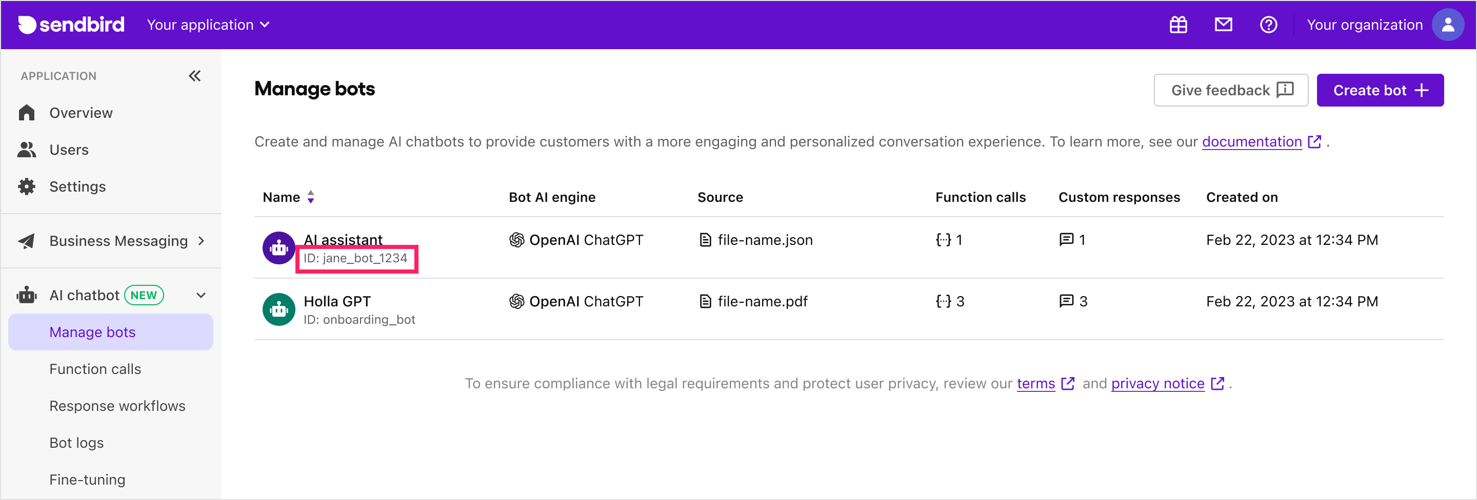
Prepare Sendbird Application ID and Bot ID. Here's how you can get them:
-
Application ID: If you don't have an account, sign up on the Sendbird Dashboard and create a new application.
-
Bot ID: If you don't have a bot, create one on the Sendbird Dashboard under AI Chatbot > Manage Bots > Create Bot.
-
You can also find your application ID and bot ID in the Sendbird Dashboard under AI Chatbot > Manage Bots > Bot Settings > Add to My Website.
-
Install the library:
npm install @sendbird/chat-ai-widget
yarn add @sendbird/chat-ai-widget
-
Add the import statement and component to your code:
 import { ChatAiWidget } from "@sendbird/chat-ai-widget";
 import "@sendbird/chat-ai-widget/dist/style.css";

 const App = () => {
   return (
     <ChatAiWidget
       applicationId="AE8F7EEA-4555-4F86-AD8B-5E0BD86BFE67" // Your Sendbird Application ID
       botId="khan-academy-bot" // Your Bot ID
     />
   );
 };

 export default App;
Not using React in your environment? You can also load this Chat AI Widget component from an HTML file on your website. Please refer to js-example.html for an example.
Run locally
yarn install:deps
yarn dev
Customization
You can customize the UI of the ChatBot by using the ChatAiWidget component. The following are the props that can be used to customize the UI.
import { ChatAiWidget } from "@sendbird/chat-ai-widget";
import '@sendbird/chat-ai-widget/dist/style.css';

const App = () => {
  return (
    <ChatAiWidget
      applicationId="Your Sendbird application ID"
      botId="Your Sendbird bot ID"
      // more available props can be found in the next section
    />
  );
};

export default App;
Available props
applicationId | string | Yes | N/A | Your Sendbird application ID |
botId | string | Yes | N/A | Your Sendbird bot ID |
userNickName | string | No | N/A | The nickname of the user |
enableEmojiFeedback | boolean | No | true | Enables emoji feedback functionality. |
enableMention | boolean | No | true | Enables mention functionality. |
deviceType | 'desktop' | 'mobile' | No | N/A | Device type to be used in the widget |
stringSet | { [key: string]: string } | No | N/A | Customizable string set. Available string sets can be found here. |
customRefreshComponent | { icon: string, style: React.CSSProperties, width: string, height: string, onClick: () => void } | No | N/A | Customizable refresh component. You can set properties such as icon, style, width, height, and onClick. |
userId | string | No | N/A | User ID to be used in the widget connect. Must be used with sessionToken and configureSession. The example usage can be found here. |
sessionToken | string | No | N/A | Session token to be used in the widget connect. Must be used with userId and configureSession. The example usage can be found here. |
configureSession | () => SessionHandler | No | N/A | Session configuration function. Must be used with userId and sessionToken. The example usage can be found here. |
autoOpen | boolean | No | N/A | Determines whether the chatbot widget automatically opens when the browser window is opened. This property is being ignored in mobile view. |
enableResetHistoryOnConnect | boolean | No | false | Determines whether the chatbot widget history is reset when the user connects. |
messageInputControls.blockWhileBotResponding | boolean | number | No | N/A | Allows to control enabled/disabled state of the message input for waiting for the bot's reply mesage. If number value is given, a timer will be set to force unblock the message input. |
dateLocale | Locale | No | enUS | Locale value to be applied to string values of message timestamp and date separator. Locale values must be imported from date-fns. |
enableHideWidgetForDeactivatedUser | boolean | No | false | Determines whether the chatbot widget is hidden when the user is deactivated. |
For internal contributors


