Product
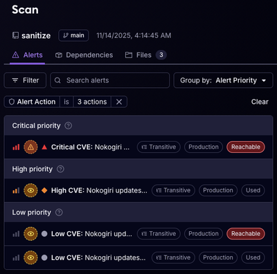
Reachability for Ruby Now in Beta
Reachability analysis for Ruby is now in beta, helping teams identify which vulnerabilities are truly exploitable in their applications.
@shipt/react-native-tachyons
Advanced tools
Welcome to Shipt's React Native Tachyons library! Checkout our documentation below to learn how to get started.
T FunctionThese instructions will help you get set up with react-native-tachyons.
# with npm
npm i --save @shipt/react-native-tachyons

# with yarn
yarn add @shipt/react-native-tachyons
You can use the build function to create your own custom tachyon strings.
// styleConfig.js

import { build } from '@shipt/react-native-tachyons';

// define your rem
const rem = 16;

// define your color palette
const colors = {
  white: '#ffffff',
  black: '#000000',
};

// define your style shorthands
const styles = {
  'gutter-h': { paddingLeft: '1rem', paddingRight: '1rem' },
  'gutter-v': { paddingTop: '1rem', paddingBottom: '1rem' },
  'some-style': { height: 100, width: '100%' },
};

// Run build
build({
  rem,
  colors,
  styles,
});
Now the custom tachyons you defined will be usable.
import React from 'react';
import { View, Text } from 'react-native';
import { styled } from '@shipt/react-native-tachyons';

const ButtonContainer = styled(View)`some-style gutter-h gutter-v`;
const ButtonContent = styled(Text)`white`;

export function Button(props) {
  return (
    <ButtonContainer>
      <ButtonContent>{props.text}</ButtonContent>
    </ButtonContainer>
  );
}
Define components using a styled-components-like syntax.
import React from 'react';
import { View, Text } from 'react-native';
import { styled } from '@shipt/react-native-tachyons';

const ButtonContainer = styled(View)`flx-i jcc aic`;
const ButtonContent = styled(Text)`p3 white`;

export function Button(props) {
  return (
    <ButtonContainer>
      <ButtonContent>{props.text}</ButtonContent>
    </ButtonContainer>
  );
}
While tachyons will cover 90% of your needs, it's inevitable that you'll sometimes need something custom.
// ...react imports
import { styled } from '@shipt/react-native-tachyons';

// style objects that won't change can be pass in here
const Box = styled(View, styles.Box, styles.anotherStyle)`flx-i gutter-h bg-white`;

function MyComponent(props) {
  const backgroundColor = props.active ? '#051937' : '#12B2EB;
  const dynamicStyle = { backgroundColor }

  // styles that will change over time can be passed as a  prop
  return <Box style={dynamicStyle} />;
}

const styles = StyleSheet.create({
  Box: {
    width: 234
  },
  anotherStyle: {
    color: 'red
  }
});
Just like the Styled Components Library (thanks for the awesome work and inspiration, guys), our styled components use the tagged template literal syntax. This means that you can use string interpolation to pass in functions that return tachyon strings based on props. That's a mouth full, so here's an example:
import { styled } from '@shipt/react-native-tachyons';

// Let's make a button that changes the background color based on a `primary` prop
const Button = styled(View)`flx-i gutter-h ${(props) => (props.primary ? 'bg-blue' : 'bg-white')}`;

function CancelButton() {
  return <Button />; // background will be white
}

function SubmitButton() {
  return <Button primary />; // background will be blue
}
You can compose and build up styled components. Let's make some buttons to demonstrate. Notice that CancelButton wraps the initial Button, etc.
import { styled } from '@shipt/react-native-tachyons'

const Button = styled(TouchableOpacity)`w5 h3 p3 black`

// Reuse Button
const CancelButton = styled(Button)`bg-white`
const WhiteTextButton = styled(Button)`white`

// Reuse WhiteTextButton
const PrimaryButton = styled(WhiteTextButton)`bg-blue`
const SuccessButton = styled(WhiteTextButton)`bg-green`
const DangerButton = styled(WhiteTextButton)`bg-red`

function Actions() {
  return <>
    <PrimaryButton onPress={() => console.log("do primary stuff")}>
    <SuccessButton onPress={() => console.log("be successful")}>
    <DangerButton onPress={() => console.log("risk it")}>
    <CancelButton onPress={() => console.log("cancel something")}>
  </>
}
T FunctionIf you're not into styled components, you can use the T function. It accepts a string of tachyons and returns an array of style objects. The array is memoized to work well with things like PureComponent and React.Memo.
import React from 'react';
import { View, Text } from 'react-native';
import { T } from '@shipt/react-native-tachyons';

export function Button(props) {
  return (
    <View style={T('flx-i jcc aic')}>
      <Text style={T('white')}>{props.text}</Text>
    </View>
  );
}
The T function will also accept additional style objects. These additional styles will override the provided tachyons.
// ...react imports
import { T } from '@shipt/react-native-tachyons';

function MyComponent() {
  const style = T('flx-i gutter-h bg-white', styles.Box);
  return <View style={style} />;
}

const styles = StyleSheet.create({
  Box: {
    width: 234,
  },
});
We'll have a babel plugin coming soon that will make debugging easier.
Animated.createAnimatedComponentWe haven't tracked down the exact issue nor can we reliably replicate, but occasionally RN will throw a nasty error
if you use Animated.createAnimatedComponent with a styled component. The solution is to style your component prior to using
Animated.createAnimatedComponent.
// GOOD
const Component = styled(View)`absolute`;

const AnimatedComponent = React.createAnimatedComponent(Component);

// BAD
const AnimatedView = React.createAnimatedComponent(View);

const AnimatedComponent = styled(AnimatedView)`absolute`;
For a full list of tachyon strings and the styles they represent, go here.
Read the Attributions here.
All changes to this repository must be made via a Pull Request. Please create PRs off of the v1 branch (default branch). All PRs are required to be reviewed by 2 engineers prior to merge.
Packages are built and published via CircleCI. The publish workflow is triggered when a tag is published.
To publish a new version of this package:
v1package.json and run npm install to update the package-lock.json file. Please follow SemVer when updating package versions.v1 branch\d+.\d+.\d+ e.g. 0.1.1 that targets the v1 branchbuild_and_publish workflow in CircleCITo find out who our Maintainers are, check out MAINTAINERS.md.
This project is licensed under the MIT License - see the LICENSE.md file for details.
FAQs
Tachyons for RN
We found that @shipt/react-native-tachyons demonstrated a not healthy version release cadence and project activity because the last version was released a year ago. It has 101 open source maintainers collaborating on the project.
Did you know?

Socket for GitHub automatically highlights issues in each pull request and monitors the health of all your open source dependencies. Discover the contents of your packages and block harmful activity before you install or update your dependencies.

Product
Reachability analysis for Ruby is now in beta, helping teams identify which vulnerabilities are truly exploitable in their applications.

Research
/Security News
Malicious npm packages use Adspect cloaking and fake CAPTCHAs to fingerprint visitors and redirect victims to crypto-themed scam sites.

Security News
Recent coverage mislabels the latest TEA protocol spam as a worm. Here’s what’s actually happening.