Installation
npm install @smarthtmlelemnets/smart-bootstrap
CSS
Copy-paste the stylesheet into your before all othernpm stylesheets to load our CSS.
<link rel="stylesheet" href="src/styles/smart.bootstrap.css">
or
import 'src/styles/smart.bootstrap.css';
Javascript
<script src="src/smart.element.js"></script>
<script src="src/smart.bootstrap.js"></script>
or
import 'src/smart.element.js'
import 'src/smart.bootstrap.js'
Overview
The package extends Bootstrap by adding Material Design and CSS3 Variables for Styling.
The Boostrap components are rewritten from scratch and are built as Web Components by using the Smart Framework.
The Bootstrap SCSS is rewritten with CSS3 Variables and Material Design is added.
Components
Demo ↗
Material Design Bootstrap Button Web Component
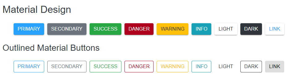
<bootstrap-button style-mode="primary">Primary</bootstrap-button>
<bootstrap-button style-mode="secondary">Secondary</bootstrap-button>
<bootstrap-button style-mode="success">Success</bootstrap-button>
<bootstrap-button style-mode="danger">Danger</bootstrap-button>
<bootstrap-button style-mode="warning">Warning</bootstrap-button>
<bootstrap-button style-mode="info">Info</bootstrap-button>
<bootstrap-button style-mode="light">Light</bootstrap-button>
<bootstrap-button style-mode="dark">Dark</bootstrap-button>
<bootstrap-button style-mode="link">Link</bootstrap-button>
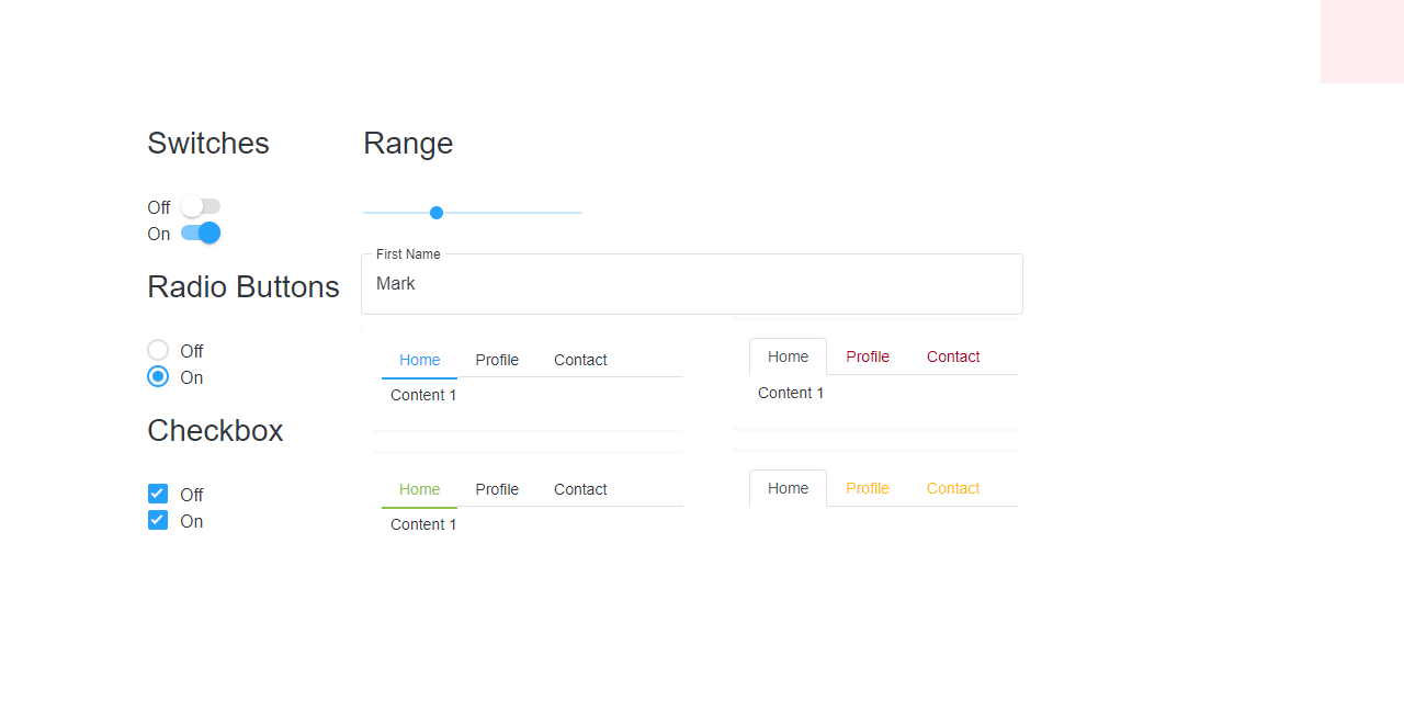
Material Design Bootstrap CheckBox Web Component
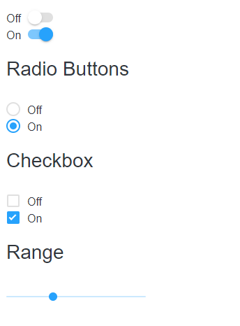
<bootstrap-check-box checked>Checked</bootstrap-check-box>
<bootstrap-check-box>Unchecked</bootstrap-check-box>
Material Design Bootstrap Radio Button Web Component
<bootstrap-radio-button checked> Active</bootstrap-radio-button>
<bootstrap-radio-button>Radio</bootstrap-radio-button>
<bootstrap-radio-button>Radio</bootstrap-radio-button>
Material Design Bootstrap DropDown Web Component
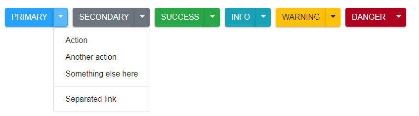
<bootstrap-drop-down label="Dropdown button">
	<a class="dropdown-item" href="#">Action</a>
	<a class="dropdown-item" href="#">Another action</a>
	<a class="dropdown-item" href="#">Something else here</a>
</bootstrap-drop-down>
Material Design Bootstrap Split Button Web Component
<bootstrap-split-button label="Dropdown button">
	<a class="dropdown-item" href="#">Action</a>
	<a class="dropdown-item" href="#">Another action</a>
	<a class="dropdown-item" href="#">Something else here</a>
</bootstrap-split-button>
Material Design Bootstrap Input Group Web Component
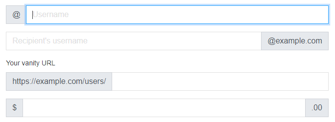
<bootstrap-input-group class="mb-3">
	<span class="input-group-text" id="basic-addon1">@</span>
	<input type="text" class="form-control" placeholder="Username" aria-label="Username"
		aria-describedby="basic-addon1">
</bootstrap-input-group>
<bootstrap-input-group class="mb-3">
	<input type="text" class="form-control" placeholder="Recipient's username"
		aria-label="Recipient's username" aria-describedby="basic-addon2">
	<span class="input-group-text" id="basic-addon2">@example.com</span>
</bootstrap-input-group>
<label for="basic-url">Your vanity URL</label>
<bootstrap-input-group class="mb-3">
	<span class="input-group-text" id="basic-addon3">https://example.com/users/</span>
</bootstrap-input-group>
<bootstrap-input-group class="mb-3">
	<span class="input-group-text">$</span>
	<input type="text" class="form-control" aria-label="Amount (to the nearest dollar)">
	<span class="input-group-text">.00</span>
</bootstrap-input-group>
<bootstrap-input-group>
	<span class="input-group-text">With textarea</span>
	<textarea class="form-control" aria-label="With textarea"></textarea>
</bootstrap-input-group>
Material Design Bootstrap Modal Web Component
<bootstrap-modal id="exampleModalLive" class="fade">
<div class="modal-header">
<h5 class="modal-title" id="exampleModalLabel">Modal title</h5>
<button type="button" class="close" data-dismiss="modal" aria-label="Close">
<span aria-hidden="true">×</span>
</button>
</div>
<div class="modal-body">
<p>Modal body text goes here.</p>
</div>
<div class="modal-footer">
<button type="button" class="btn btn-secondary" data-dismiss="modal">Close</button>
<button type="button" class="btn btn-primary">Save changes</button>
</div>
</bootstrap-modal>
Material Design Bootstrap Tabs Web Component
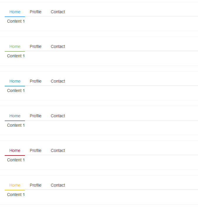
<bootstrap-tabs style-mode="warning" role="tablist">
	<a class="nav-link active" id="home-tab" data-toggle="tab" href="#home13" role="tab"
		aria-controls="home13" aria-selected="true">Home</a>
	<a class="nav-link" id="profile-tab" data-toggle="tab" href="#profile13" role="tab"
		aria-controls="profile13" aria-selected="false">Profile</a>
	<a class="nav-link" id="contact-tab" data-toggle="tab" href="#contact13" role="tab"
		aria-controls="contact13" aria-selected="false">Contact</a>
</bootstrap-tabs>
<div class="tab-content" id="myTabContent">
	<div class="tab-pane fade show active" id="home13" role="tabpanel" aria-labelledby="home-tab">
		Content 1
	</div>
	<div class="tab-pane fade" id="profile13" role="tabpanel" aria-labelledby="profile-tab">
		Content 2
	</div>
	<div class="tab-pane fade" id="contact13" role="tabpanel" aria-labelledby="contact-tab">
		Content 3
	</div>
</div>
Material Design Bootstrap Input Web Component
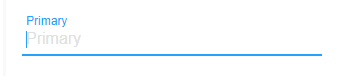
<bootstrap-input placeholder="Primary" style-mode="primary"></bootstrap-input>
Material Design Bootstrap TextArea Web Component
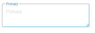
<bootstrap-textarea placeholder="Primary" style-mode="primary"></bootstrap-textarea>
Material Design Bootstrap Range Web Component
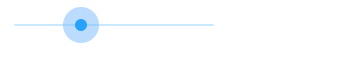
<bootstrap-range></bootstrap-range>
Material Design Progress Web Component
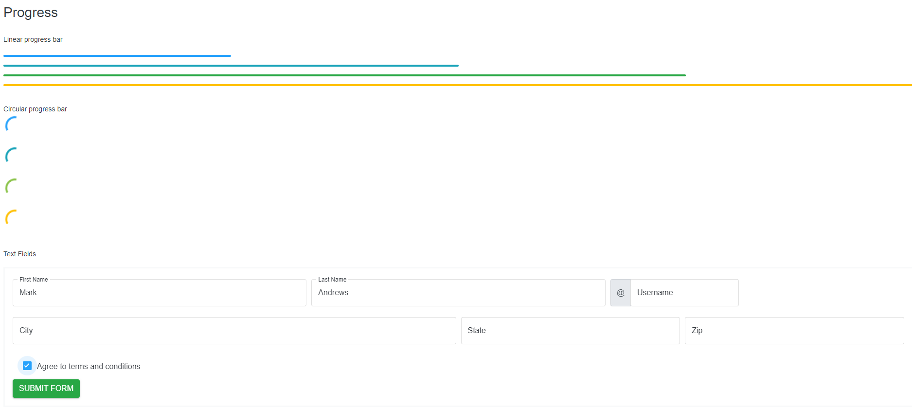
<bootstrap-progress></bootstrap-progress>
Material Design Circular Progress Web Component
<bootstrap-circular></bootstrap-circular>
Material Design File Input Web Component
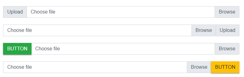
<bootstrap-file-input></bootstrap-file-input>
Material Design Bootstrap Switch Button Web Component
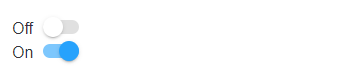
<bootstrap-switch-button></bootstrap-switch-button>
The file structure
-
src/
Javascript files.
-
src/styles/
License
Apache License 2.0


