Product
Introducing GitHub Actions Scanning Support
Detect malware, unsafe data flows, and license issues in GitHub Actions with Socket’s new workflow scanning support.
@spectrum-web-components/action-menu
Advanced tools
An `<sp-action-menu>` is an action button that triggers an overlay with `<sp-menu-items>` for activation. Use an `<sp-menu>` element to outline the items that will be made available to the user when interacting with the `<sp-action-menu>` element. By defa
An <sp-action-menu> is an action button that triggers an overlay with <sp-menu-items> for activation. Use an <sp-menu> element to outline the items that will be made available to the user when interacting with the <sp-action-menu> element. By default, <sp-action-menu> does not manage a selection. If you'd like for a selection to be managed, use selects="single" on the <sp-menu> to activate this functionality.
yarn add @spectrum-web-components/action-menu
Import the side effectful registration of <sp-action-menu> via:
import '@spectrum-web-components/action-menu/sp-action-menu.js';
The default of <sp-action-menu> will load dependencies in @spectrum-web-components/overlay asynchronously via a dynamic import. In the case that you would like to import those tranverse dependencies statically, import the side effectful registration of <sp-action-menu> as follows:
import '@spectrum-web-components/action-menu/sync/sp-action-menu.js';
When looking to leverage the ActionMenu base class as a type and/or for extension purposes, do so via:
import { ActionMenu } from '@spectrum-web-components/action-menu';
<sp-action-menu size="s">
    <span slot="label">More Actions</span>
    <sp-menu-item>
        Deselect
    </sp-menu-item>
    <sp-menu-item>
        Select inverse
    </sp-menu-item>
    <sp-menu-item>
        Feather...
    </sp-menu-item>
    <sp-menu-item>
        Select and mask...
    </sp-menu-item>
    <sp-menu-divider></sp-menu-divider>
    <sp-menu-item>
        Save selection
    </sp-menu-item>
    <sp-menu-item disabled>
        Make work path
    </sp-menu-item>
</sp-action-menu>
<sp-action-menu size="m">
    <span slot="label">More Actions</span>
    <sp-menu-item>
        Deselect
    </sp-menu-item>
    <sp-menu-item>
        Select inverse
    </sp-menu-item>
    <sp-menu-item>
        Feather...
    </sp-menu-item>
    <sp-menu-item>
        Select and mask...
    </sp-menu-item>
    <sp-menu-divider></sp-menu-divider>
    <sp-menu-item>
        Save selection
    </sp-menu-item>
    <sp-menu-item disabled>
        Make work path
    </sp-menu-item>
</sp-action-menu>
<sp-action-menu size="l">
    <span slot="label">More Actions</span>
    <sp-menu-item>
        Deselect
    </sp-menu-item>
    <sp-menu-item>
        Select inverse
    </sp-menu-item>
    <sp-menu-item>
        Feather...
    </sp-menu-item>
    <sp-menu-item>
        Select and mask...
    </sp-menu-item>
    <sp-menu-divider></sp-menu-divider>
    <sp-menu-item>
        Save selection
    </sp-menu-item>
    <sp-menu-item disabled>
        Make work path
    </sp-menu-item>
</sp-action-menu>
<sp-action-menu size="xl">
    <span slot="label">More Actions</span>
    <sp-menu-item>
        Deselect
    </sp-menu-item>
    <sp-menu-item>
        Select inverse
    </sp-menu-item>
    <sp-menu-item>
        Feather...
    </sp-menu-item>
    <sp-menu-item>
        Select and mask...
    </sp-menu-item>
    <sp-menu-divider></sp-menu-divider>
    <sp-menu-item>
        Save selection
    </sp-menu-item>
    <sp-menu-item disabled>
        Make work path
    </sp-menu-item>
</sp-action-menu>
In order to deliver an <sp-action-menu> without an icon, use the label-only slot. This will supress any icon from being displayed, both the default ellipsis icon or any icon the user might provide to the element.
<sp-action-menu>
    <span slot="label-only">More Actions</span>
    <sp-menu-item>
        Deselect
    </sp-menu-item>
    <sp-menu-item>
        Select inverse
    </sp-menu-item>
    <sp-menu-item>
        Feather...
    </sp-menu-item>
    <sp-menu-item>
        Select and mask...
    </sp-menu-item>
    <sp-menu-divider></sp-menu-divider>
    <sp-menu-item>
        Save selection
    </sp-menu-item>
    <sp-menu-item disabled>
        Make work path
    </sp-menu-item>
</sp-action-menu>
The visible label that is be provided via the default <slot> interface can be omitted in preference of an icon only interface. In this context be sure that the <sp-action-menu> continued to be accessible to screen readers by applying the label attribute. This will apply an aria-label attribute of the same value to the <button> element that toggles the menu list.
<sp-action-menu label="More Actions">
    <sp-menu-item>
        Deselect
    </sp-menu-item>
    <sp-menu-item>
        Select inverse
    </sp-menu-item>
    <sp-menu-item>
        Feather...
    </sp-menu-item>
    <sp-menu-item>
        Select and mask...
    </sp-menu-item>
    <sp-menu-divider></sp-menu-divider>
    <sp-menu-item>
        Save selection
    </sp-menu-item>
    <sp-menu-item disabled>
        Make work path
    </sp-menu-item>
</sp-action-menu>
A custom icon can be supplied via the icon slot in order to replace the default meatballs icon.
<sp-action-menu>
    <sp-icon-settings slot="icon"></sp-icon-settings>
    <span slot="label">Actions under the gear</span>
    <sp-menu-item>
        Deselect
    </sp-menu-item>
    <sp-menu-item>
        Select inverse
    </sp-menu-item>
    <sp-menu-item>
        Feather...
    </sp-menu-item>
    <sp-menu-item>
        Select and mask...
    </sp-menu-item>
    <sp-menu-divider></sp-menu-divider>
    <sp-menu-item>
        Save selection
    </sp-menu-item>
    <sp-menu-item disabled>
        Make work path
    </sp-menu-item>
</sp-action-menu>
When selects is set to single, the <sp-action-menu> element will maintain one selected item after an initial selection is made.
<p>
The value of the `<sp-action-menu>` element is:
<span id="single-value"></span>
</p>
<sp-action-menu
selects="single"
onchange="this.previousElementSibling.querySelector('#single-value').textContent=this.value"
>
<span slot="label">Available shapes</span>
<sp-menu-item value="shape-1-square">Square</sp-menu-item>
<sp-menu-item value="shape-2-triangle">Triangle</sp-menu-item>
<sp-menu-item value="shape-3-parallelogram">Parallelogram</sp-menu-item>
<sp-menu-item value="shape-4-star">Star</sp-menu-item>
<sp-menu-item value="shape-5-hexagon">Hexagon</sp-menu-item>
<sp-menu-item value="shape-6-circle" disabled>Circle</sp-menu-item>
</sp-action-menu>
On mobile, the menu can be exposed in either a sp-popover or sp-tray. By default, sp-action-menu will render an sp-tray. If you would like to render sp-popover on mobile, add the attribute force-popover to the sp-action-menu.
Usage Guidance:
To see this functionality in action, load this page from your mobile device or use Chrome DevTools (or equivalent) and select a mobile device once the Device Toolbar (the phone/tablet icon) is active.
<sp-action-menu force-popover>
    <span slot="label">Action Menu</span>
    <sp-menu-item>Deselect</sp-menu-item>
    <sp-menu-item>Select Inverse</sp-menu-item>
    <sp-menu-item>Feather...</sp-menu-item>
    <sp-menu-item>Select and Mask...</sp-menu-item>
    <sp-menu-divider></sp-menu-divider>
    <sp-menu-item>Save Selection</sp-menu-item>
    <sp-menu-item disabled>Make Work Path</sp-menu-item>
</sp-action-menu>
Tooltip in action menu can be attached via adding <sp-tooltip> and can be customized by using various parameters (e.g. placement, content, etc) as needed.
<sp-action-menu>
    <sp-tooltip slot="tooltip" self-managed placement="bottom">
        Content
    </sp-tooltip>
    <span slot="label">Available shapes</span>
    <sp-menu-item value="shape-1-square">Square</sp-menu-item>
    <sp-menu-item value="shape-2-triangle">Triangle</sp-menu-item>
    <sp-menu-item value="shape-3-parallelogram">Parallelogram</sp-menu-item>
</sp-action-menu>
An <sp-action-menu> parent will ensure that the internal <sp-menu> features a role of listbox and contains children with the role option. Upon focusing the <sp-action-menu> using ArrowDown will also open the menu while throwing focus into first selected (or unselected when none are selected) menu item to assist in selecting of a new value.
FAQs
Did you know?

Socket for GitHub automatically highlights issues in each pull request and monitors the health of all your open source dependencies. Discover the contents of your packages and block harmful activity before you install or update your dependencies.

Product
Detect malware, unsafe data flows, and license issues in GitHub Actions with Socket’s new workflow scanning support.

Product
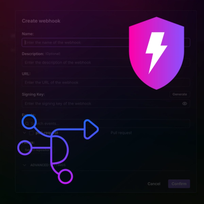
Add real-time Socket webhook events to your workflows to automatically receive pull request scan results and security alerts in real time.

Research
The Socket Threat Research Team uncovered malicious NuGet packages typosquatting the popular Nethereum project to steal wallet keys.