Product
Introducing Rust Support in Socket
Socket now supports Rust and Cargo, offering package search for all users and experimental SBOM generation for enterprise projects.
@spectrum-web-components/base
Advanced tools
The `SpectrumElement` base class as created by mixing `SpectrumMixin` onto `LitElement` adopts `dir` values from the `document` at connection time with a fallback to `lrt`. In a TypeScript context, it also enforces the presence of `this.shadowRoot` on ext
The SpectrumElement base class as created by mixing SpectrumMixin onto LitElement adopts dir values from the document at connection time with a fallback to lrt. In a TypeScript context, it also enforces the presence of this.shadowRoot on extending components.
yarn add @spectrum-web-components/base
When looking to leverage the SpectrumElement base class as a type and/or for extension purposes, do so via:
import { SpectrumElement } from '@spectrum-web-components/base';

export MyElement extends SpectrumElement {}
Similarly the SpectrumMixin class factory mixin is available via:
import { SpectrumMixin } from '@spectrum-web-components/base';

export MyElement extends SpectrumMixin(HTMLElement) {}
dir managementWith powerful CSS selectors like :host(:dir(rtl)) and :host-content([dir=rtl]) not yet enjoying cross-browser support, reliably delivering content in both "left to right" and "right to left" while relying on Shadow DOM means certain trade offs need to be made. While every custom element build from SpectrumMixin could have its dir attribute applied to manage this, doing so is not only a pain for apply, it's a pain to maintain over time. To support the flexibility to deliver content in both of these directions, elements built from SpectrumMixin will observe the dir attribute of either the document or a containing sp-theme. This will allow your sites and applications to manage content direction in a single place while also opening the possibility of having multiple content directions on the same page by scoping those content sections with sp-theme elements.
Placing a dir attribute on an element built from SpectrumMixin before attaching it to the DOM will prevent it from resolving the text direction value to a parent sp-theme or document element. Elements applied to the page in this way will also NOT participate in observing any such elements, so their dir values will remain as initialized regardless of changes in other parts of your documents. If you choose to leverage this, be aware that any child (in both light DOM and shadow DOM) of this element will need to have a dir attribute applied as well if you do not want it resolving to a parent sp-theme or document element itself. In this way, it is likely that you would benefit from leveraging an sp-theme element to create scope in your document for managing this custom content direction section of your page.
isLTRWhile CSS offers many powerful solutions for styling content in various directions, sometimes JS functionality depends on the specific of that direction. Elements built from SpectrumMixin have the this.isLTR getter that will resolve to true when dir === 'ltr'.
Elements built from SpectrumMixin assume that you will be using shadow DOM in the resulting custom element. To simplify TypeScript usage the presence of this.shadowRoot is asserted as non-null so that you have direct access to it without extended type checking.
1.7.0 (2025-06-11)
sp-overlay: Fixed : Overlays (like pickers and action menus) were incorrectly closing when scrolling occurred within components. The fix ensures the handleScroll method in OverlayStack only responds to document/body scrolling events and ignores component-level scrolling events, which was the original intention.
sp-card: Fixed: On mobile Chrome (both Android and iOS), scrolling on sp-card components would inadvertently trigger click events. This was caused by the timing-based click detection (200ms threshold) in the pointer event handling, which could misinterpret quick scrolls as clicks. This issue did not affect Safari on mobile devices.
sp-action-button: - Fixed : Action buttons with href attributes now properly detects modifier keys and skips the proxy click, allowing only native browser behavior to proceed.
sp-styles: Remove unnecessary system theme references to reduce complexity for components that don't need the additional mapping layer.
sp-card: - Fixed: sp-card component relies on sp-popover for certain toggle interactive behaviors, but this dependency was missing from its dependency tree.
sp-menu: Fixes: Icons in menu stories weren't properly responding to theme changes when used in functional story components. Switching to class-based LitElement components ensures proper component lifecycle hooks and shadow DOM context for icon initialization and theme integration.
sp-tabs: Added @spectrum-web-components/action-button as a dependency for Tabs as its used in the direction button.
sp-split-view: Added @spectrum-web-components/shared dependency in splitview since it uses ranDomId from the shared package
sp-textfield: Replace deprecated word-break: break-word with overflow-wrap: break-word to align with modern CSS standards and improve cross-browser compatibility. This property was deprecated in Chrome 44 (July 2015) in favor of the standardized overflow-wrap property.
FAQs
The `SpectrumElement` base class as created by mixing `SpectrumMixin` onto `LitElement` adopts `dir` values from the `document` at connection time with a fallback to `lrt`. In a TypeScript context, it also enforces the presence of `this.shadowRoot` on ext
The npm package @spectrum-web-components/base receives a total of 11,248 weekly downloads. As such, @spectrum-web-components/base popularity was classified as popular.
We found that @spectrum-web-components/base demonstrated a healthy version release cadence and project activity because the last version was released less than a year ago. It has 7 open source maintainers collaborating on the project.
Did you know?

Socket for GitHub automatically highlights issues in each pull request and monitors the health of all your open source dependencies. Discover the contents of your packages and block harmful activity before you install or update your dependencies.

Product
Socket now supports Rust and Cargo, offering package search for all users and experimental SBOM generation for enterprise projects.

Product
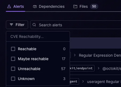
Socket’s precomputed reachability slashes false positives by flagging up to 80% of vulnerabilities as irrelevant, with no setup and instant results.

Product
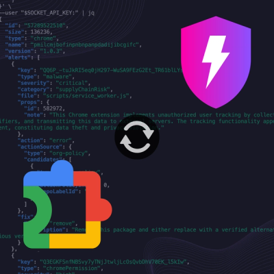
Socket is launching experimental protection for Chrome extensions, scanning for malware and risky permissions to prevent silent supply chain attacks.