Product
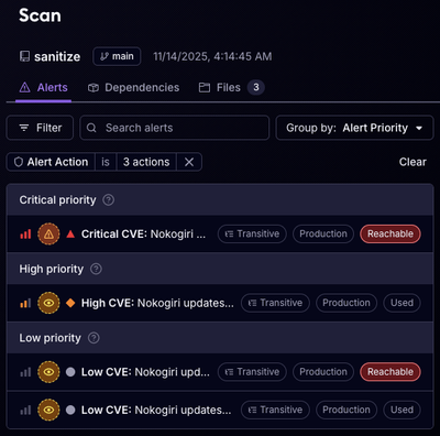
Announcing Socket Certified Patches: One-Click Fixes for Vulnerable Dependencies
A safer, faster way to eliminate vulnerabilities without updating dependencies
@spectrum-web-components/divider
Advanced tools
`sp-divider` brings clarity to a layout by grouping and dividing content that exists in close proximity. It can also be used to establish rhythm and hierarchy.
sp-divider brings clarity to a layout by grouping and dividing content that exists in close proximity. It can also be used to establish rhythm and hierarchy.
yarn add @spectrum-web-components/divider
Import the side effectful registration of <sp-divider> via:
import '@spectrum-web-components/divider/sp-divider.js';
When looking to leverage the Divider base class as a type and/or for extension purposes, do so via:
import { Divider } from '@spectrum-web-components/divider';
<h2 class="spectrum-Heading spectrum-Heading--sizeXS">Small</h2>
<sp-divider size="s"></sp-divider>
<p class="spectrum-Body">
    Divide like-elements (tables, tool groups, elements within a panel, etc.)
</p>
<h2 class="spectrum-Heading spectrum-Heading--sizeS">Medium</h2>
<sp-divider size="m"></sp-divider>
<p class="spectrum-Body">
    Divide subsections, or divide different groups of elements (between panels,
    rails, etc.)
</p>
<h2 class="spectrum-Heading spectrum-Heading--sizeM">Large</h2>
<sp-divider size="l"></sp-divider>
<p class="spectrum-Body">Page or Section Titles.</p>
When a vertical Divider is used inside of a flex container, use align-self: stretch; height: auto; on the Divider.
<div style="height: 32px; display: flex;">
    <sp-action-button quiet label="Zoom in">
        <sp-icon-magnify slot="icon"></sp-icon-magnify>
    </sp-action-button>
    <sp-divider
        size="s"
        style="align-self: stretch; height: auto;"
        vertical
    ></sp-divider>
    <sp-action-button quiet label="Zoom in">
        <sp-icon-magnify slot="icon"></sp-icon-magnify>
    </sp-action-button>
</div>
<div style="height: 32px; display: flex;">
    <sp-action-button quiet label="Zoom in">
        <sp-icon-magnify slot="icon"></sp-icon-magnify>
    </sp-action-button>
    <sp-divider
        size="m"
        style="align-self: stretch; height: auto;"
        vertical
    ></sp-divider>
    <sp-action-button quiet label="Zoom in">
        <sp-icon-magnify slot="icon"></sp-icon-magnify>
    </sp-action-button>
</div>
<div style="height: 32px; display: flex;">
    <sp-action-button quiet label="Zoom in">
        <sp-icon-magnify slot="icon"></sp-icon-magnify>
    </sp-action-button>
    <sp-divider
        size="l"
        style="align-self: stretch; height: auto;"
        vertical
    ></sp-divider>
    <sp-action-button quiet label="Zoom in">
        <sp-icon-magnify slot="icon"></sp-icon-magnify>
    </sp-action-button>
</div>
FAQs
`sp-divider` brings clarity to a layout by grouping and dividing content that exists in close proximity. It can also be used to establish rhythm and hierarchy.
We found that @spectrum-web-components/divider demonstrated a healthy version release cadence and project activity because the last version was released less than a year ago. It has 7 open source maintainers collaborating on the project.
Did you know?

Socket for GitHub automatically highlights issues in each pull request and monitors the health of all your open source dependencies. Discover the contents of your packages and block harmful activity before you install or update your dependencies.

Product
A safer, faster way to eliminate vulnerabilities without updating dependencies

Product
Reachability analysis for Ruby is now in beta, helping teams identify which vulnerabilities are truly exploitable in their applications.

Research
/Security News
Malicious npm packages use Adspect cloaking and fake CAPTCHAs to fingerprint visitors and redirect victims to crypto-themed scam sites.