Product
Introducing Rust Support in Socket
Socket now supports Rust and Cargo, offering package search for all users and experimental SBOM generation for enterprise projects.
@spectrum-web-components/icon
Advanced tools
`<sp-icon>` renders an icon to the page. By default the `name` attribute will pair with separately registered icon sets to deliver the icons. When not present, `<sp-icon>` will subsequently check for its `src` attribute which could populate the icon via a
<sp-icon> renders an icon to the page. By default the name attribute will pair with separately registered icon sets to deliver the icons. When not present, <sp-icon> will subsequently check for its src attribute which could populate the icon via an image, and then fallback to any slotted content for an element based icon.
yarn add @spectrum-web-components/icon
Import the side effectful registration of <sp-icon> via:
import '@spectrum-web-components/icon/sp-icon.js';
When looking to leverage the Icon base class as a type and/or for extension purposes, do so via:
import { Icon } from '@spectrum-web-components/icon';
Names of the icons on this page are provided by the <sp-icons-medium> icon set. Learn how to create your own via sp-iconset.
<sp-icons-medium></sp-icons-medium>
<sp-icon name="ui:Arrow100"></sp-icon>
Icons are available in various sizes in Spectrum ranging from s to xxl. By default an sp-icon without a size attribute will appear as if it were size="m". We can specify the size via size attribute.
<sp-icon size="s" name="ui:Arrow100"></sp-icon>
<sp-icon size="m" name="ui:Arrow100"></sp-icon>
<sp-icon size="l" name="ui:Arrow100"></sp-icon>
<sp-icon size="xl" name="ui:Arrow100"></sp-icon>
<sp-icon size="xxl" name="ui:Arrow100"></sp-icon>
Icons apply their color as currentColor, so change the color property of the element for customization.
<sp-icon name="ui:Arrow100" style="color: red;"></sp-icon>
An image icon can be supplied via the src attribute. Remember that you cannot style the contents of an image via CSS, so use graphics that are appropriate for your application's design requirements.
<sp-icon
    label="Previous"
    src="data:image/svg+xml;base64,PHN2ZyB4bWxucz0iaHR0cDovL3d3dy53My5vcmcvMjAwMC9zdmciIHZpZXdCb3g9Ii0yOTU3Ljk5NSAtNTUzMC4wMzIgNiAxMCI+PGRlZnM+PHN0eWxlPi5he2ZpbGw6bm9uZTtzdHJva2U6IzE0NzNlNjtzdHJva2UtbGluZWNhcDpyb3VuZDtzdHJva2UtbGluZWpvaW46cm91bmQ7c3Ryb2tlLW1pdGVybGltaXQ6MTA7c3Ryb2tlLXdpZHRoOjJweDt9PC9zdHlsZT48L2RlZnM+PHBhdGggY2xhc3M9ImEiIGQ9Ik0yNTEuMywzMzNsNC00LTQtNCIgdHJhbnNmb3JtPSJ0cmFuc2xhdGUoLTI3MDEuNjk1IC01MTk2LjAzMikgcm90YXRlKDE4MCkiLz48L3N2Zz4="
></sp-icon>
Icons can also be supplied via HTML elements and are applied via the default <slot>.
<sp-icon>
    <svg
        xmlns="http://www.w3.org/2000/svg"
        viewBox="0 0 22 22"
        role="img"
        fill="currentColor"
        height="18"
        width="18"
        aria-hidden="true"
    >
        <path
            d="M19.75,10.04h-15l5.97-5.97a.483.483,0,0,0,0-.7l-.35-.36a.513.513,0,0,0-.71,0L2.24,10.44a.513.513,0,0,0,0,.71l7.39,7.84a.513.513,0,0,0,.71,0l.35-.35a.513.513,0,0,0,0-.71L4.76,11.5H19.75a.25.25,0,0,0,.25-.25v-.96A.25.25,0,0,0,19.75,10.04Z"
        ></path>
    </svg>
</sp-icon>
If no meaning is lost by visually hiding an icon, it is considered decorative. Decorative icons should not have a label and should be hidden from assistive technology. aria-hidden is set to true by default for icons.
If an icon does add meaning, a label is required. Use the label attribute to set the label's text as the aria-label of the icon and remove the aria-hidden attribute.
<sp-icon name="ui:Arrow100" label="Arrow pointing to the right"></sp-icon>
1.7.0 (2025-06-11)
sp-overlay: Fixed : Overlays (like pickers and action menus) were incorrectly closing when scrolling occurred within components. The fix ensures the handleScroll method in OverlayStack only responds to document/body scrolling events and ignores component-level scrolling events, which was the original intention.
sp-card: Fixed: On mobile Chrome (both Android and iOS), scrolling on sp-card components would inadvertently trigger click events. This was caused by the timing-based click detection (200ms threshold) in the pointer event handling, which could misinterpret quick scrolls as clicks. This issue did not affect Safari on mobile devices.
sp-action-button: - Fixed : Action buttons with href attributes now properly detects modifier keys and skips the proxy click, allowing only native browser behavior to proceed.
sp-styles: Remove unnecessary system theme references to reduce complexity for components that don't need the additional mapping layer.
sp-card: - Fixed: sp-card component relies on sp-popover for certain toggle interactive behaviors, but this dependency was missing from its dependency tree.
sp-menu: Fixes: Icons in menu stories weren't properly responding to theme changes when used in functional story components. Switching to class-based LitElement components ensures proper component lifecycle hooks and shadow DOM context for icon initialization and theme integration.
sp-tabs: Added @spectrum-web-components/action-button as a dependency for Tabs as its used in the direction button.
sp-split-view: Added @spectrum-web-components/shared dependency in splitview since it uses ranDomId from the shared package
sp-textfield: Replace deprecated word-break: break-word with overflow-wrap: break-word to align with modern CSS standards and improve cross-browser compatibility. This property was deprecated in Chrome 44 (July 2015) in favor of the standardized overflow-wrap property.
FAQs
`<sp-icon>` renders an icon to the page. By default the `name` attribute will pair with separately registered icon sets to deliver the icons. When not present, `<sp-icon>` will subsequently check for its `src` attribute which could populate the icon via a
The npm package @spectrum-web-components/icon receives a total of 11,962 weekly downloads. As such, @spectrum-web-components/icon popularity was classified as popular.
We found that @spectrum-web-components/icon demonstrated a healthy version release cadence and project activity because the last version was released less than a year ago. It has 7 open source maintainers collaborating on the project.
Did you know?

Socket for GitHub automatically highlights issues in each pull request and monitors the health of all your open source dependencies. Discover the contents of your packages and block harmful activity before you install or update your dependencies.

Product
Socket now supports Rust and Cargo, offering package search for all users and experimental SBOM generation for enterprise projects.

Product
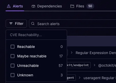
Socket’s precomputed reachability slashes false positives by flagging up to 80% of vulnerabilities as irrelevant, with no setup and instant results.

Product
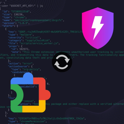
Socket is launching experimental protection for Chrome extensions, scanning for malware and risky permissions to prevent silent supply chain attacks.