Research
Namastex.ai npm Packages Hit with TeamPCP-Style CanisterWorm Malware
Malicious Namastex.ai npm packages appear to replicate TeamPCP-style Canister Worm tradecraft, including exfiltration and self-propagation.
@sq-ui/sq-grid
Advanced tools
A simple and clean CSS grid which can be configured to use either CSS Grid or Flexbox.
A simple and clean CSS grid which can be configured to use either CSS Grid or Flexbox.
See a combined live preview here
Documentation can be found here
SQ-Grid offers three types of grids:
The grid which the browser should use is determined by @supports queries. In case the browser supports either native CSS grids or flexbox, the UI kit exposes class rules which the developer can use to manipulate the grid according to either grid or flexbox rules. In case the browser doesn't support either of those two features, the UI kit defaults to using floats to establish the grid rules.
npm install @sq-ui/sq-grid./node_modules/@sq-ui/sq-grid/dist/sq-grid.css
./node_modules/@sq-ui/sq-grid/mixins.scss
./node_modules/@sq-ui/sq-grid/sq-grid.scss
The grid uses a maximum of 12 columns per row. All the width calculations and corresponding classes are based on the 12-column layout.
The grid consists of the following classes:
npm installnpm run build:sassFAQs
A simple and clean CSS grid which can be configured to use either CSS Grid or Flexbox.
The npm package @sq-ui/sq-grid receives a total of 2 weekly downloads. As such, @sq-ui/sq-grid popularity was classified as not popular.
We found that @sq-ui/sq-grid demonstrated a not healthy version release cadence and project activity because the last version was released a year ago. It has 2 open source maintainers collaborating on the project.
Did you know?

Socket for GitHub automatically highlights issues in each pull request and monitors the health of all your open source dependencies. Discover the contents of your packages and block harmful activity before you install or update your dependencies.

Research
Malicious Namastex.ai npm packages appear to replicate TeamPCP-style Canister Worm tradecraft, including exfiltration and self-propagation.

Product
Explore exportable charts for vulnerabilities, dependencies, and usage with Reports, Socket’s new extensible reporting framework.

Product
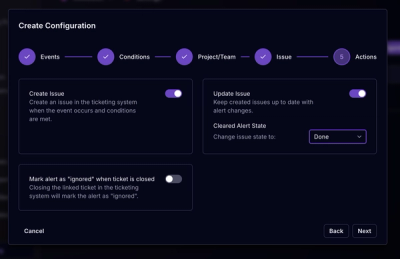
Socket for Jira lets teams turn alerts into Jira tickets with manual creation, automated ticketing rules, and two-way sync.